
Your landing page’s weakest score is Trust.
How sieve ranks
60Growth scoreupdated
category scores
category scoresShowHide
Score over time
Trust
32PoorProof that the product is real, competent, and safe to try.


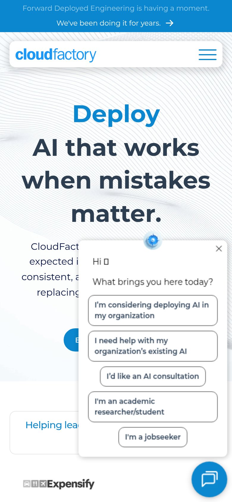
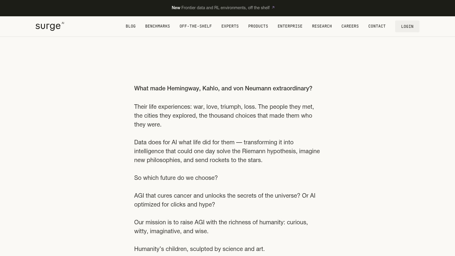
| Trust read | |
|---|---|
| sieve | No visible trust signal identified. |
| implicit context Scale AI may benefit from pre-existing familiarity among its target audience. | |
| "We've trained over 80% of the world's leading AI models and deploy them at enterprise scale." | |
| Expensify logo at the edge of a customer logo strip (mobile capture) | |
| G2.com, Capterra.com and Proxyway.com star-rating badges above the headline | |
| "New Frontier data and RL environments, off the shelf" announcement banner |
CTA
55FairCopy, size, verb, cost-feel — does the primary CTA earn the click?


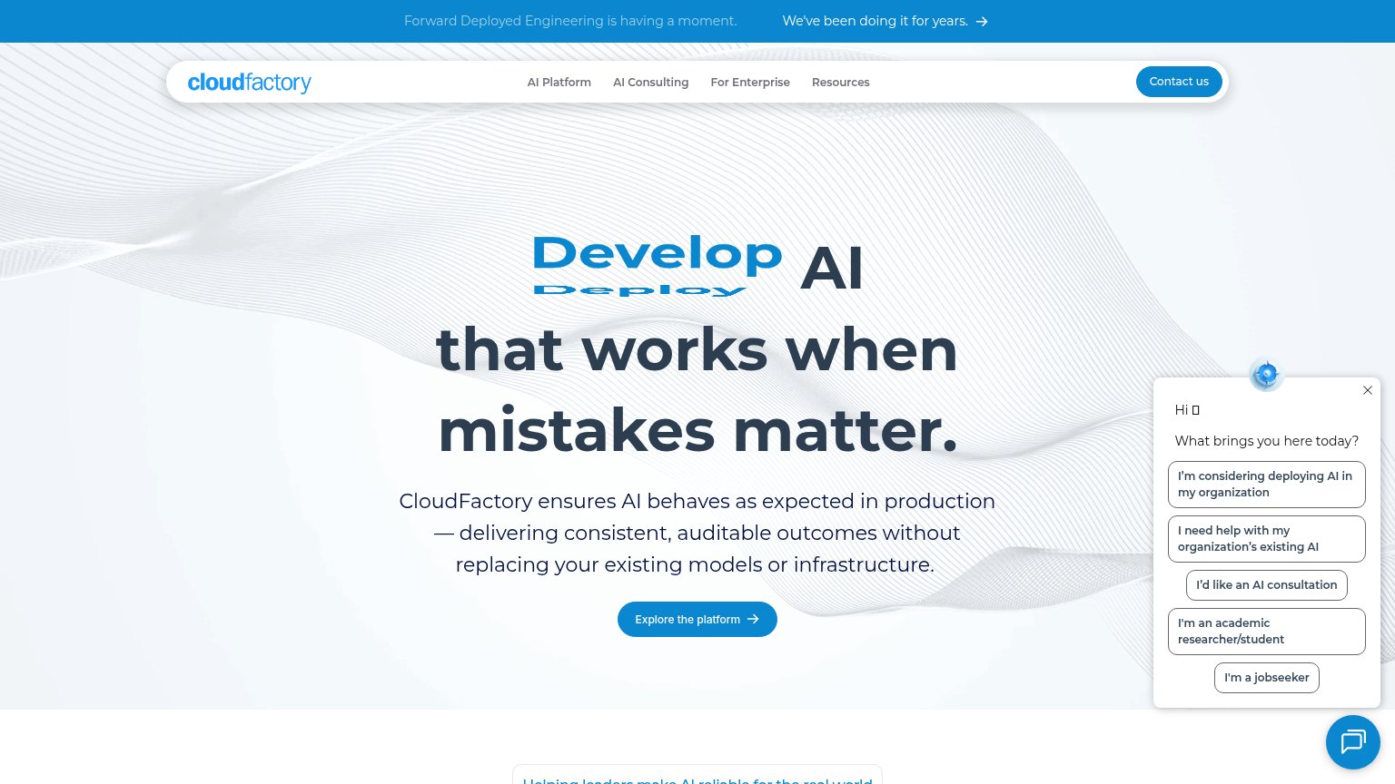
Problems
- click feels costly — sales talk
- weaker than nav's 'Try the agent now'
- 'Contact' is not a value verb
- two competing CTA labels
Information hierarchy
68FairDoes the design help or inhibit what the page is trying to say?
1234- Try the agent now — Dark pill styled at equal weight to the hero "Contact Us" CTA, splitting the primary action between two destinations.
- Seven-item nav row — Home, About, Case studies, Web Scraping, Document Processing, Contact us, Documentation — seven equal-weight exits before the visitor reaches the headline.
- Duplicate sieve wordmark — Repeats the top-left logo directly above the headline, outranking "Accurate data from messy, unstructured sources" in the scan path.
- AI scale badge — Outlined pill sits at the top of the hero stack and competes with the headline for the first read.
Value props
72FairTitle, subtitle, hero — do they sell the product's true value?
sieve’s headline sells
Accurate data from messy, unstructured sources
Websites, PDFs, filings, and more. Extracted by AI, verified by experts, delivered ready to use.
Working
- Names real outcome: accurate structured data
- Subhead lists concrete sources: PDFs, filings
- "Verified by experts" builds trust wedge
Could improve
- No numbers: accuracy, volume, or speed
- Hero art decorates, shows no product
- No emotional hook for data-cleanup pain
Mobile web
74FairThe phone experience as a first-class citizen.
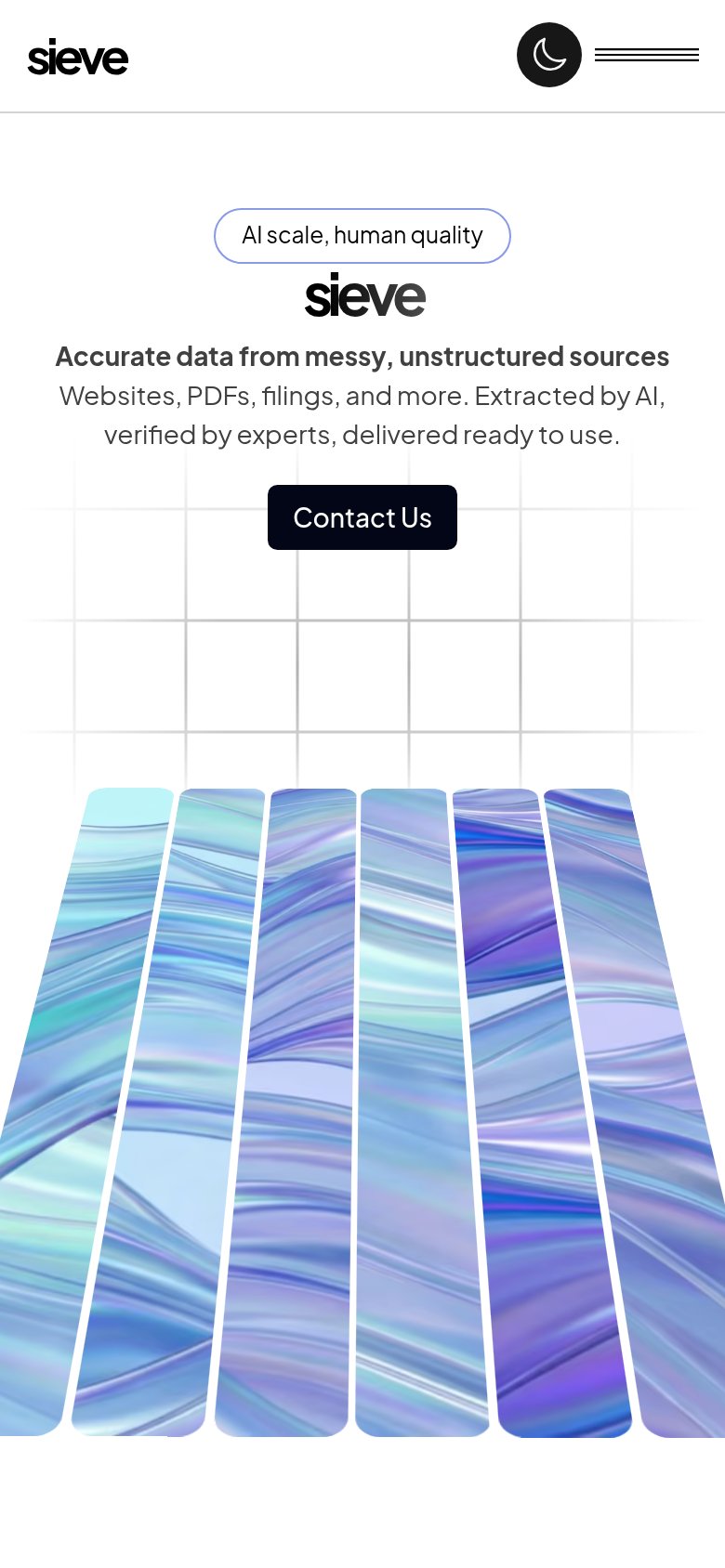 12
- Contact Us button — Desktop-proportioned button floats narrow in the phone column instead of going near-full-width for the thumb.
- Hamburger menu icon — Three thin lines with no border or fill read as decoration and give a small, ambiguous tap target.