
Your landing page’s weakest score is Trust.
How Method ranks
71Growth scoreupdated
category scores
category scoresShowHide
Score over time
Trust
58FairProof that the product is real, competent, and safe to try.


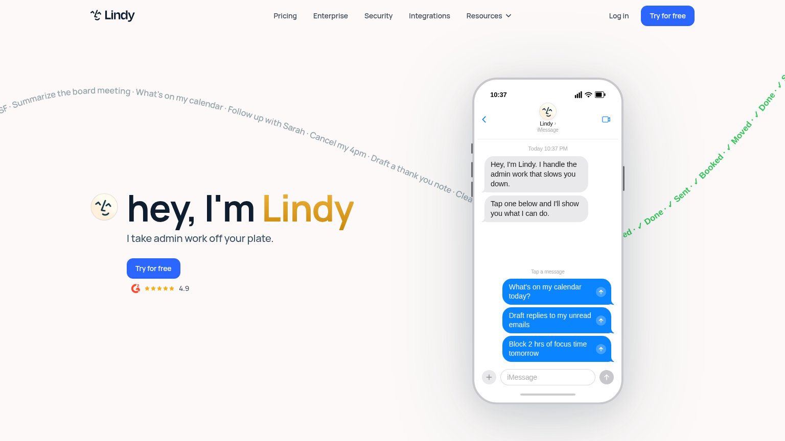
| Trust read | |
|---|---|
| Method | "Backed by Y Combinator" badge above the headline |
| No visible trust signal identified. | |
| No visible trust signal identified. | |
| G2 badge with 4.9 star rating below the "Try for free" CTA | |
| "TRUSTED BY TEAMS LEADING THE FUTURE" logo bar with Statsig, SurrealDB, and Case Status (mobile capture) | |
| "We raised a $50M Series B led by Benchmark" banner |
Value props
68FairTitle, subtitle, hero — do they sell the product's true value?
Method’s headline sells
Make the next run more reliable.
Turn a repeated task into a workflow with checks. Method helps you iterate with agents, build faster, and ship more reliable workflows.
Working
- Names a felt pain: unreliable repeat runs
- Demo shows a real task, not decoration
- Subhead states the mechanism: checks
Could improve
- Zero numbers or concrete proof points
- 'Run' assumes prior agent-workflow context
- Generic 'build faster' dilutes the claim
CTA
72FairCopy, size, verb, cost-feel — does the primary CTA earn the click?
Problems
- generic label, no payoff named
- competes with 3 other fold CTAs
- demo looks interactive but isn't
- nav pushes 'Book a cloud call' instead
Information hierarchy
78FairDoes the design help or inhibit what the page is trying to say?
123- Book a cloud call — Second black pill CTA at equal weight to 'Get started' splits the primary action path.
- Copy prompt button — Same footprint as 'Get started' beside it, making three same-size choices in one row.
- Nav link row — Docs, Blog, and Sign in offer three exits before the visitor reaches the hero CTA.
Mobile web
78FairThe phone experience as a first-class citizen.
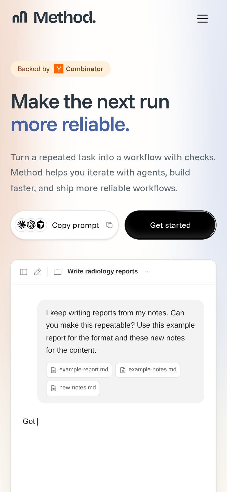 12
- Side-by-side CTA row — "Get started" shares the row with "Copy prompt" at equal weight, halving the primary tap target instead of going full-bleed.
- Copy prompt button — Three provider icons plus a copy icon crowd a secondary action that competes visually with the primary CTA.