
Your landing page’s weakest score is Trust.
How Mesmer ranks
64Growth scoreupdated
category scores
category scoresShowHide
Score over time
Trust
44PoorProof that the product is real, competent, and safe to try.
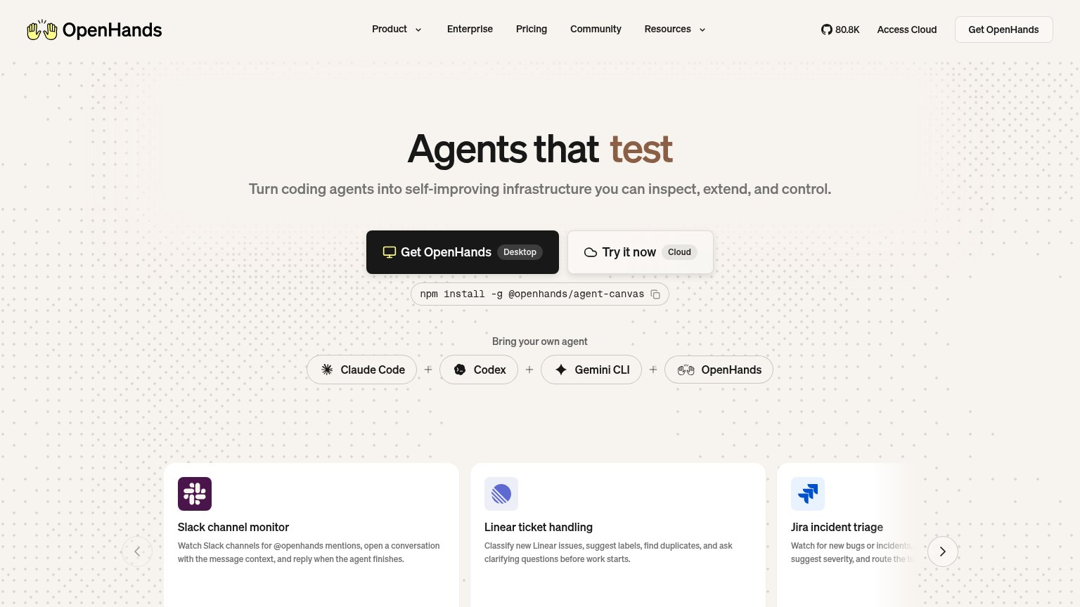
| Trust read | |
|---|---|
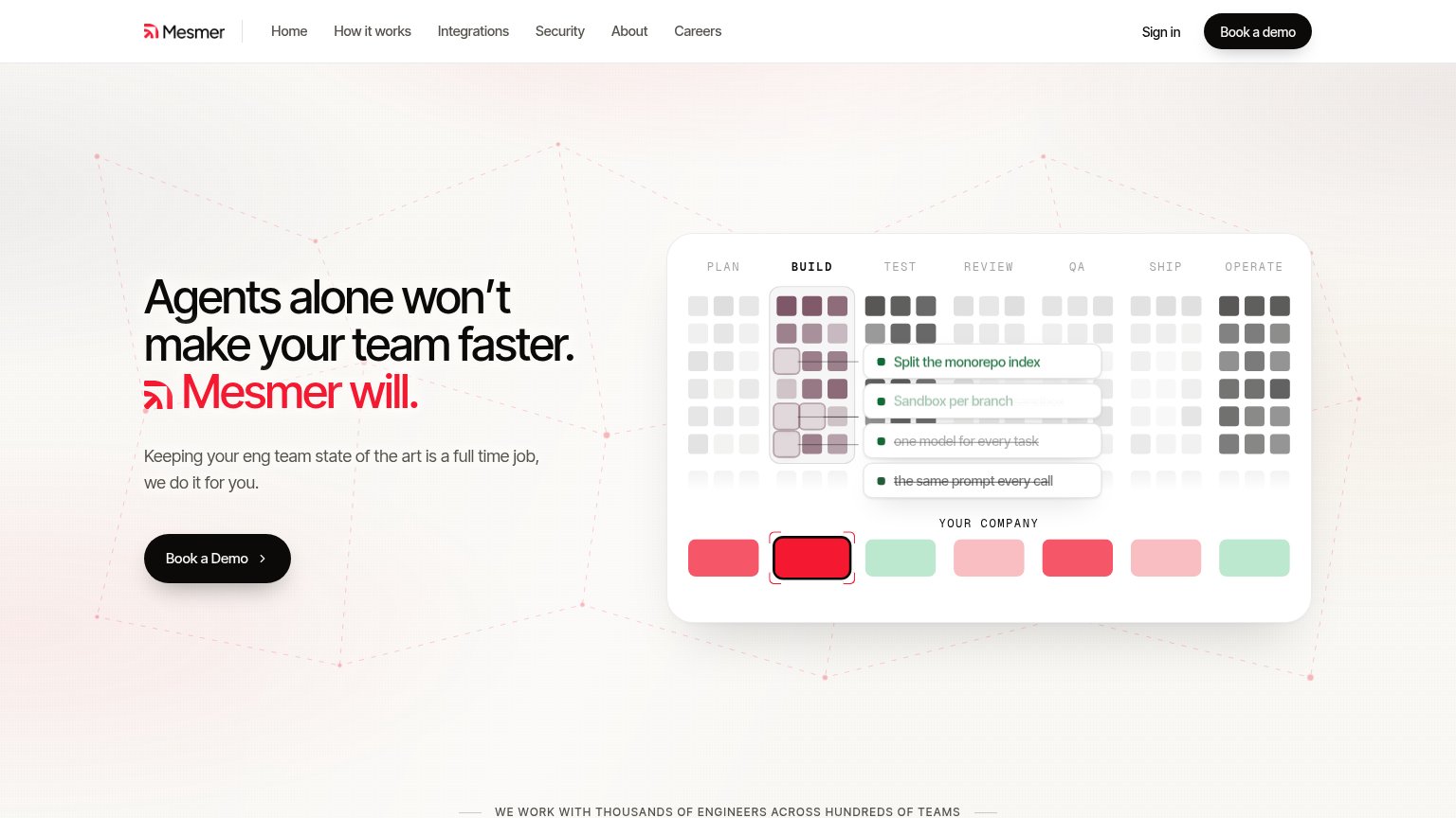
| Mesmer | "WE WORK WITH THOUSANDS OF ENGINEERS ACROSS HUNDREDS OF TEAMS" strip text |
| No visible trust signal identified. | |
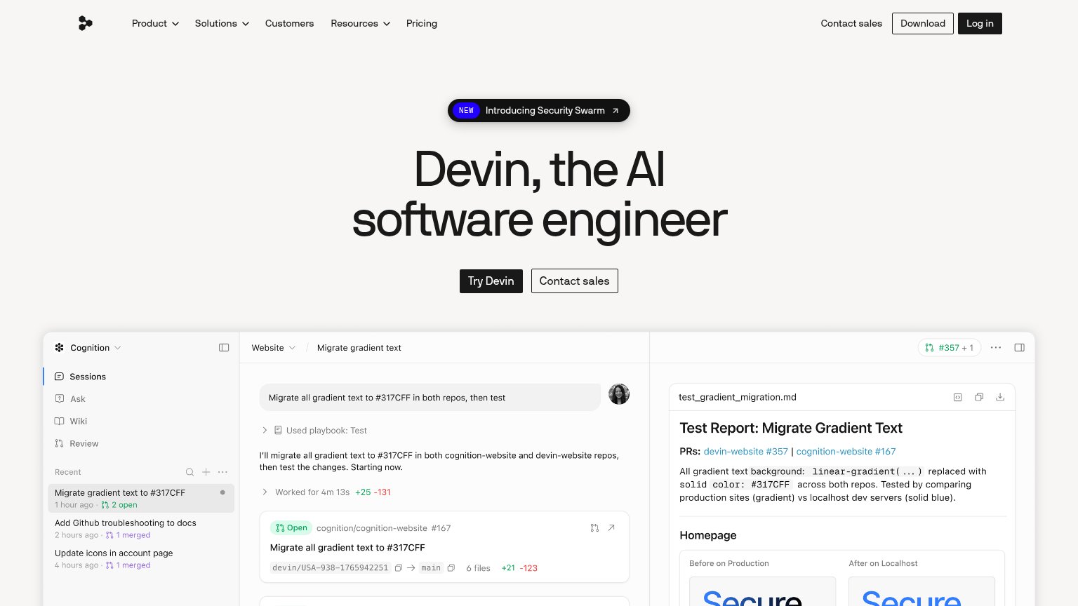
| Embedded Devin session demo showing the task "Migrate all gradient text to #317CFF in both repos, then test" with real P | |
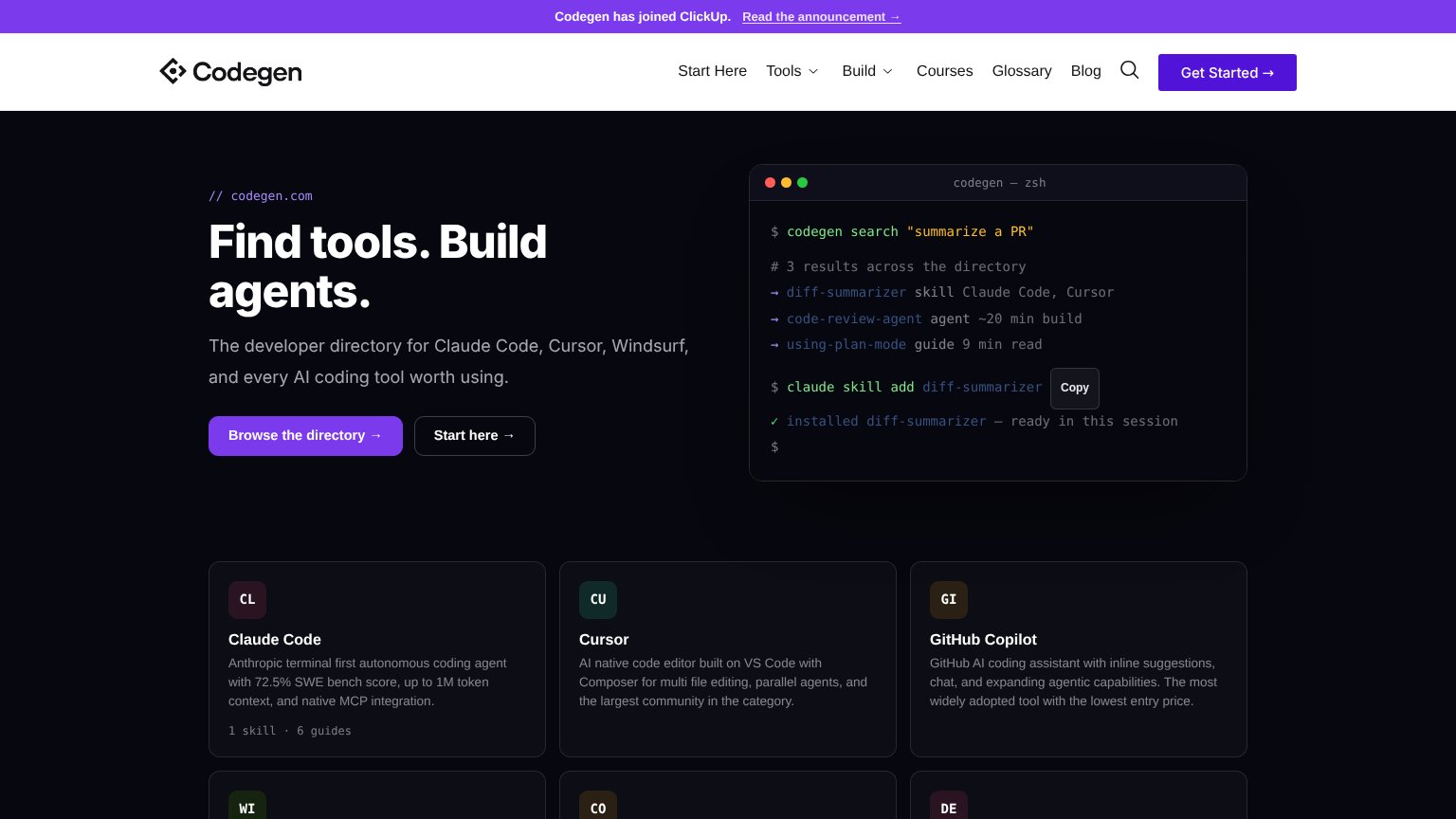
| Terminal demo running 'codegen search "summarize a PR"' with real directory results | |
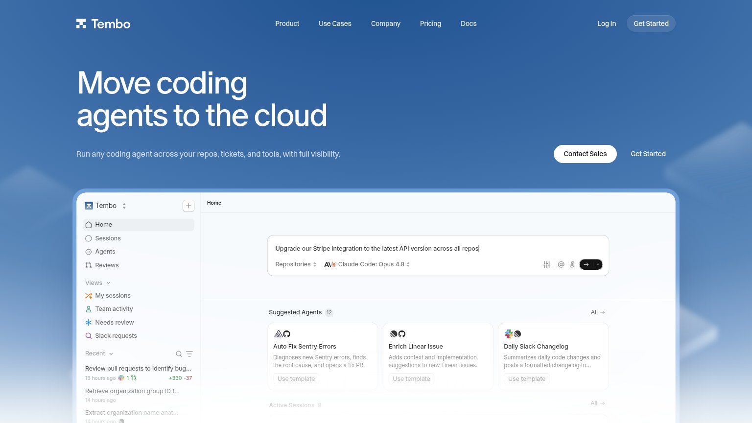
| Embedded product UI showing real agent sessions, e.g. "Review pull requests to identify bug..." with "+330 -37" diff sta | |
| "80.8K" GitHub star count in the desktop header |
Value props
62FairTitle, subtitle, hero — do they sell the product's true value?
Mesmer’s headline vague
Agents alone won't make your team faster. Mesmer will.
Keeping your eng team state of the art is a full time job, we do it for you.
Working
- Contrarian hook on agent hype
- Names the buyer's real burden
- Hero visual shows SDLC pipeline stages
Could improve
- Never says what Mesmer actually does
- Zero numbers or proof points in fold
- Subhead restates problem, no mechanism
CTA
68FairCopy, size, verb, cost-feel — does the primary CTA earn the click?
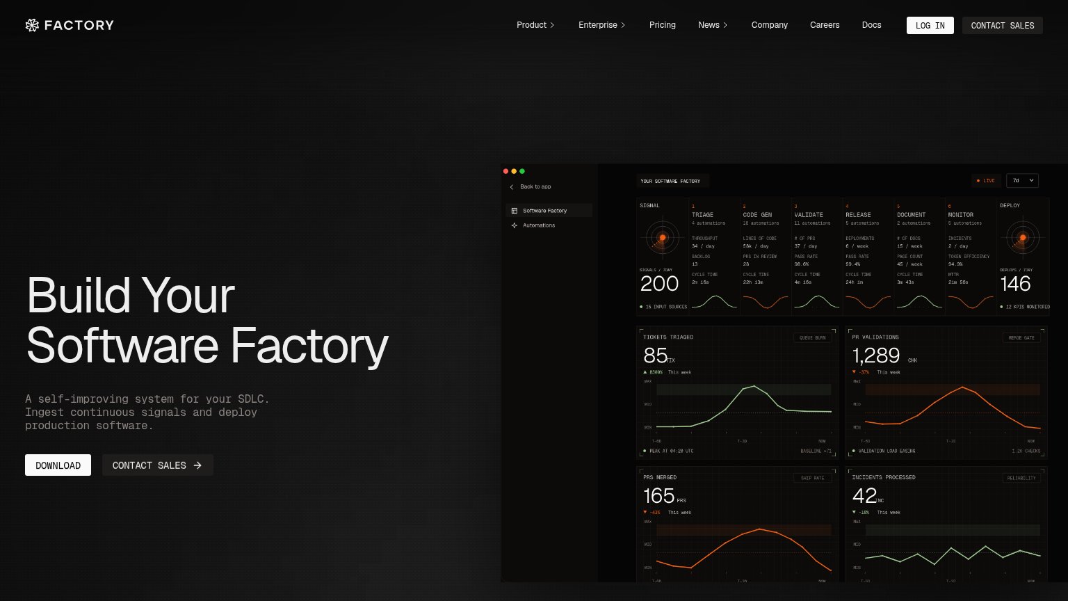
Problems
- click feels costly — sales call
- no self-serve or value path
- capitalization drifts across labels
Mobile web
68FairThe phone experience as a first-class citizen.
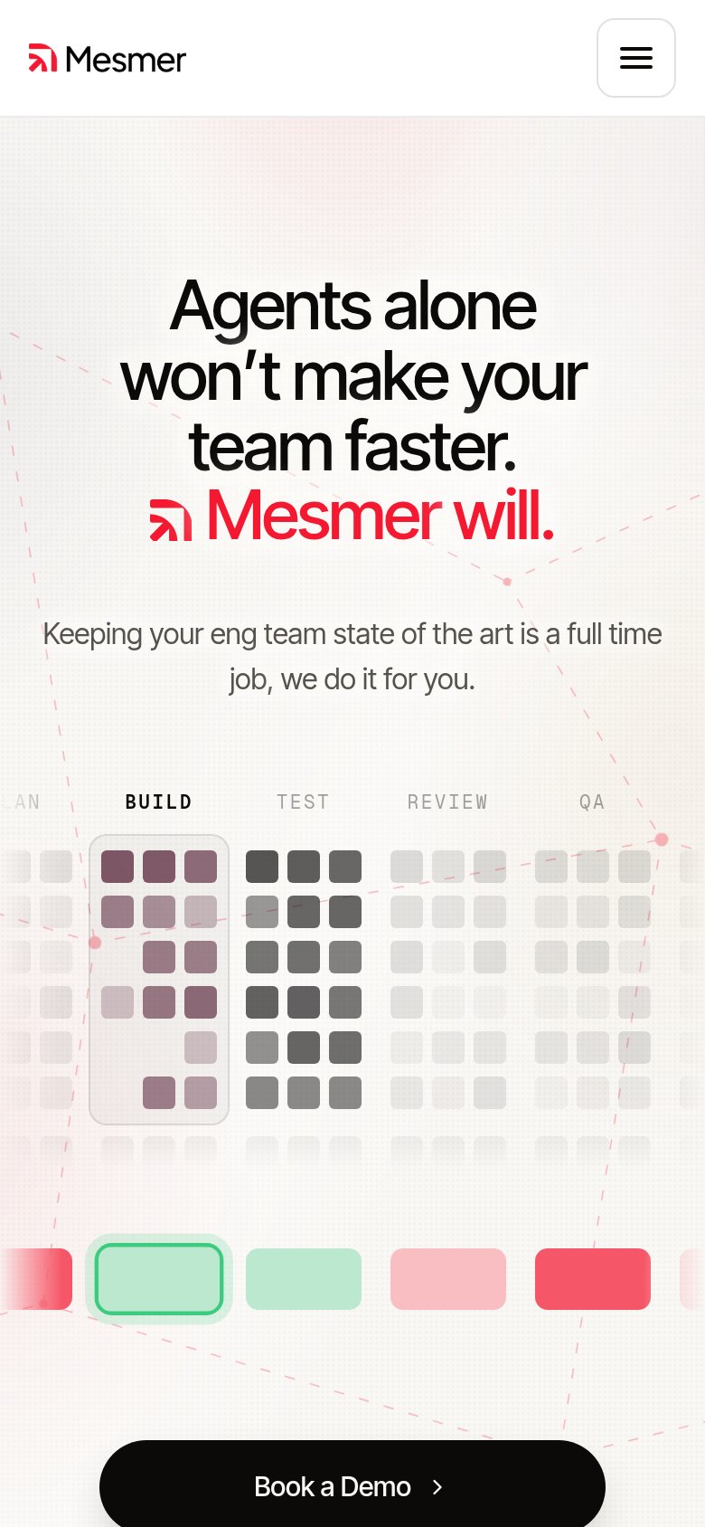 123
- Book a Demo button — Primary CTA is cut off at the bottom edge of the first viewport, barely tappable.
- Pipeline tile grid — Desktop-scale visualization eats half the mobile fold and pushes the CTA off-screen.
- Clipped LAN column — Left column label and tiles overflow the viewport edge, looking broken on mobile.
Information hierarchy
76FairDoes the design help or inhibit what the page is trying to say?
123- Six-link navigation row — Home, How it works, Integrations, Security, About, Careers all compete with the demo ask at equal weight.
- Strikethrough tooltip labels — "one model for every task" and "the same prompt every call" render as faded crossed-out text that reads as broken UI, not a message.
- Sign in link — Sits at near-equal prominence beside Book a demo, splitting the top-right action zone.