
Your landing page’s weakest score is Trust.
How Mbodi AI ranks
67Growth scoreupdated
category scores
category scoresShowHide
Trust
38PoorProof that the product is real, competent, and safe to try.
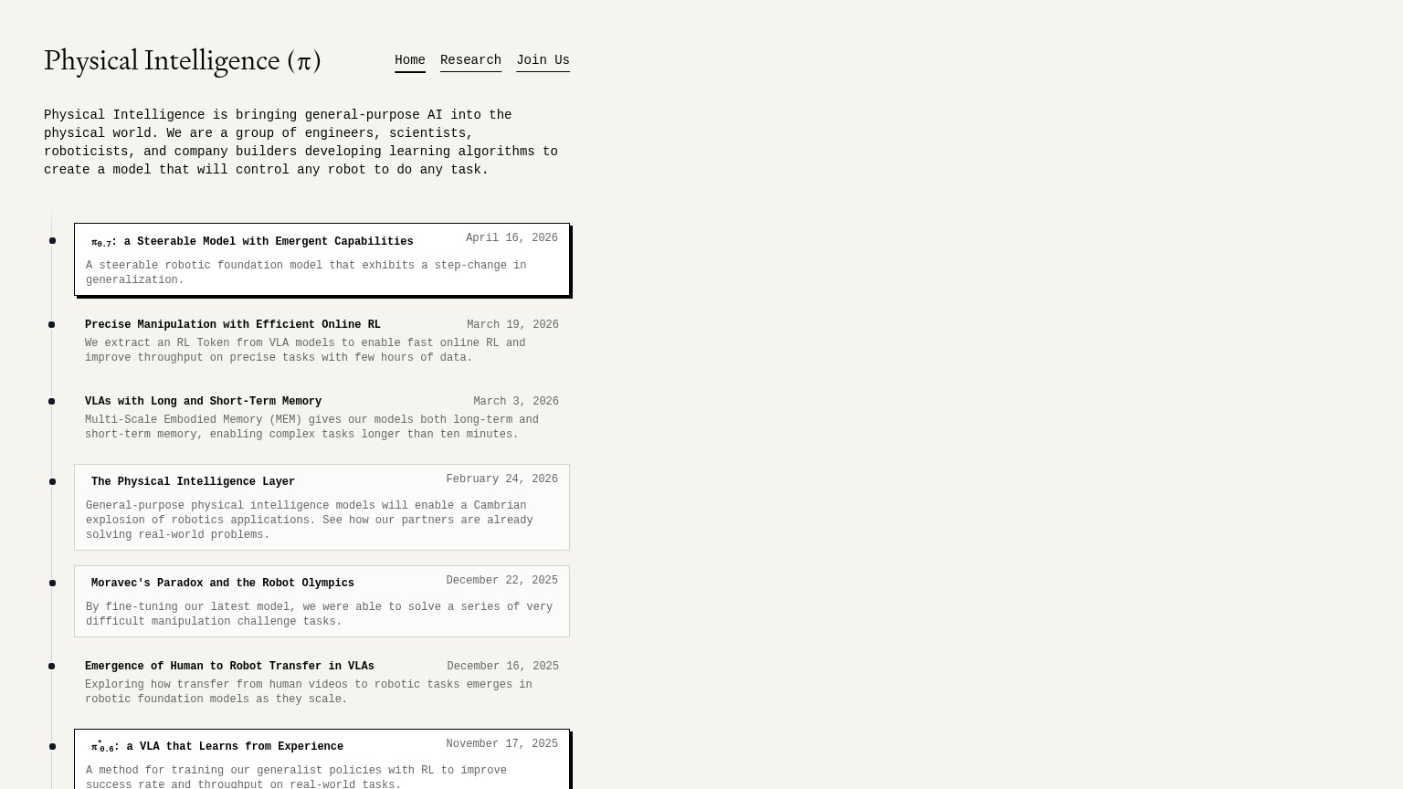
| Trust read | |
|---|---|
| Mbodi AI | No visible trust signal identified. |
| Dated research timeline, e.g. "π0.7: a Steerable Model with Emergent Capabilities — April 16, 2026" | |
| No visible trust signal identified. | |
| No visible trust signal identified. |
CTA
68FairCopy, size, verb, cost-feel — does the primary CTA earn the click?
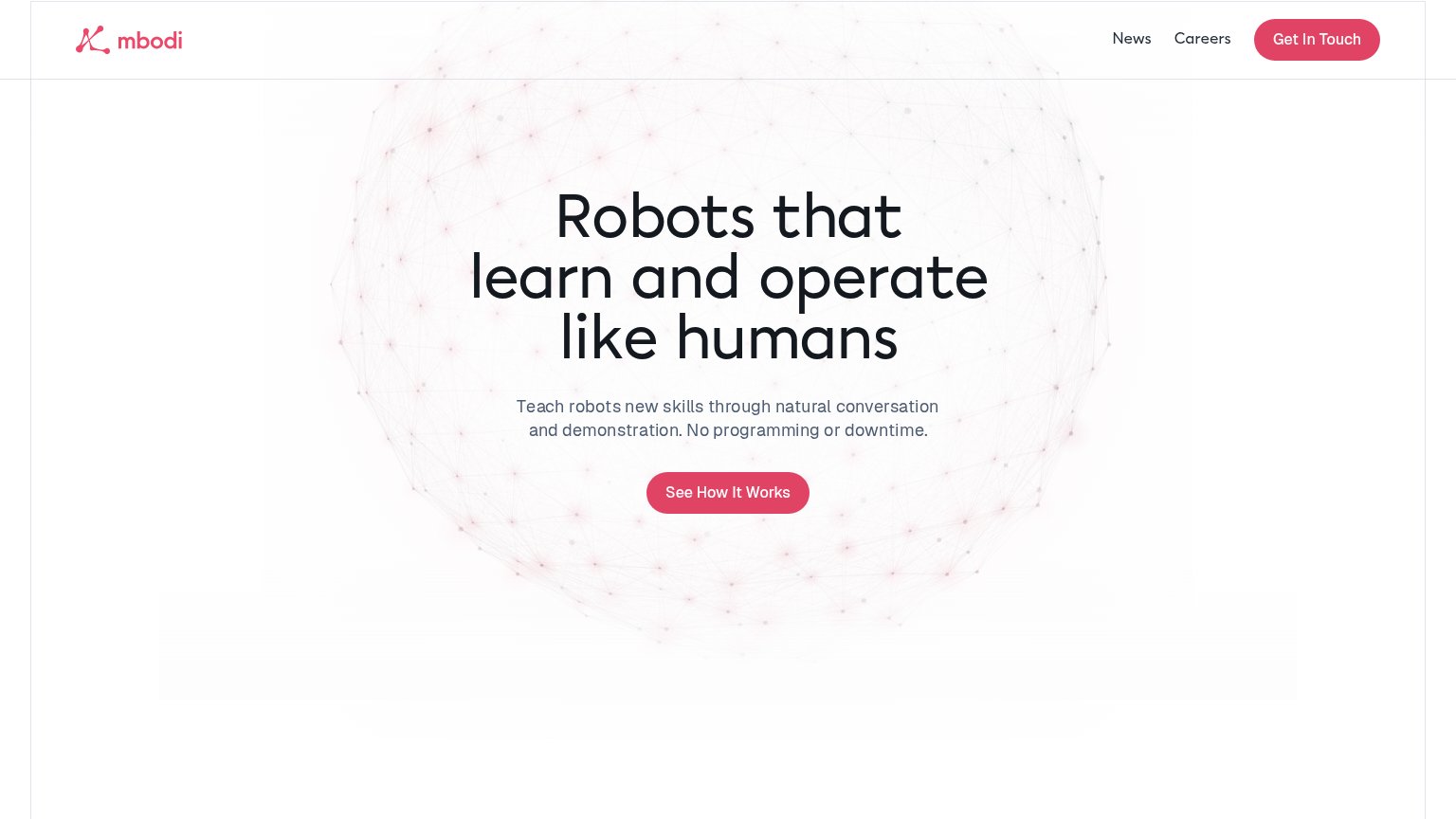
Problems
- passive tour, not a conversion step
- 4 words, past single-fixation length
- competes with nav 'Get In Touch'
- no payoff named in the label
Value props
68FairTitle, subtitle, hero — do they sell the product's true value?
Mbodi AI’s headline sells
Robots that learn and operate like humans
Teach robots new skills through natural conversation and demonstration. No programming or downtime.
Working
- Subhead names mechanism: conversation + demo
- Kills two objections: programming, downtime
- Headline states category in plain language
Could improve
- No numbers or proof points in the fold
- Hero mesh decorates, never demonstrates
- No named task, robot type, or industry
Mobile web
80StrongThe phone experience as a first-class citizen.
 12
- Oversized hero headline — Wraps into four tall lines and eats half the viewport before the value statement is readable.
- See How It Works button — Floats at partial width instead of the near-full-bleed size mobile thumbs expect.
Information hierarchy
83StrongDoes the design help or inhibit what the page is trying to say?
12- Get In Touch button — Same pink pill weight as the primary CTA, creating two competing actions in the fold.
- Neural mesh background — So faint it fails to communicate robotics or AI, leaving the brand world nearly blank.