
Your landing page’s weakest score is Mobile web.
How Cua ranks
64Growth scoreupdated
category scores
category scoresShowHide
Score over time
Mobile web
54FairThe phone experience as a first-class citizen.
 123
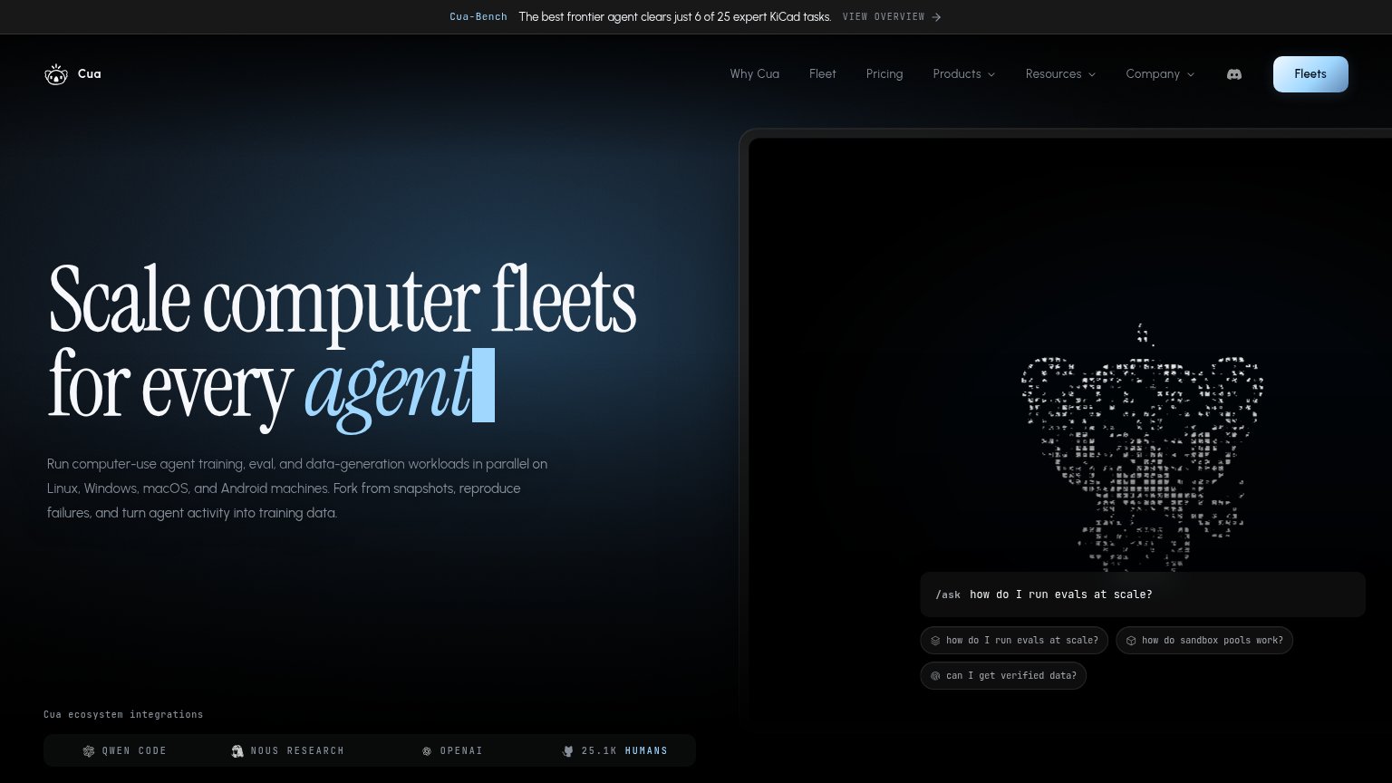
- Hero animation panel — Decorative ASCII-art frame consumes the top half of the fold and pushes the headline and any CTA out of view.
- Truncated announcement bar — Banner cuts off mid-sentence ('6 of 25 expert Ki…') with no visible link, leaving a broken message at the top.
- /ask input field — The only actionable element sits below the fold and reads as a static code snippet, not a tappable CTA.
Information hierarchy
62FairDoes the design help or inhibit what the page is trying to say?
 1234
- Fleets nav button — The only button-styled CTA is a small corner nav item with a vague noun label, invisible in a one-second scan.
- /ask input field — Competes with the nav button as the apparent primary action; the fold never signals which one to take.
- Navigation link row — Ten-plus links plus a Discord icon outweigh the CTA and leak attention before any conversion.
- Cua-Bench banner link — 'VIEW OVERVIEW' pulls first-glance attention to an exit path at the very top of the page.
CTA
62FairCopy, size, verb, cost-feel — does the primary CTA earn the click?


Problems
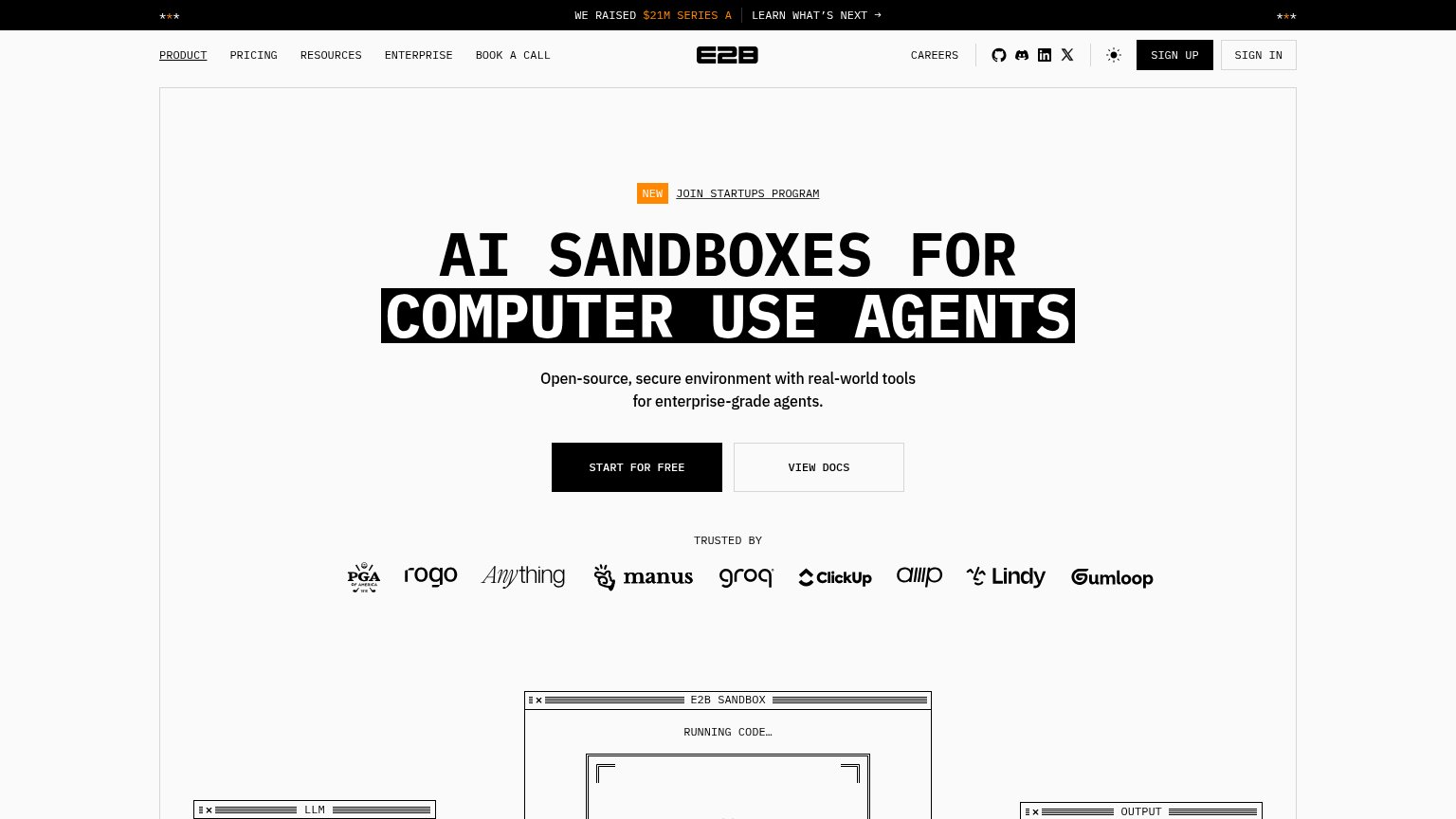
- no submit affordance on input
- placeholder is Q&A, not product use
- nav button 'Fleets' is a bare noun
- no action verb anywhere
Trust
64FairProof that the product is real, competent, and safe to try.
| Trust read | |
|---|---|
| Cua | "Cua ecosystem integrations" strip with QWEN CODE, NOUS RESEARCH, OPENAI, and "25.1K HUMANS" |
| implicit context E2B may benefit from pre-existing familiarity among its target audience. | |
| No visible trust signal identified. | |
| "10,000+ companies building beyond the API" with Microsoft, DeepMind, Amplitude, Ramp, Clay, and Lovable logos | |
| "one-click VSCode SSH, tmux automation, live previews, and serverless scale-to-zero" feature copy in the Morph Devboxes | |
| "loved by 11,000+ teams building agents" above a logo row including Cash App, Vercel, Framer, and Y Combinator |
Value props
76FairTitle, subtitle, hero — do they sell the product's true value?
Cua’s headline sells
Scale computer fleets for every agent
Run computer-use agent training, eval, and data-generation workloads in parallel on Linux, Windows, macOS, and Android machines. Fork from snapshots, reproduce failures, and turn agent activity into training data.
Working
- Subhead names 4 OSes and 3 concrete outcomes
- Cua-Bench banner adds real benchmark proof
- Integrations strip shows credible ecosystem
Could improve
- Hero visual is a mascot, not the product working
- No numbers in headline or subhead
- Copy is affectless — no pain or relief named