
Your landing page’s weakest score is Value props.
How Capacitive ranks
- 1.
Capacitive35
35Growth scoreupdated
category scores
category scoresShowHide
Score over time
Value props
15PoorTitle, subtitle, hero — do they sell the product's true value?
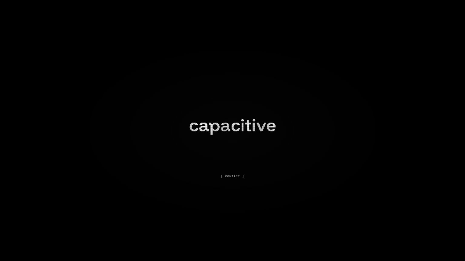
Capacitive’s headline vague
capacitive
Working
- Clean, memorable brand presentation
- Zero clutter — one clear action
Could improve
- No statement of what the product does
- No outcome, audience, or proof point
- CONTACT is the only path — no context
Trust
22PoorProof that the product is real, competent, and safe to try.
| Trust read | |
|---|---|
| Capacitive | No visible trust signal identified. |
CTA
42PoorCopy, size, verb, cost-feel — does the primary CTA earn the click?
Problems
- no action verb — reads as label
- tiny footprint, styled as footnote
- contact feels high-cost, no payoff
- no value proposition around it
Information hierarchy
48PoorDoes the design help or inhibit what the page is trying to say?
1- CONTACT bracket link — The only CTA is tiny, dim gray bracket text with no button affordance, easy to miss on the black field.
Mobile web
48PoorThe phone experience as a first-class citizen.
 12
- CONTACT text link — Primary CTA is a dim, small text link instead of a high-contrast, thumb-sized button.
- Capacitive wordmark hero — Logo carries no value statement, so visitors get no reason to tap the lone CTA.
Competitors
No close-enough competitors identified
The matcher only keeps the closest possible competitors — nothing borderline made the cut. Refresh to try again.