BloomYC P25 landing page report.
← Back to YC P25

Your landing page’s weakest score is Trust.

How Bloom ranks

  1. 1.a0.dev74
  2. 2.Bloom71
  3. 3.Rork69
  4. 4.Appacella56
Fix Trust

Score over time

80706050Rork 69 on Sep 21 (Live)a0.dev 74 on Mar 23 (Wayback)a0.dev 73 on Apr 15 (Wayback)a0.dev 74 on May 3 (Wayback)a0.dev 75 on May 12 (Wayback)a0.dev 76 on Aug 9 (Wayback)a0.dev 74 on Sep 21 (Live)Appacella 56 on Sep 21 (Live)Bloom 65 on Mar 23 (Wayback)Bloom 71 on Apr 16 (Wayback)Bloom 72 on Jun 24 (Wayback)Bloom 66 on Sep 13 (Wayback)Bloom 71 on Sep 21 (Live)Mar 23Apr 16Jun 24Sep 13Sep 21
Past reportsShow past reportsHide past reports
  1. Sep 21, 202671LiveOverall +5 · Mobile web +14 · Information hierarchy +4Viewing
  2. Sep 13, 202666Overall −6 · Mobile web −14 · Information hierarchy −4View →
  3. Jun 24, 202672Overall +1 · Trust +10 · Mobile web −6View →
  4. Apr 16, 202671Overall +6 · Mobile web +16 · Information hierarchy +4View →
  5. Mar 23, 202665First tracked report — strongest CTA 72, weakest Trust 52View →

Trust

55Fair

Proof that the product is real, competent, and safe to try.

Trust read
Bloom"Backed by Y Combinator" badge above the headline
RorkThe interactive builder UI — "An app that..." prompt with Build/Model controls and iPhone/Android/Web platform toggles
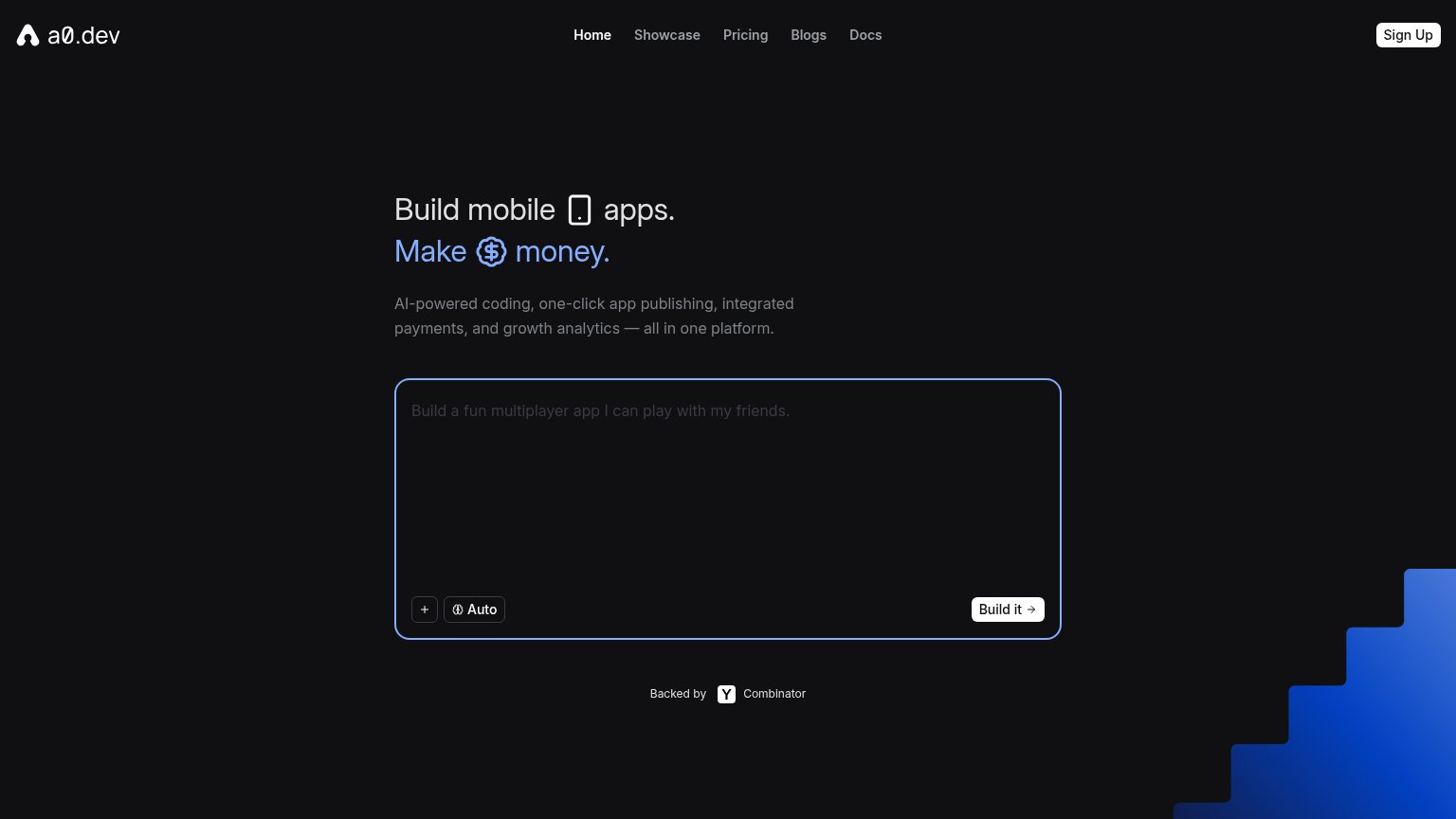
a0.dev"Backed by Y Combinator" badge below the prompt box
AppacellaNo visible trust signal identified.

Information hierarchy

72Fair

Does the design help or inhibit what the page is trying to say?

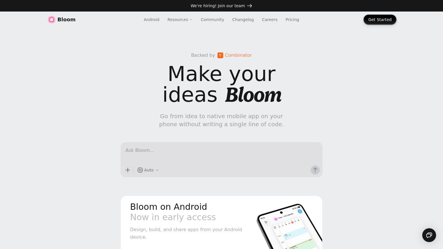
Information hierarchy annotations on the desktop capture1234
  1. Ask Bloom input — The primary conversion surface reads as a flat gray box with a faint arrow — it looks disabled and loses the one-second CTA test to the darker 'Get Started' button above it.
  2. Hiring banner — The highest-contrast band on the page is a recruiting link, pulling first attention to an exit that has nothing to do with conversion.
  3. Nav link row — Six equal-weight links plus a dropdown sit directly above the hero, offering exits before the visitor reaches the promise.
  4. Get Started button — Styled as the strongest button on the page but competes with the 'Ask Bloom...' prompt below, splitting the primary action into two destinations.

Value props

72Fair

Title, subtitle, hero — do they sell the product's true value?

Bloom’s headline undersellsMake your ideas BloomGo from idea to native mobile app on your phone without writing a single line of code.

Working

  • Subhead names outcome: native app, no code
  • Live 'Ask Bloom...' box demonstrates product
  • YC badge lends instant credibility

Could improve

  • Headline is a pun, carries no value
  • No numbers or proof points in fold
  • No emotional hook for non-coders

Mobile web

76Fair

The phone experience as a first-class citizen.

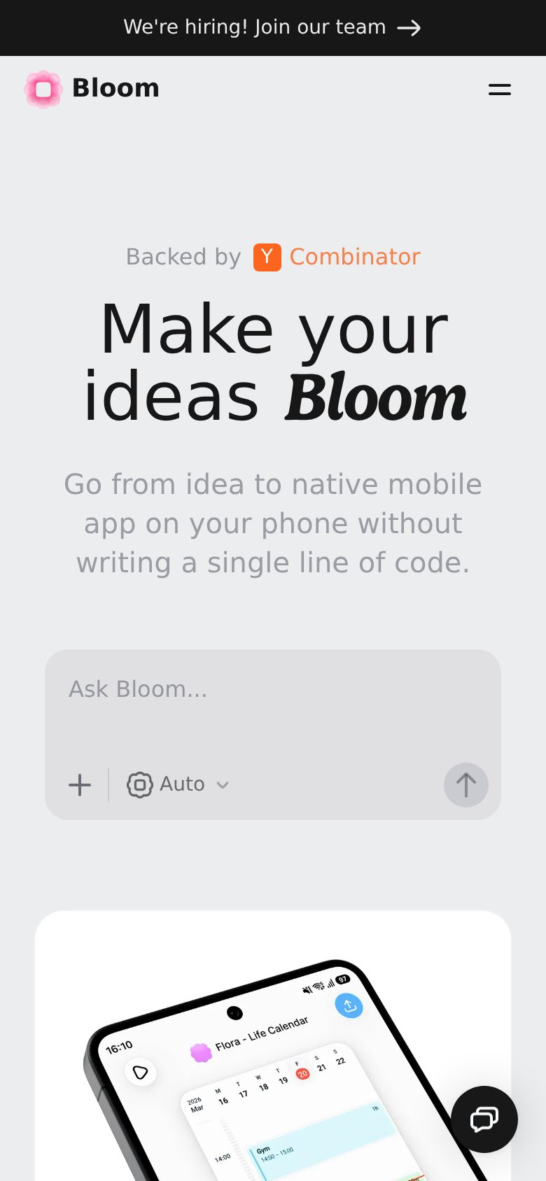
Mobile web annotations on the mobile capture123
  1. Small arrow submit button — The only visible CTA is an unlabeled gray arrow icon — too small and ambiguous for a thumb-first visitor.
  2. Hiring banner — The "We're hiring! Join our team" bar spends the top of a small fold on a non-customer message.
  3. Chat bubble — The floating chat widget hovers over the content column and adds clutter to an already tight phone fold.

CTA

78Fair

Copy, size, verb, cost-feel — does the primary CTA earn the click?

Bloomin-product action
a0.devin-product action

Problems

  • placeholder omits the payoff (an app)
  • icon-only arrow submit, unlabeled
  • submit arrow looks disabled/greyed
  • nav 'Get Started' competes with input

Competitors

inferred from product, audience, and value prop