
Your landing page’s weakest score is Trust.
How Vyra ranks
74Growth scoreupdated
category scores
category scoresShowHide
Score over time
Trust
44PoorProof that the product is real, competent, and safe to try.

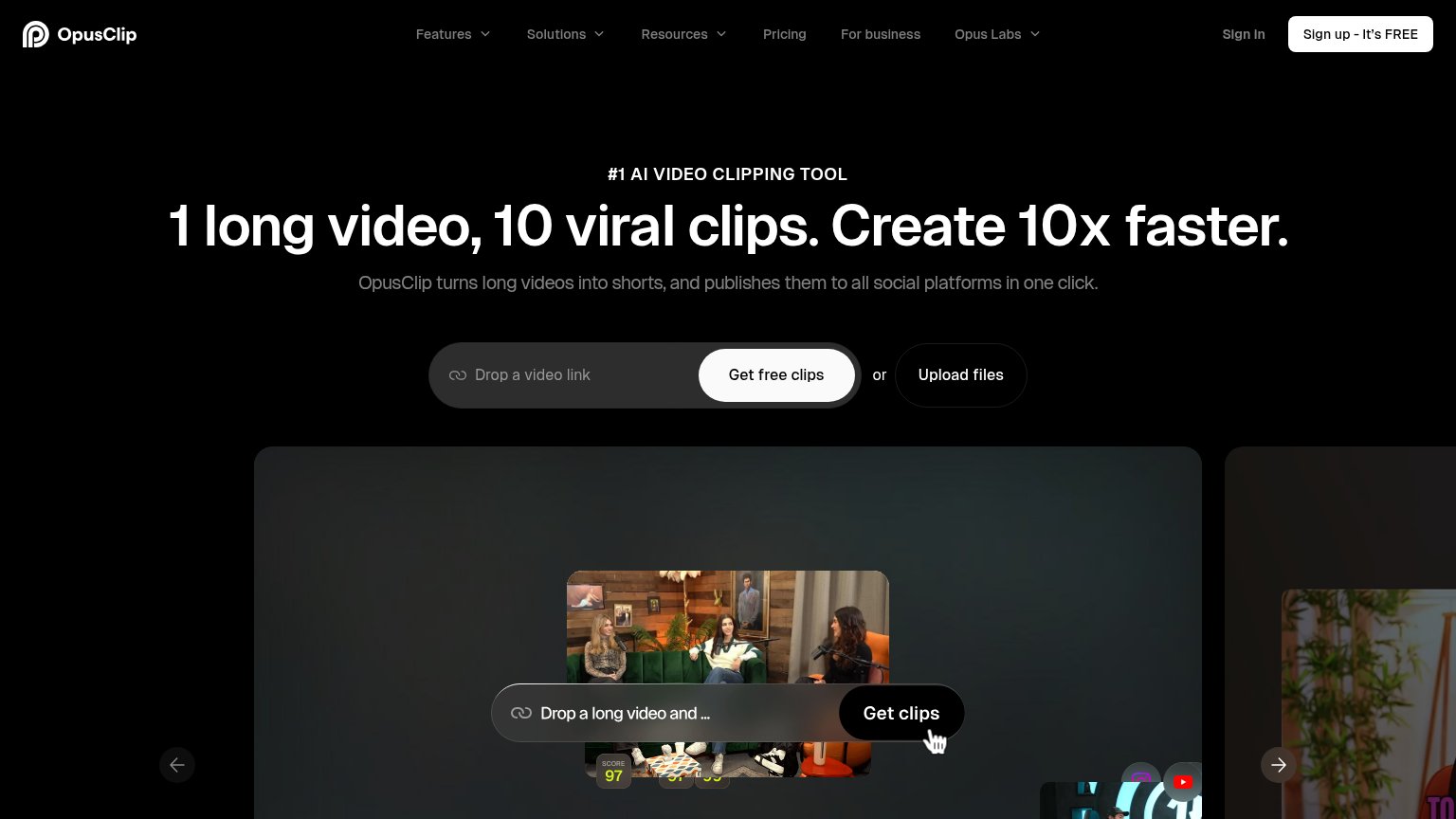
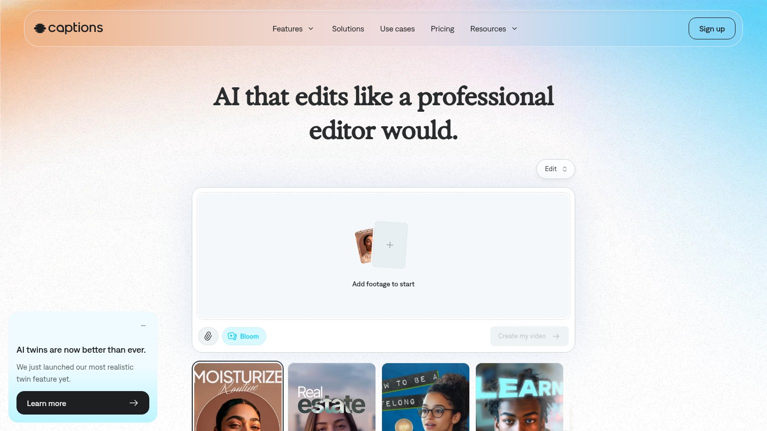


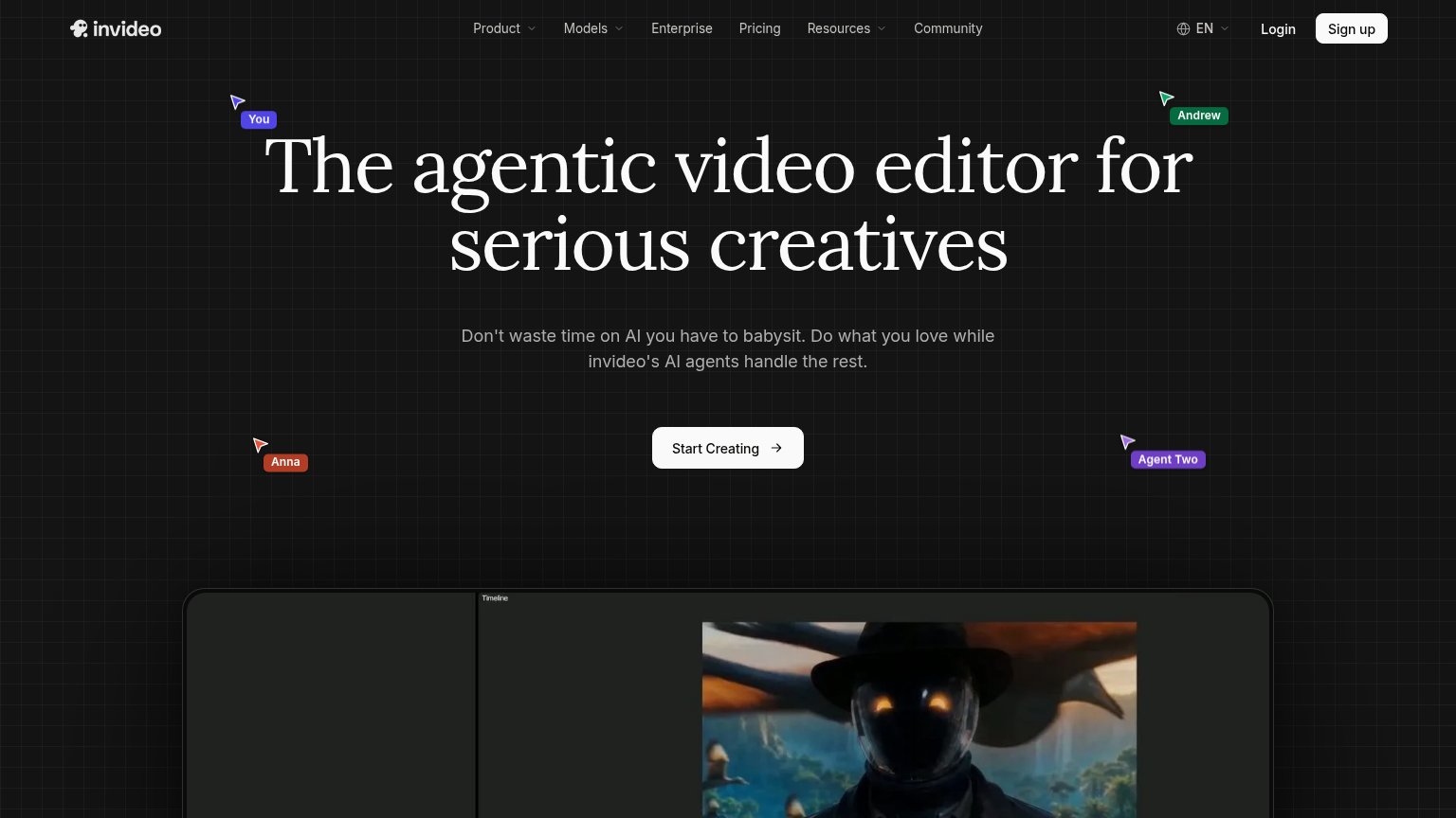
| Trust read | |
|---|---|
| Vyra | Embedded Vyra editor UI showing the "color wheel trend" project with Vyra AI prompt bar and timeline |
| Embedded editor widget: "Add footage to start" with "Create my video" button and example output thumbnails | |
| Product demo showing a long video converted into scored short clips ("SCORE 97") with social platform icons | |
| Underlord AI chat panel showing a real editing workflow: "I see there are some repeated takes and long pauses. I'll remo | |
| Interactive prompt box with "Attach Media" button and media thumbnails showing the real product input UI | |
| Product editor screenshot with timeline UI and rendered video output below the hero |
CTA
78FairCopy, size, verb, cost-feel — does the primary CTA earn the click?
Problems
- 4 words, not 3
- nav button drops 'free'
- demo input not actionable
Value props
82StrongTitle, subtitle, hero — do they sell the product's true value?
Vyra’s headline sells
Raw footage in. Finished video out.
Describe your edit naturally. Get a finished draft in minutes. Every editing tool, one conversation.
Working
- Input-to-output promise in 8 words
- Subhead names mechanism and speed
- Hero shows real editor with prompt
Could improve
- Preview pane is empty black box
- No numbers or social proof
- "Every editing tool" is unproven
Mobile web
82StrongThe phone experience as a first-class citizen.
 123
- Get started CTA — Pill button spans only half the column; near-full-bleed width would be far easier to thumb.
- Demo Export button — High-contrast white button inside the embedded demo competes with the real CTA and invites dead taps.
- Timeline control rows — Slip/Ripple toggles and layer rows look like live UI but are inert, adding confusing tap targets.
Information hierarchy
84StrongDoes the design help or inhibit what the page is trying to say?
1234- Get started for free — Low-contrast periwinkle button blends into the blue sky behind it, weakening the one action the fold exists for.
- Nav Get Started pill — High-contrast black pill outweighs the hero CTA and creates a second competing button style at the top of the scan path.
- Export button — The white Export pill inside the demo reads as a live third CTA, pulling clicks toward a non-functional screenshot control.
- Demo empty chat panel — The dark left panel shows only a truncated prompt "Cut my cli|" with no visible AI output, so the demo fails to communicate the product's result.