Viraj AeroYC F26 landing page report.
← Back to YC F26

Your landing page’s weakest score is Trust.

How Viraj Aero ranks

  1. 1.Viraj Aero64
  2. 2.PBS Aerospace50
  3. 3.Turbotech39
Fix Trust

Score over time

706050403020Turbotech 34 on Mar 25 (Wayback)Turbotech 33 on May 11 (Wayback)Turbotech 39 on Sep 22 (Live)PBS Aerospace 46 on Apr 12 (Wayback)PBS Aerospace 44 on May 19 (Wayback)PBS Aerospace 45 on Jun 9 (Wayback)PBS Aerospace 47 on Sep 9 (Wayback)PBS Aerospace 50 on Sep 22 (Live)Viraj Aero 64 on May 18 (Wayback)Viraj Aero 61 on Jun 12 (Wayback)Viraj Aero 64 on Sep 20 (Live)May 18Jun 12Sep 20
Past reportsShow past reportsHide past reports
  1. Sep 20, 202664LiveOverall +3 · Information hierarchy +6 · Trust +6Viewing
  2. Jun 12, 202661Overall −3 · Information hierarchy −4 · Value props −4View →
  3. May 18, 202664First tracked report — strongest Information hierarchy 76, weakest Trust 42View →

Trust

48Poor

Proof that the product is real, competent, and safe to try.

Trust read
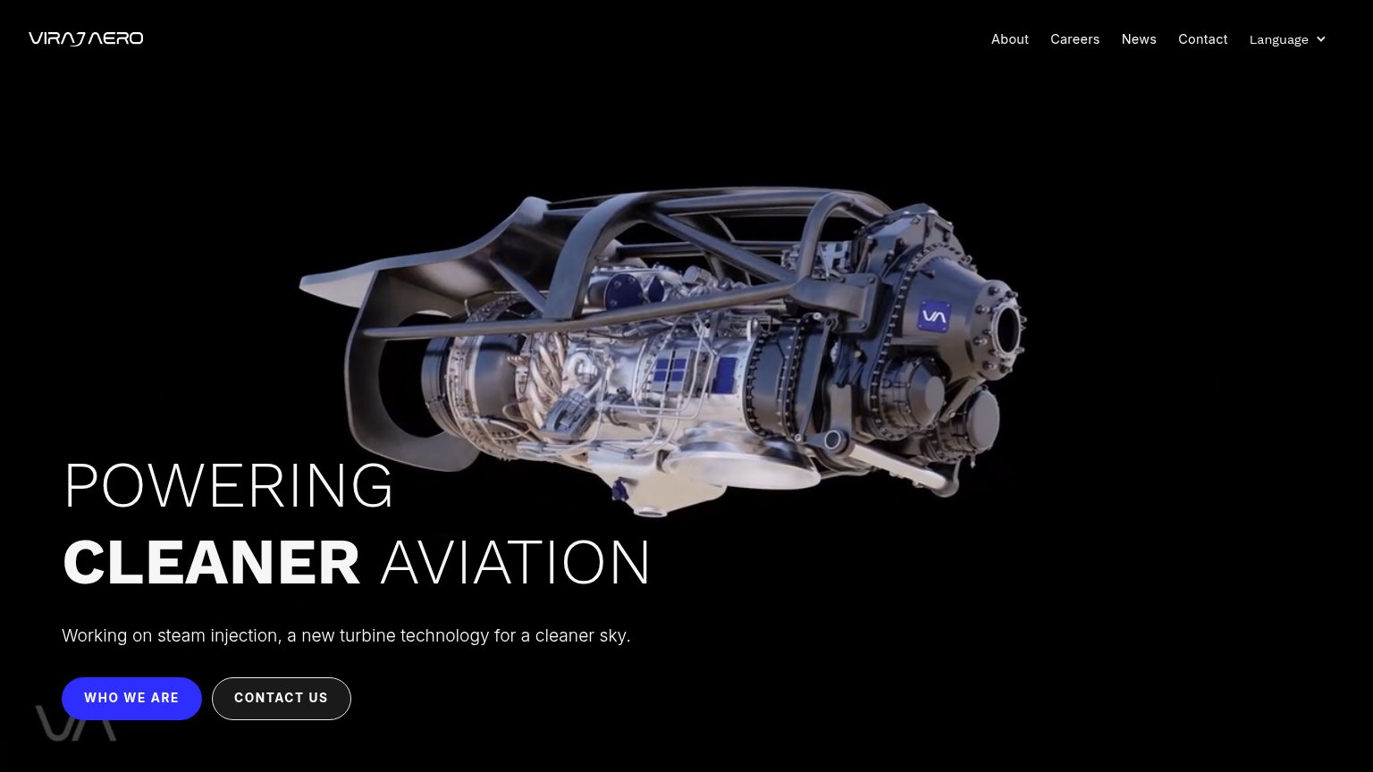
Viraj AeroDetailed turbine engine hero image with branded VA plate
TurbotechNo visible trust signal identified.
PBS AerospaceNo visible trust signal identified.

CTA

58Fair

Copy, size, verb, cost-feel — does the primary CTA earn the click?

Viraj Aero

Problems

  • no action verb — reads as a label
  • promises an about page, not value
  • 'we' talks about the company, not to visitor

Value props

62Fair

Title, subtitle, hero — do they sell the product's true value?

Viraj Aero’s headline undersellsPOWERING CLEANER AVIATIONWorking on steam injection, a new turbine technology for a cleaner sky.

Working

  • Names a clear outcome: cleaner aviation
  • Subhead cites real tech: steam injection
  • Hero shows actual turbine hardware

Could improve

  • No numbers on emissions or efficiency
  • 'Working on' signals unfinished R&D
  • No audience or use case named

Mobile web

72Fair

The phone experience as a first-class citizen.

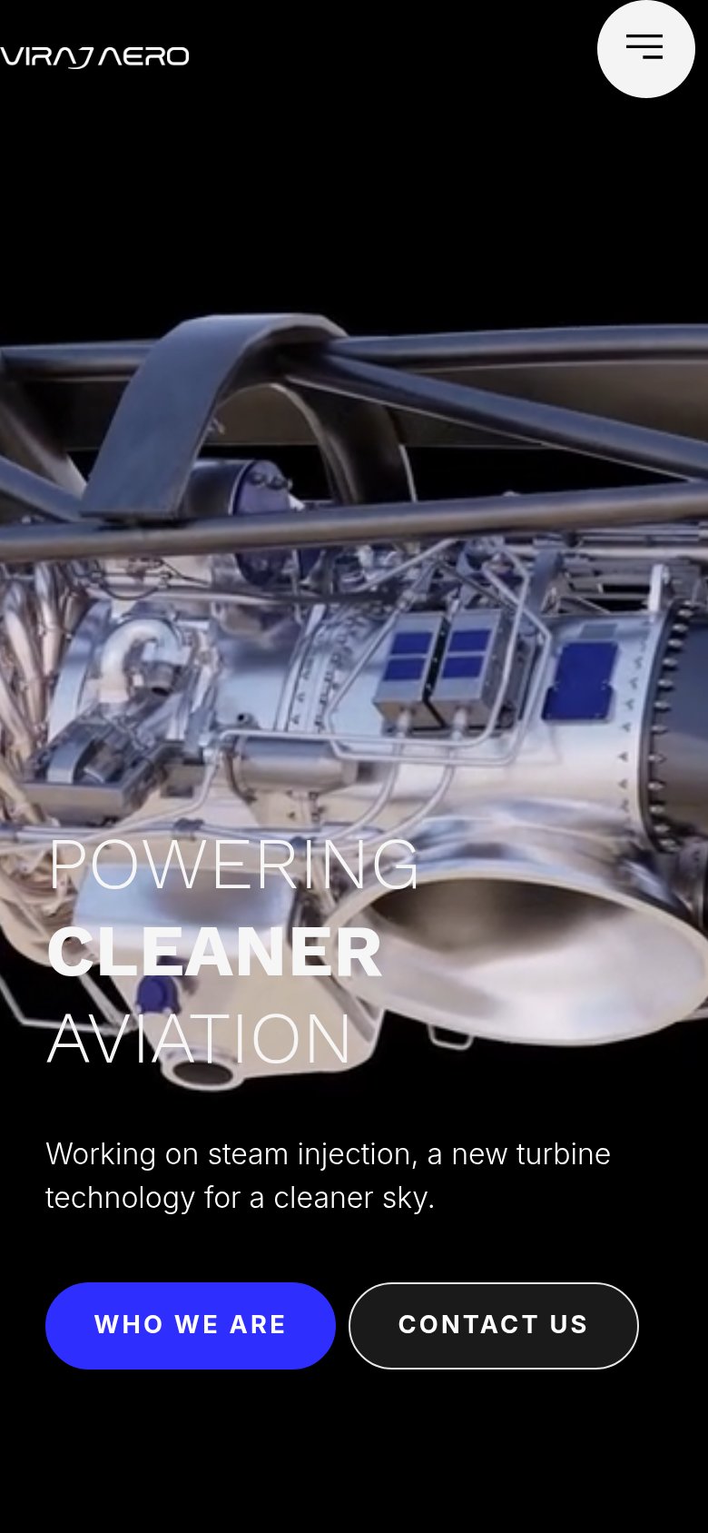
Mobile web annotations on the mobile capture123
  1. Hero headline overlay — Thin white type sits on bright chrome engine imagery — 'POWERING' and 'AVIATION' nearly wash out.
  2. Side-by-side CTA row — Primary 'WHO WE ARE' shares the row at half-width instead of taking full-bleed prominence.
  3. Logo clipped at edge — The VIRAJ AERO wordmark touches the left viewport edge with no padding, looking cropped.

Information hierarchy

78Fair

Does the design help or inhibit what the page is trying to say?

Information hierarchy annotations on the desktop capture123
  1. Dual equal-weight CTAs — 'WHO WE ARE' and 'CONTACT US' sit side by side at similar size, so no single action reads as primary.
  2. Nav duplicates Contact CTA — 'Contact' in the nav repeats the 'CONTACT US' button, adding an exit path that splits the same intent.
  3. Headline overlaps render — 'POWERING' sits partly on the light turbine imagery, reducing contrast on the first word of the value prop.

Competitors

inferred from product, audience, and value prop