
Your landing page’s weakest score is Trust.
How Shire Intelligence ranks
- 1.
Shire Intelligence66
- 2.
5-Out (formerly Hotplate/AI restaurant ops via CCTV — Presto/Vision AI category)64
66Growth scoreupdated
category scores
category scoresShowHide
Trust
32PoorProof that the product is real, competent, and safe to try.
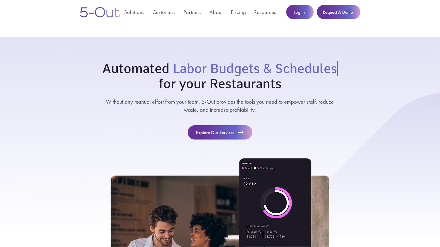
| Trust read | |
|---|---|
| Shire Intelligence | No visible trust signal identified. |
| Revenue forecast UI card showing "Actual $2,812" vs "Forecast $4,331 | Range $3,723 - 4,920" |
Information hierarchy
72FairDoes the design help or inhibit what the page is trying to say?
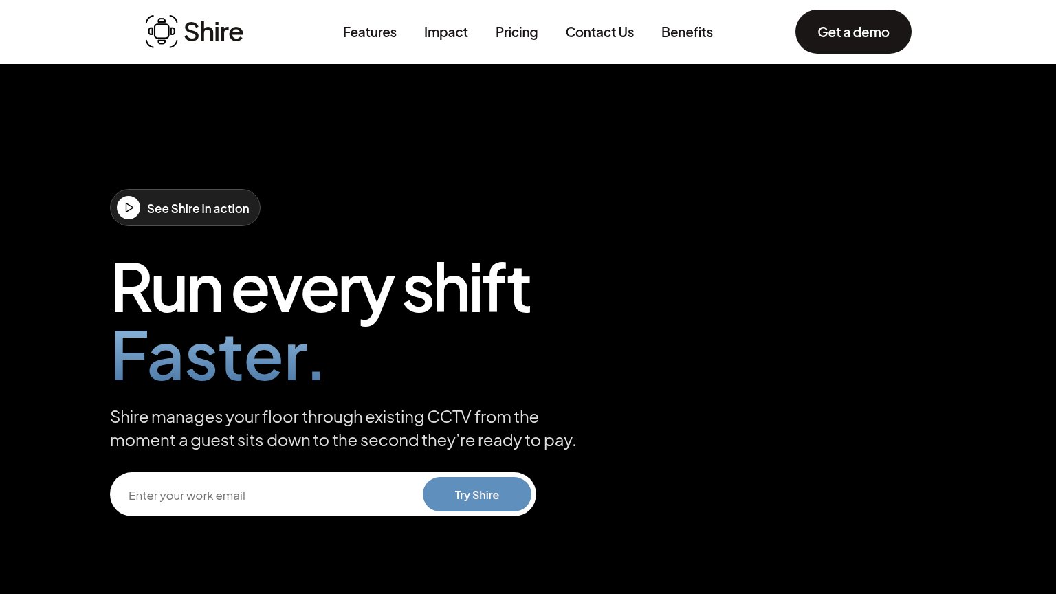 1234
- Try Shire button — Muted blue-on-white styling makes the primary conversion the weakest-contrast button in the fold.
- Get a demo pill — Highest-contrast button on the page competes directly with the hero email capture for the primary action.
- Five-link nav row — Features, Impact, Pricing, Contact Us, Benefits give five equal-weight exits before the CTA.
- See Shire in action — Dark pill sits first in the scan path, pulling clicks to video before the headline or CTA registers.
CTA
72FairCopy, size, verb, cost-feel — does the primary CTA earn the click?
Problems
- low contrast on dark hero
- nav 'Get a demo' competes visually
- email gate contradicts 'Try'
Value props
72FairTitle, subtitle, hero — do they sell the product's true value?
Shire Intelligence’s headline sells
Run every shift Faster.
Shire manages your floor through existing CCTV from the moment a guest sits down to the second they're ready to pay.
Working
- Outcome-led headline for operators
- "Existing CCTV" defuses hardware objection
- Sit-down-to-pay scope is concrete
Could improve
- No numbers quantify "Faster"
- Empty hero shows no product
- No proof points in the fold
Mobile web
84StrongThe phone experience as a first-class citizen.
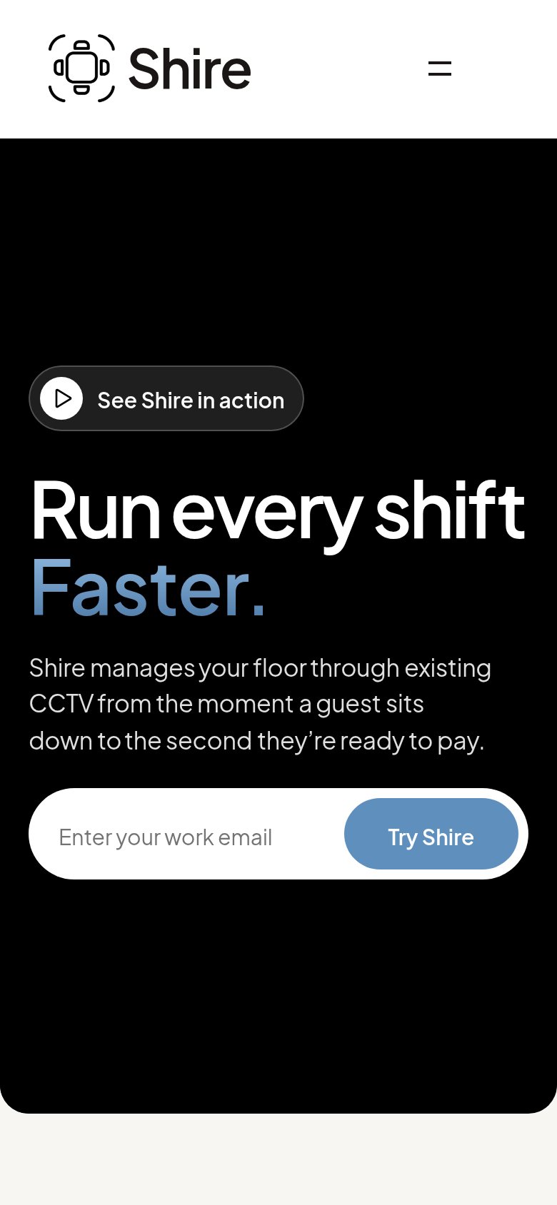 12
- Try Shire button — Occupies only the right third of the bar — undersized tap target versus a full-width stacked button.
- See Shire pill — Sits above the headline, so a competing tap target is the first interactive element visitors meet.
Competitors
inferred from product, audience, and value prop#1Shire Intelligence66
#2