
Your landing page’s weakest score is Trust.
How Nodus Compute ranks
- 1.
Baseten77
- 2.
Modal76
- 3.
Nodus Compute73
- 4.
Together AI73
- 5.
Anyscale72
- 6.
Runpod68
73Growth scoreupdated
category scores
category scoresShowHide
Score over time
Trust
58FairProof that the product is real, competent, and safe to try.
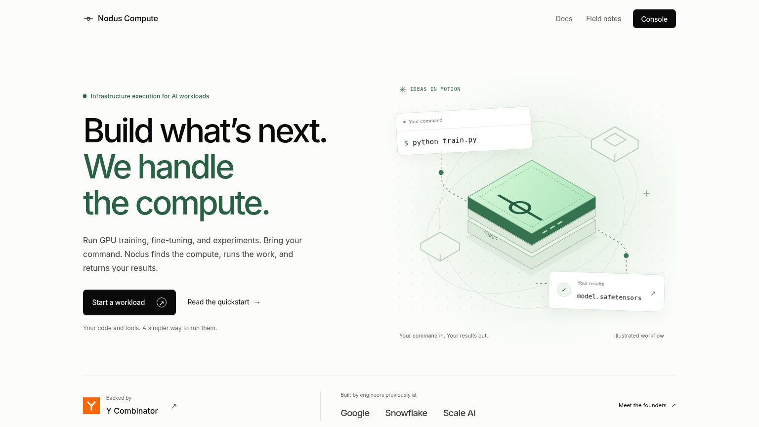
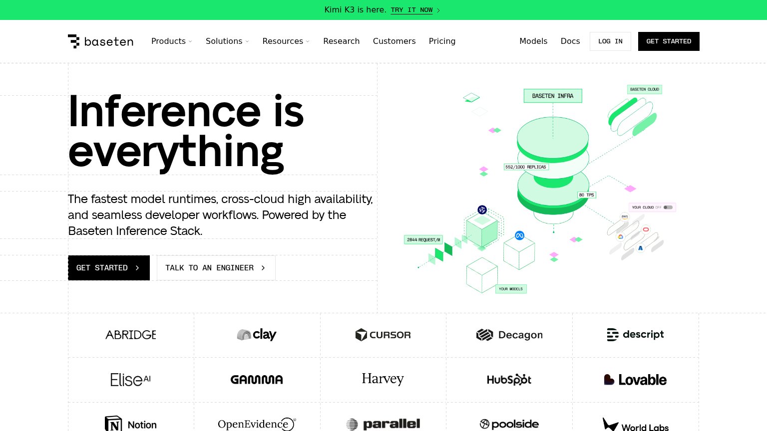
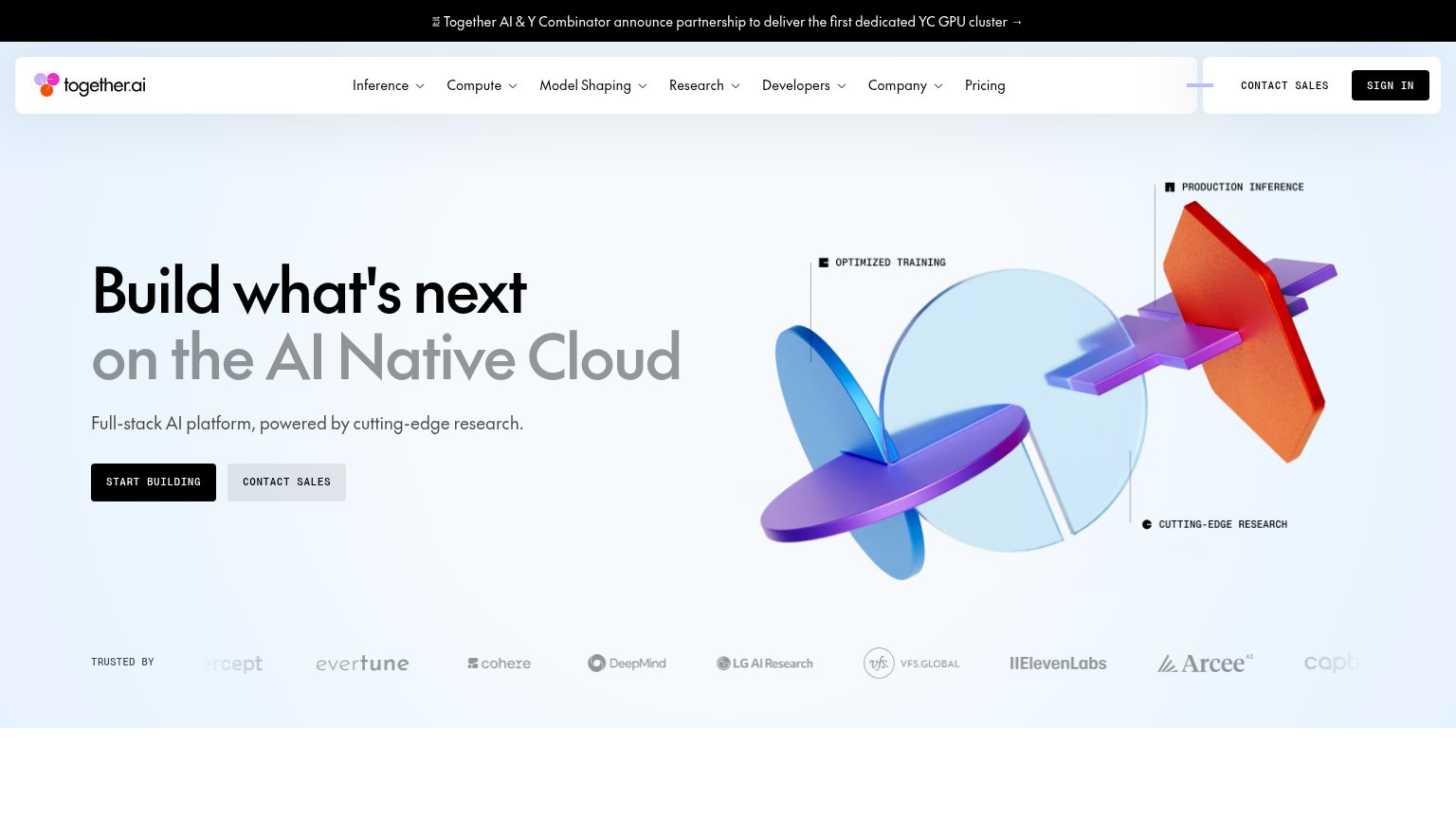
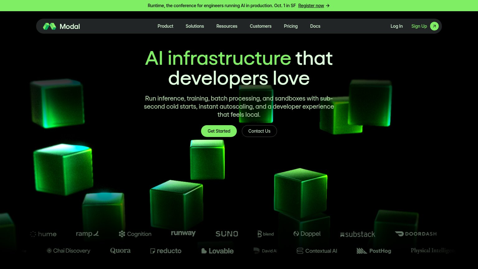
| Trust read | |
|---|---|
| Nodus Compute | "Backed by Y Combinator" badge with "Built by engineers previously at Google, Snowflake, Scale AI" |
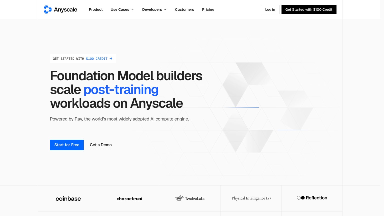
| Customer logo strip featuring Ramp, Quora, DoorDash, Suno, Cognition, Runway, Substack, PostHog | |
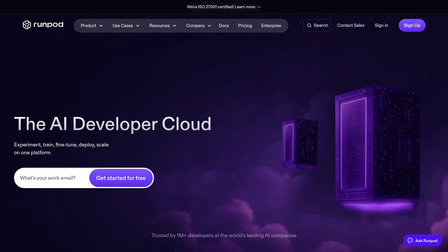
| "Trusted by 1M+ developers at the world's leading AI companies" | |
| Customer logo wall featuring Cursor, Notion, HubSpot, Harvey, Descript, and Lovable | |
| "TRUSTED BY" logo strip with Cohere, DeepMind, LG AI Research, VFS.Global, ElevenLabs | |
| Customer logo bar: coinbase, character.ai, TwelveLabs, Physical Intelligence (π), Reflection |
Value props
72FairTitle, subtitle, hero — do they sell the product's true value?
Nodus Compute’s headline sells
Build what's next. We handle the compute.
Run GPU training, fine-tuning, and experiments. Bring your command. Nodus finds the compute, runs the work, and returns your results.
Working
- Headline names the real trade: Nodus Compute build, it runs
- Subhead states a clear input→output workflow
- Hero shows train.py in, model.safetensors out
Could improve
- Zero numbers: no GPUs, speed, or price
- No emotional hook for infra pain
- Kicker "Infrastructure execution" is jargon
Mobile web
72FairThe phone experience as a first-class citizen.
 123
- Uncollapsed nav link row — Desktop links stack as a second header deck instead of collapsing to a hamburger, eating fold height.
- Console button — Dark pill styled identically to the primary CTA, splitting attention before 'Start a workload' appears.
- Start a workload button — Stops well short of the right edge; a full-bleed width would make the thumb target unmissable.
CTA
78FairCopy, size, verb, cost-feel — does the primary CTA earn the click?
Problems
- 'workload' feels heavy, jargony
- no free/$0 signal in fold
- 'Console' button competes in nav
Information hierarchy
84StrongDoes the design help or inhibit what the page is trying to say?
123- Console nav button — Styled in the same black pill weight as "Start a workload," splitting the eye between two equal CTAs.
- Founders and YC strip — "Meet the founders" and the Y Combinator link creep into the fold, adding two exits before the primary action.
- Read the quickstart link — Sits on the same baseline as the primary CTA, offering an immediate detour to docs at the decision point.