
Your landing page’s weakest score is Trust.
How Lantern AI ranks
- 1.
Juicebox (PeopleGPT)77
- 2.
Paraform77
- 3.
Dover69
- 4.
Lantern AI68
- 5.
Mercor54
68Growth scoreupdated
category scores
category scoresShowHide
Score over time
Trust
48PoorProof that the product is real, competent, and safe to try.

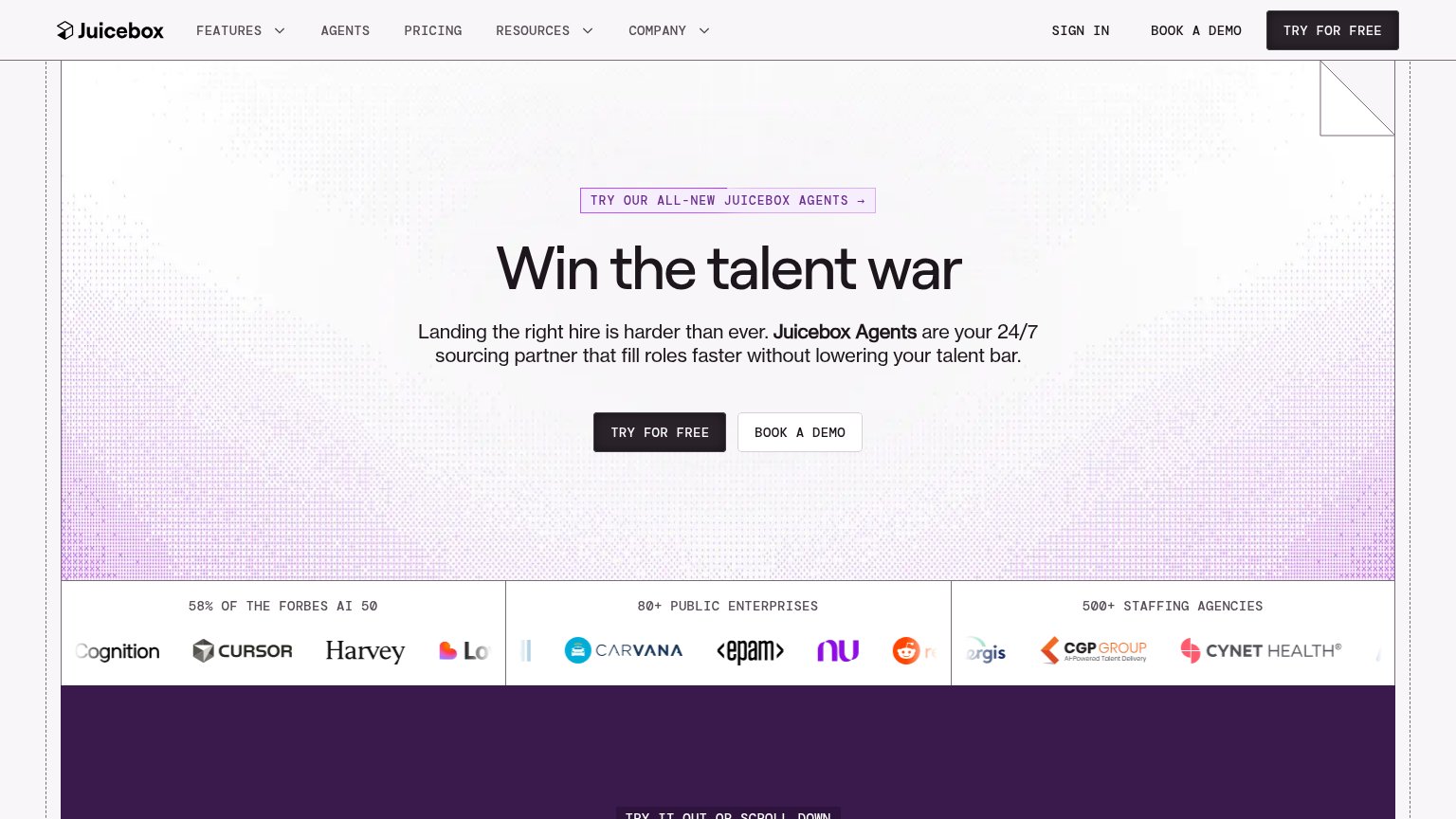
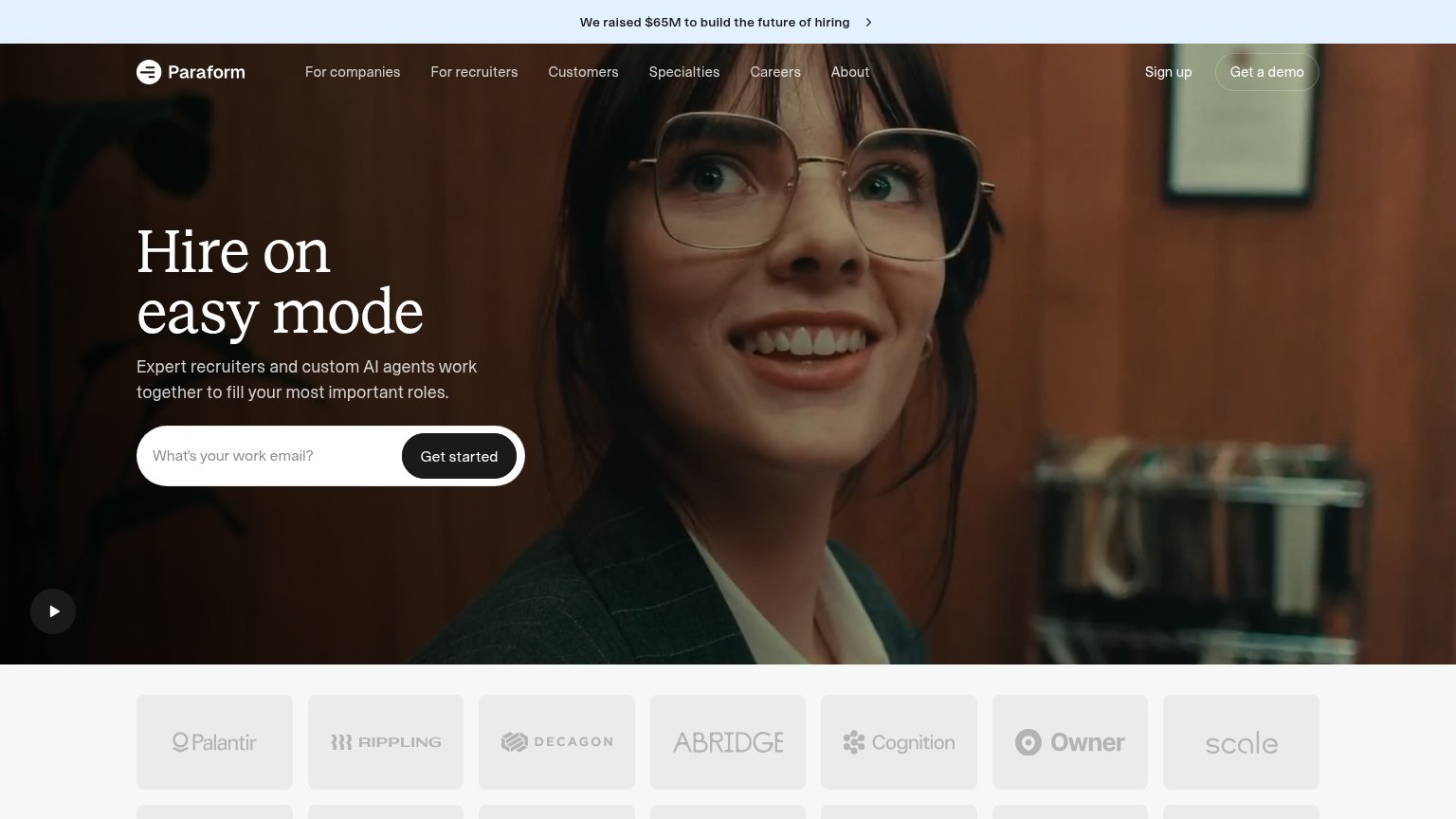
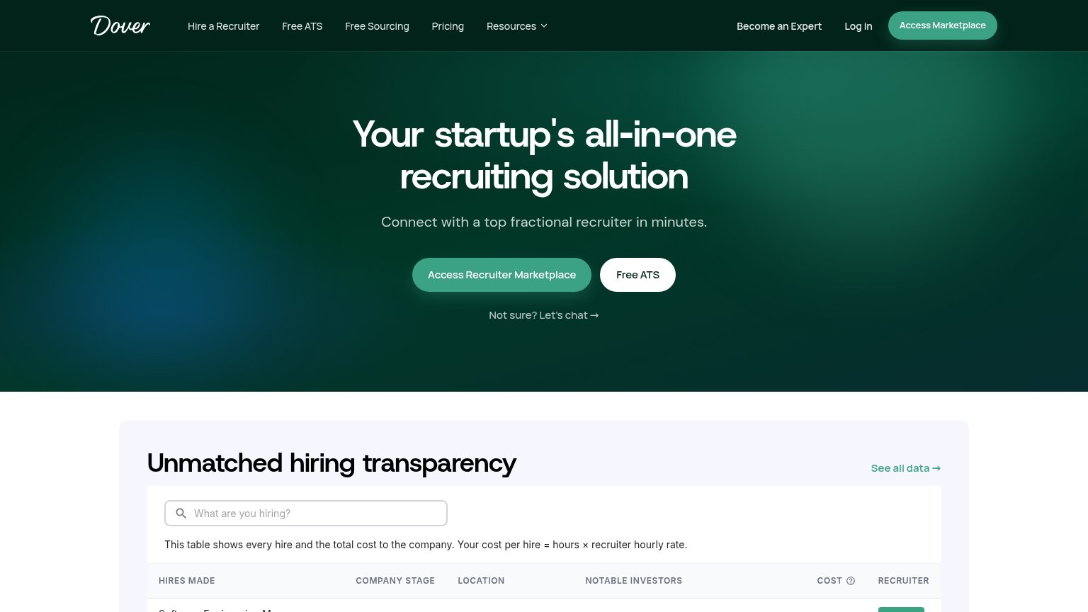
| Trust read | |
|---|---|
| Lantern AI | BACKED BY Y COMBINATOR · F26 badge |
| implicit context Mercor may benefit from pre-existing familiarity among its target audience. | |
| "58% OF THE FORBES AI 50" logo band with Cursor, Harvey, Notion, Carvana, EPAM logos | |
| "Unmatched hiring transparency" table stating "This table shows every hire and the total cost to the company" | |
| Customer logo wall featuring Palantir, Rippling, Decagon, Abridge, Cognition, Owner, and Scale |
CTA
68FairCopy, size, verb, cost-feel — does the primary CTA earn the click?
Problems
- demo booking feels costly
- input funnels to calendar, not product
- no zero-commitment path visible
Information hierarchy
74FairDoes the design help or inhibit what the page is trying to say?
1234- Duplicate Book a Demo — Two 'Book a Demo' CTAs in the fold — the orange nav button and the cream form button compete at different weights, splitting the scan path.
- Eight-item nav row — JUDGMENT through FAQ adds eight same-weight exit links directly above the hero, each one a leak before the primary action.
- Human/LLM toggle — A novel 'READ AS Human/LLM' control sits at the same visual weight as the primary CTA and demands processing before its purpose is clear.
- Form CTA mismatch — The input asks 'Who do Lantern AI need?' but the button says 'Book a Demo' — the action doesn't match the prompt, muddying what submitting does.
Value props
76FairTitle, subtitle, hero — do they sell the product's true value?
Lantern AI’s headline sells
Turn your taste into hires.
Lantern learns what exceptional looks like at your company in fifteen minutes, tests it against the market, then finds, interviews, and schedules people worth meeting.
Working
- 'Taste into hires' flatters user judgment
- Subhead names full pipeline: find to schedule
- 'Fifteen minutes' sets concrete effort bar
Could improve
- Hero image decorates, demonstrates nothing
- Headline vague without the subhead
- No proof numbers beyond YC badge
Mobile web
76FairThe phone experience as a first-class citizen.
 123
- Human / LLM toggle — Cryptic desktop control eats header space on mobile and confuses visitors instead of collapsing into a menu.
- Header Book a Demo — Duplicates the form's Book a Demo button in the same viewport, splitting the tap between two identical CTAs.
- Placeholder demo input — The 'Who do Lantern AI need?' field reads as a required step before the button, adding friction to a demo tap it doesn't need.