
Your landing page’s weakest score is Trust.
How Faraday ranks
63Growth scoreupdated
category scores
category scoresShowHide
Score over time
Trust
48PoorProof that the product is real, competent, and safe to try.
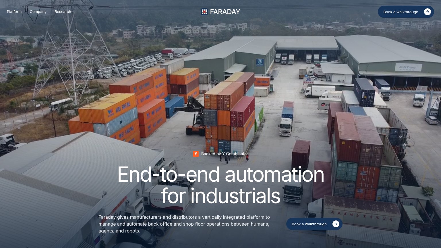
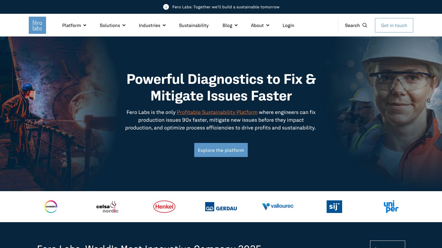

| Trust read | |
|---|---|
| Faraday | "Backed by Y Combinator" badge above the hero headline |
| Customer logo bar: Covestro, Celsa Nordic, Henkel, Gerdau, Vallourec, SIJ, Uniper | |
| "500+ manufacturers on AI, downtime, and what's getting in the way" report banner | |
| "PRODUCTION EVENTS 45,362,241,991" live usage stats strip | |
| Detailed real product screenshot of the AI Hivemind workflow dashboard | |
| No visible trust signal identified. |
Value props
58FairTitle, subtitle, hero — do they sell the product's true value?
Faraday’s headline vague
End-to-end automation for industrials
Faraday gives manufacturers and distributors a vertically integrated platform to manage and automate back office and shop floor operations between humans, agents, and robots.
Working
- Subhead names audience and scope clearly
- "Humans, agents, and robots" is distinctive
- YC badge adds early credibility
Could improve
- Headline is a category, not an outcome
- No numbers or proof points in the fold
- Hero video decorates; product never shown
Mobile web
62FairThe phone experience as a first-class citizen.
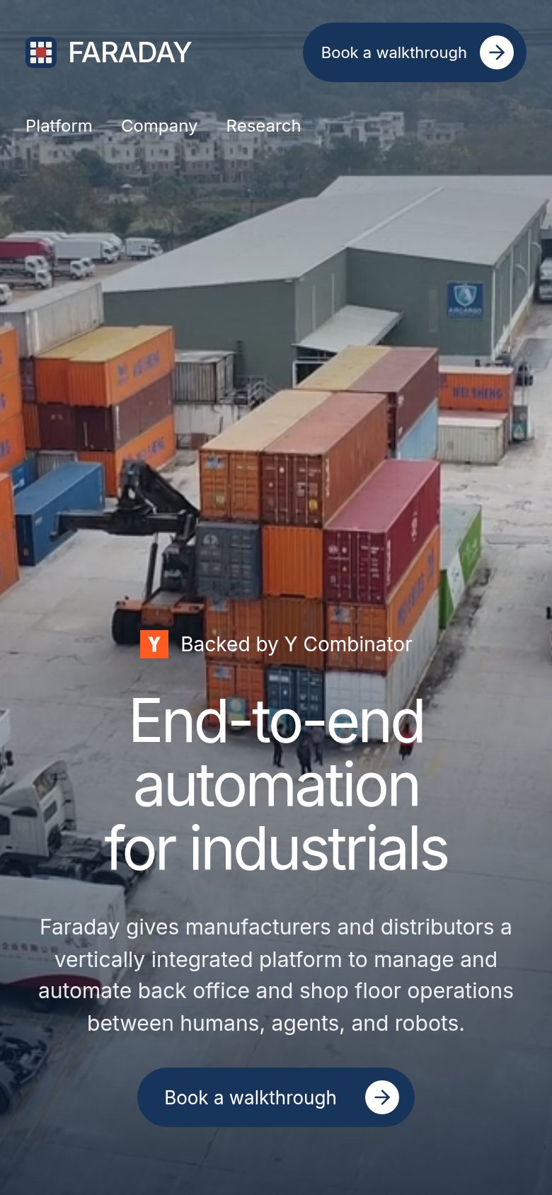 1234
- Uncollapsed nav link row — Desktop links "Platform / Company / Research" sit in a second header row instead of a hamburger, eating hero space.
- Bottom-edge primary CTA — The "Book a walkthrough" button sits at the capture's bottom edge and will drop below the fold on shorter screens.
- Three-line hero headline — Headline scales down too little and wraps into three tall lines, pushing the subhead and CTA down.
- Duplicate header CTA — A second "Book a walkthrough" pill in the header adds bulk that crowds the double-decker top bar.
CTA
68FairCopy, size, verb, cost-feel — does the primary CTA earn the click?
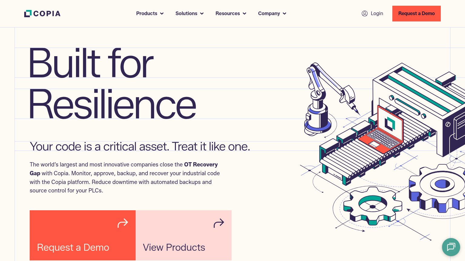
Problems
- click feels costly — books a meeting
- no lighter secondary path
- no value promised in the label
Information hierarchy
78FairDoes the design help or inhibit what the page is trying to say?
123- Duplicate walkthrough CTA — Two identically styled 'Book a walkthrough' buttons in one fold split attention instead of reinforcing a single action point.
- Bottom-left CTA placement — The lower 'Book a walkthrough' sits right of the subheadline, off the centered scan axis set by the headline.
- Subheadline over busy imagery — Small light-grey paragraph text sits directly on detailed container imagery with no scrim, reducing legibility of the value prop detail.