
Your landing page’s weakest score is Trust.
How Deploy ranks
66Growth scoreupdated
category scores
category scoresShowHide
Score over time
Trust
32PoorProof that the product is real, competent, and safe to try.
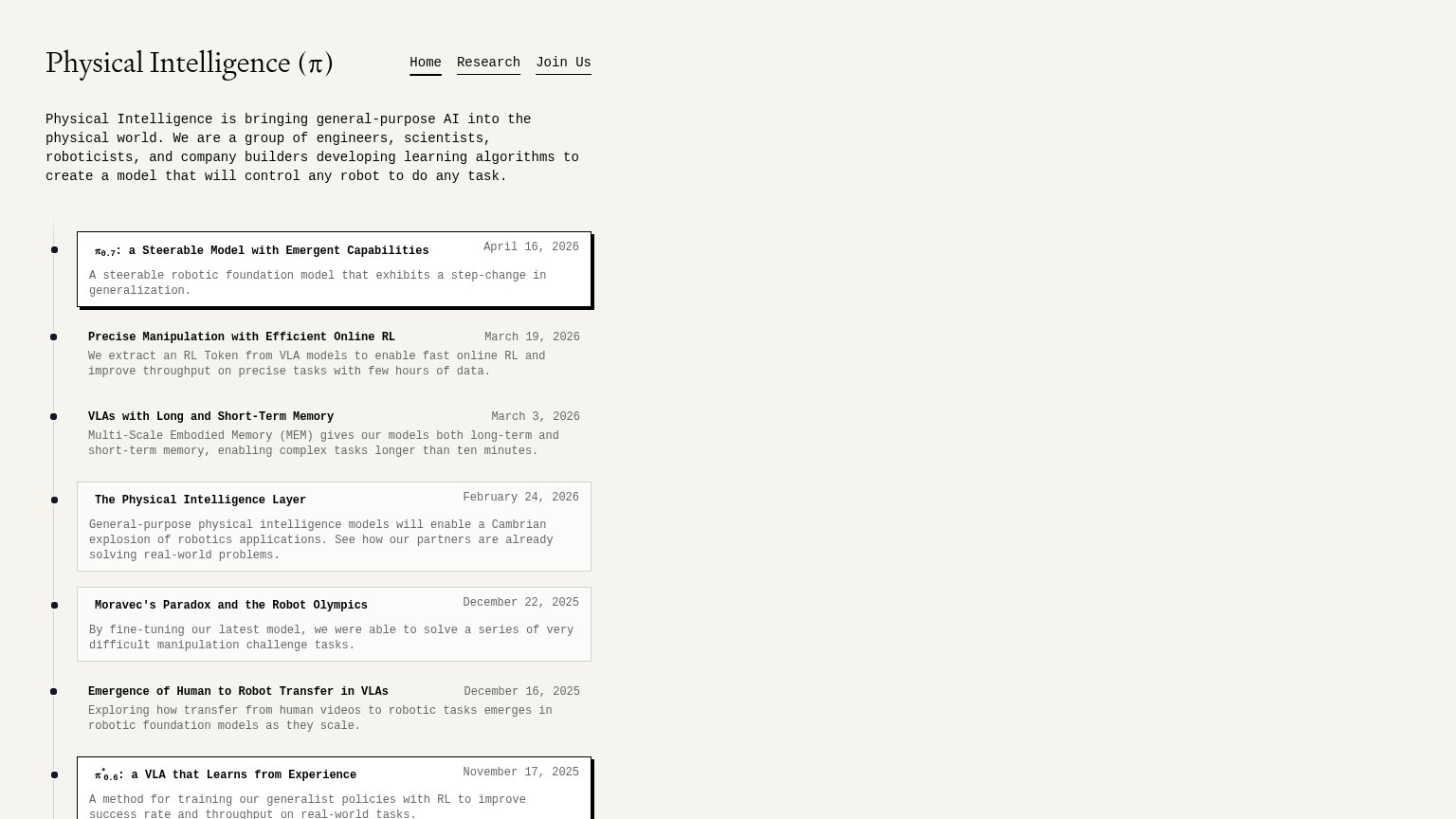
| Trust read | |
|---|---|
| Deploy | No visible trust signal identified. |
| Dated research timeline, e.g. "π0.7: a Steerable Model with Emergent Capabilities — April 16, 2026" | |
| No visible trust signal identified. | |
| No visible trust signal identified. | |
| No visible trust signal identified. |
CTA
68FairCopy, size, verb, cost-feel — does the primary CTA earn the click?
Problems
- no action verb delivering value
- click implies a sales call
- no payoff or outcome named
Mobile web
72FairThe phone experience as a first-class citizen.
 12
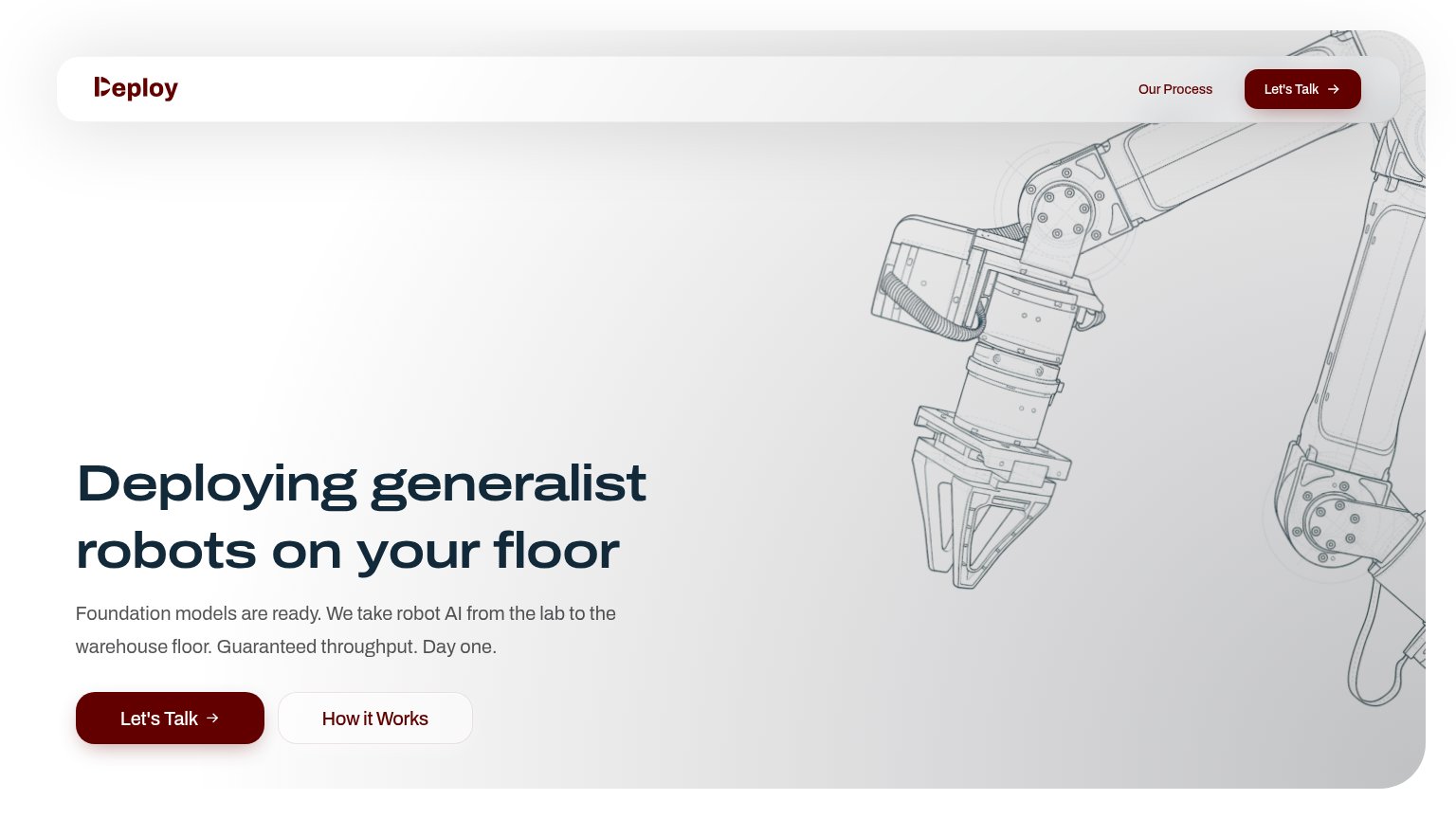
- Oversized hero illustration — The robot-arm graphic fills most of the first viewport, pushing the headline and primary CTA below the fold.
- Duplicate Let's Talk pill — The header repeats the same CTA as the hero button below, adding redundancy instead of a distinct action.
Value props
74FairTitle, subtitle, hero — do they sell the product's true value?
Deploy’s headline sells
Deploying generalist robots on your floor
Foundation models are ready. We take robot AI from the lab to the warehouse floor. Guaranteed throughput. Day one.
Working
- 'On Deploy's floor' grounds it in the buyer's world
- 'Guaranteed throughput. Day one.' hits ops anxiety
- Names segment: lab-to-warehouse deployment
Could improve
- No numbers backing 'guaranteed throughput'
- Blueprint art decorates, doesn't demonstrate
- No proof points or customers in the fold
Information hierarchy
86StrongDoes the design help or inhibit what the page is trying to say?
12- How it Works button — Same size and shape as the primary CTA beside it, splitting first-click attention.
- Nav Let's Talk button — Duplicates the hero CTA at equal visual weight, giving two competing versions of one action.