
Your landing page’s weakest score is Trust.
How Wardstone ranks
57Growth scoreupdated
category scores
category scoresShowHide
Score over time
Trust
38PoorProof that the product is real, competent, and safe to try.
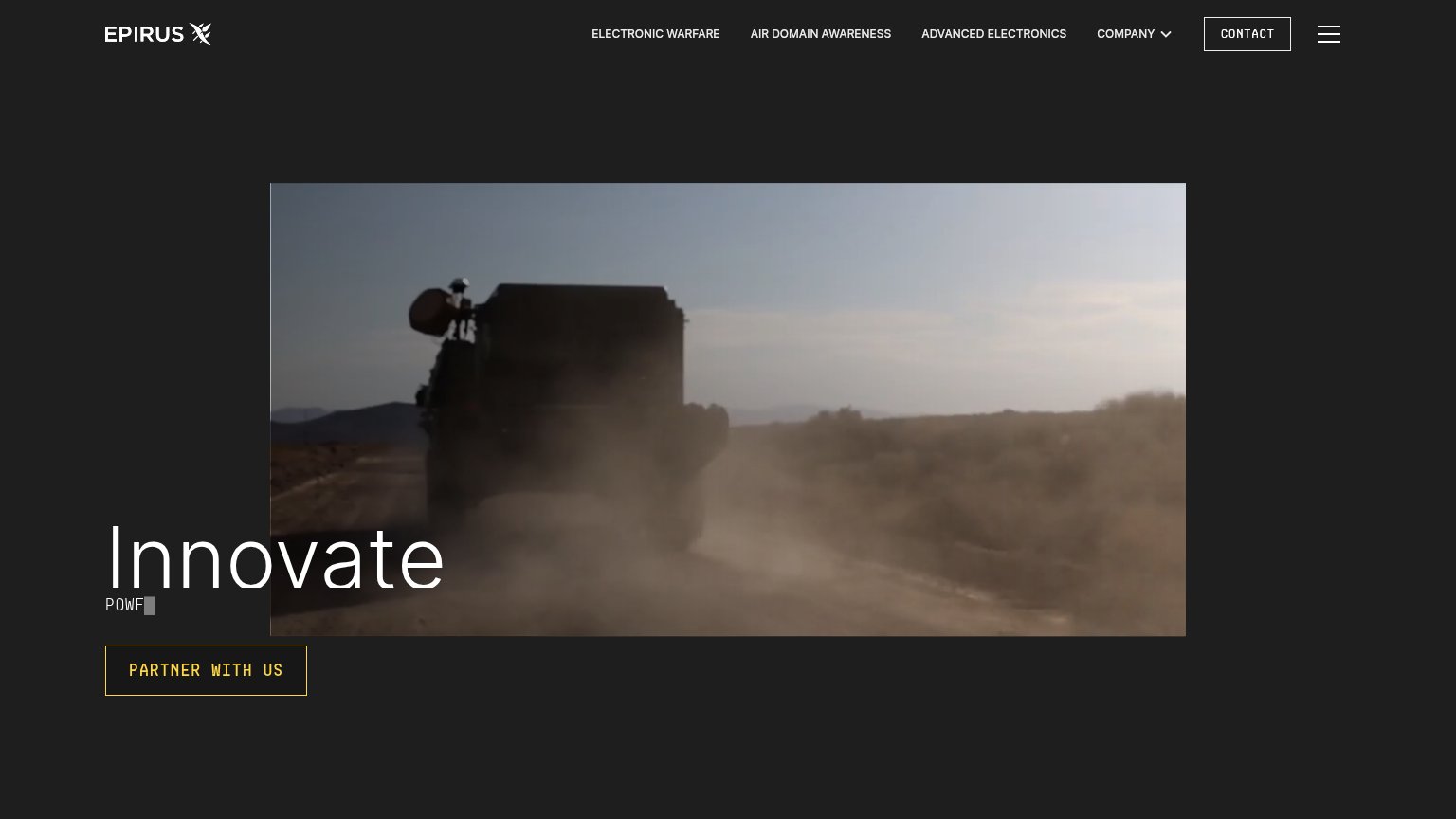
| Trust read | |
|---|---|
| Wardstone | No visible trust signal identified. |
| implicit context Anduril Industries may benefit from pre-existing familiarity among its target audience. | |
| Hero field footage of a military vehicle carrying mounted hardware on a desert road | |
| No visible trust signal identified. | |
| No visible trust signal identified. |
Value props
42PoorTitle, subtitle, hero — do they sell the product's true value?
Wardstone’s headline vague
THE MODULAR INTERCEPTOR PLATFORM
Working
- Names a clear product category
- Confident, single-message fold
- Defense-appropriate tone
Could improve
- No subhead adds specifics
- No outcome, threat, or numbers
- Hero image decorates, not demos
Information hierarchy
64FairDoes the design help or inhibit what the page is trying to say?
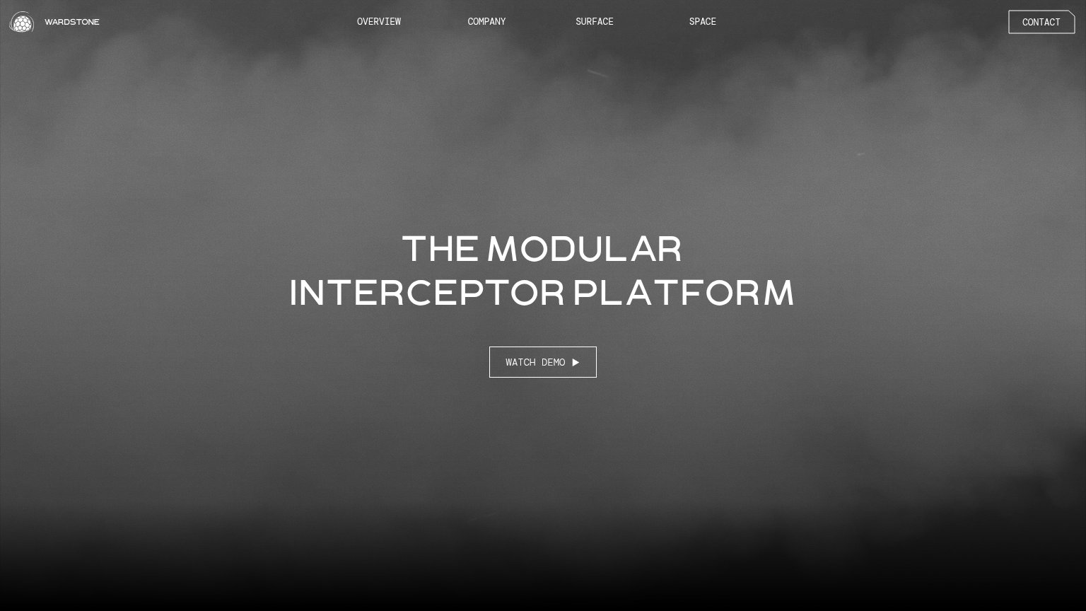 123
- Watch Demo CTA — Ghost outline button in low contrast against the gray fog blends into the background instead of commanding the fold.
- Headline block — "THE MODULAR INTERCEPTOR PLATFORM" carries no supporting subtitle, leaving the hierarchy a single tier with nothing to explain what Wardstone does.
- Contact button — Boxed styling matches the primary CTA weight, splitting attention between two same-weight boxed actions in the fold.
CTA
68FairCopy, size, verb, cost-feel — does the primary CTA earn the click?
Problems
- ghost style blends into hero
- same styling as nav CONTACT
- no payoff hint beyond 'demo'
- small footprint vs headline
Mobile web
72FairThe phone experience as a first-class citizen.
 1
- WATCH DEMO button — Thin outlined ghost button at half column width; low contrast against the gray backdrop makes the sole CTA easy to miss.