
Your landing page’s weakest score is Trust.
How Soren ranks
61Growth scoreupdated
category scores
category scoresShowHide
Score over time
Trust
38PoorProof that the product is real, competent, and safe to try.
| Trust read | |
|---|---|
| Soren | No visible trust signal identified. |
| No visible trust signal identified. | |
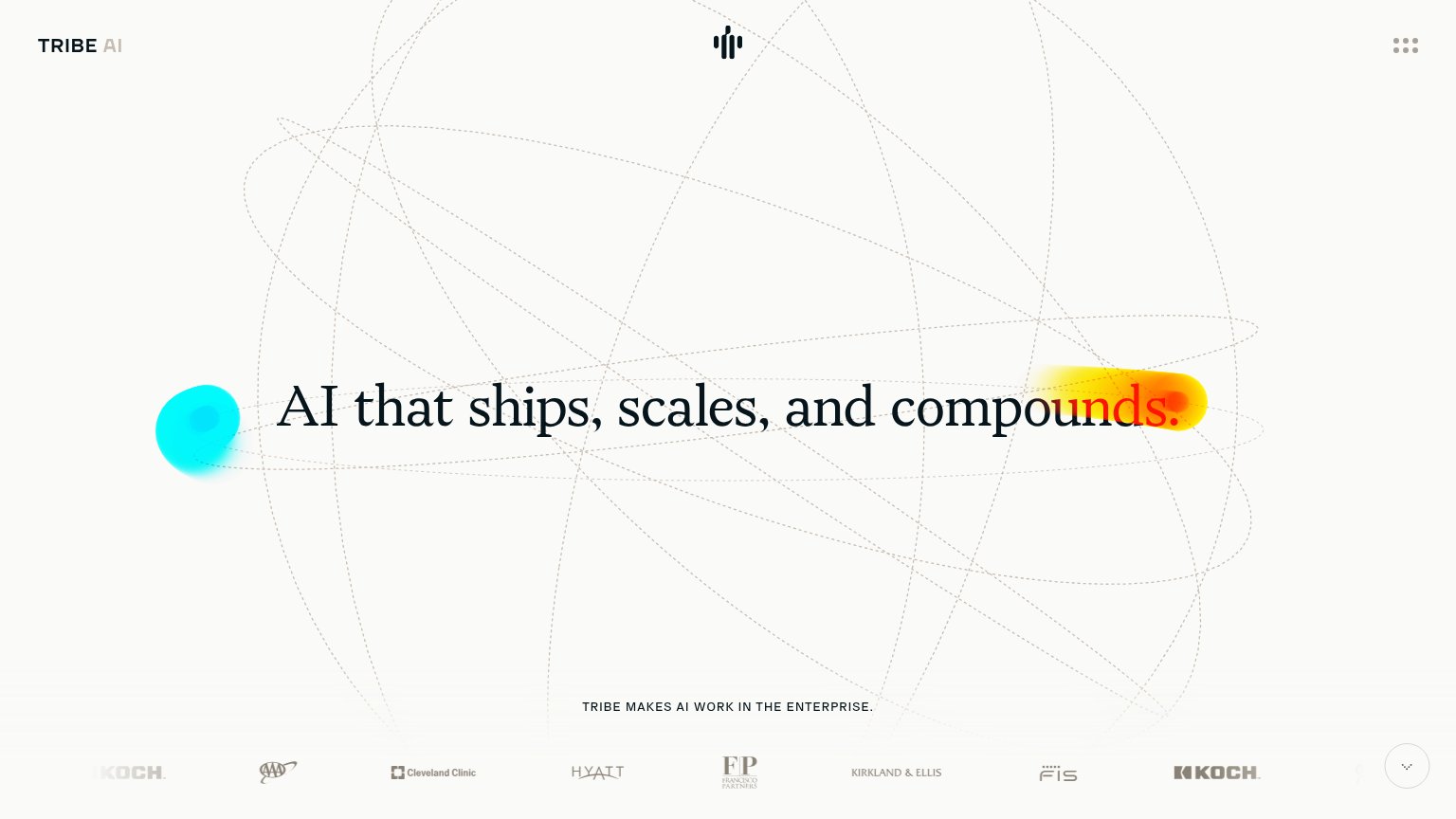
| Client logo strip featuring AAA, Cleveland Clinic, Hyatt, Kirkland & Ellis, Francisco Partners, FIS, and Koch | |
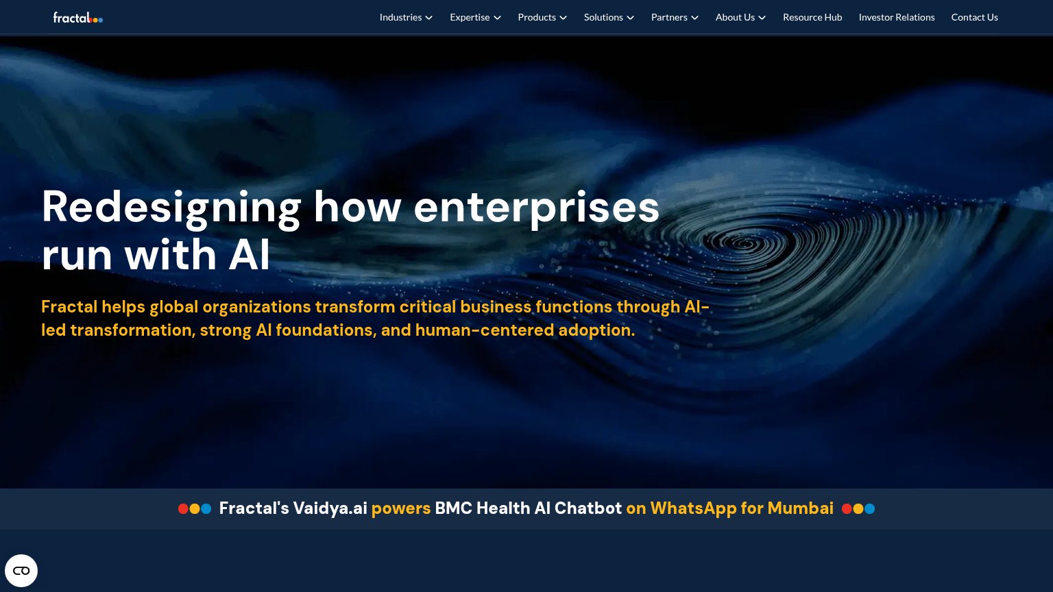
| Fractal's Vaidya.ai powers BMC Health AI Chatbot on WhatsApp for Mumbai | |
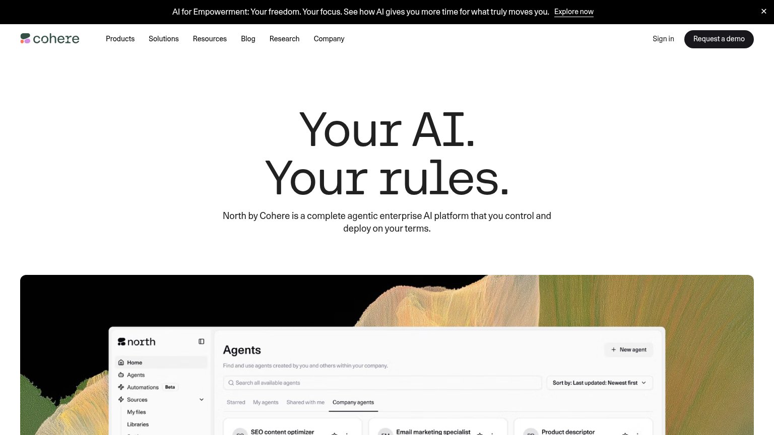
| North Agents dashboard UI with named agents ("SEO content optimizer", "Email marketing specialist") and version tags |
Value props
48PoorTitle, subtitle, hero — do they sell the product's true value?
Soren’s headline vague
A custom AI operating system for your business
Soren is building the AI operating systems that will power the next generation of traditional businesses, transforming how work gets done and how operations run.
Working
- 'Custom' signals bespoke, not off-the-shelf
- 'Traditional businesses' hints at the audience
- Calm, premium tone matches high-touch positioning
Could improve
- No concrete task, outcome, or number
- Subhead restates headline in vision-speak
- Hero image shows a lobby, not the product
CTA
70FairCopy, size, verb, cost-feel — does the primary CTA earn the click?

Problems
- booking feels costly — calendar ahead
- nav says 'Book a demo', hero differs
- no product access before a meeting
Information hierarchy
72FairDoes the design help or inhibit what the page is trying to say?
123- Book a demo pill — White high-contrast nav button duplicates the demo ask and outshines 'Book a walkthrough' below it, splitting the primary action.
- Headline bottom-left corner — The core promise sits at the very bottom edge of the fold, last in the scan path instead of anchoring it.
- See what's inside button — Ghost secondary CTA sits directly beside the primary at near-equal size, adding a competing choice at the decision point.
Mobile web
76FairThe phone experience as a first-class citizen.
 123
- Book a walkthrough button — Primary CTA sits at the fold's bottom edge and is only text-width, not full-bleed.
- See what's inside button — Secondary CTA is clipped by the viewport edge, looking broken and competing with the primary.
- Supporting paragraph — Four lines of body copy push both CTAs to the very bottom of the first viewport.