
Your landing page’s weakest score is Trust.
How Patent Watch ranks
64Growth scoreupdated
category scores
category scoresShowHide
Score over time
Trust
52FairProof that the product is real, competent, and safe to try.
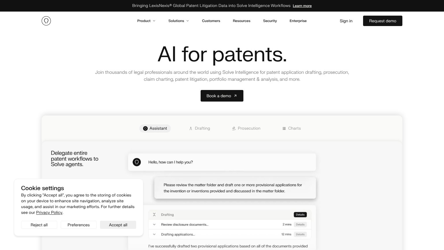
| Trust read | |
|---|---|
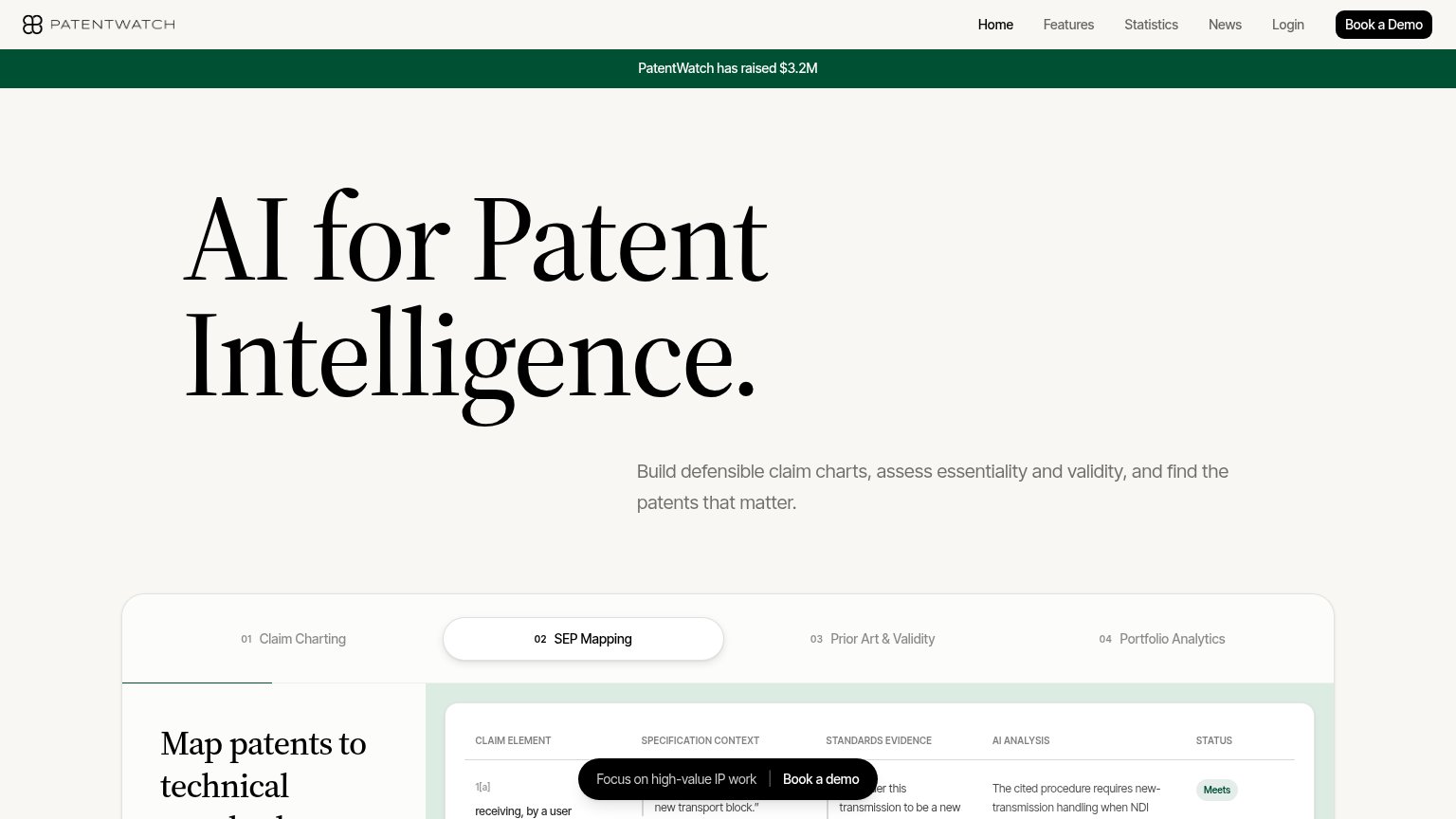
| Patent Watch | SEP Mapping claim-chart product UI with "Claim Element", "Standards Evidence", "AI Analysis" columns and "Meets" status |
| No visible trust signal identified. | |
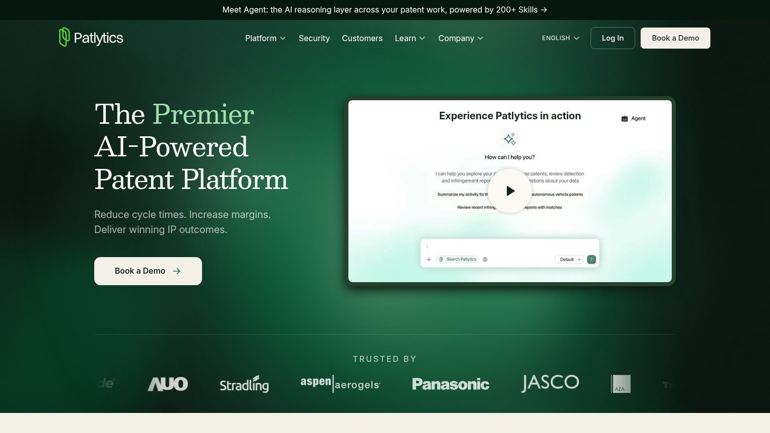
| "TRUSTED BY" logo strip with Panasonic, JASCO, Aspen Aerogels, AUO, Stradling | |
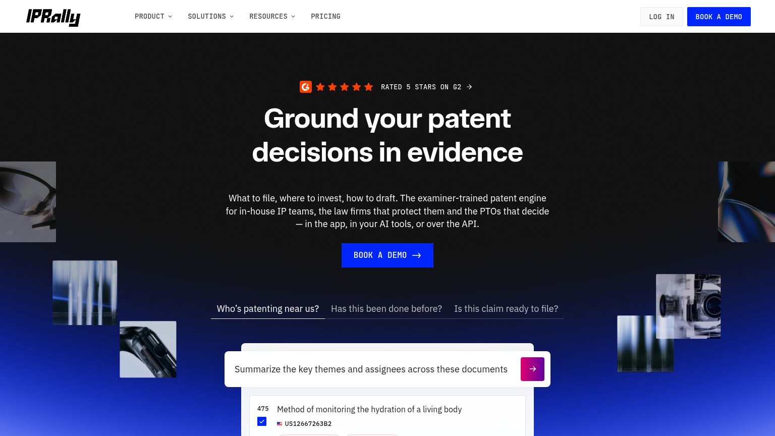
| "RATED 5 STARS ON G2" badge with five stars above the headline | |
| Announcement bar: "Bringing LexisNexis® Global Patent Litigation Data into Solve Intelligence Workflows" | |
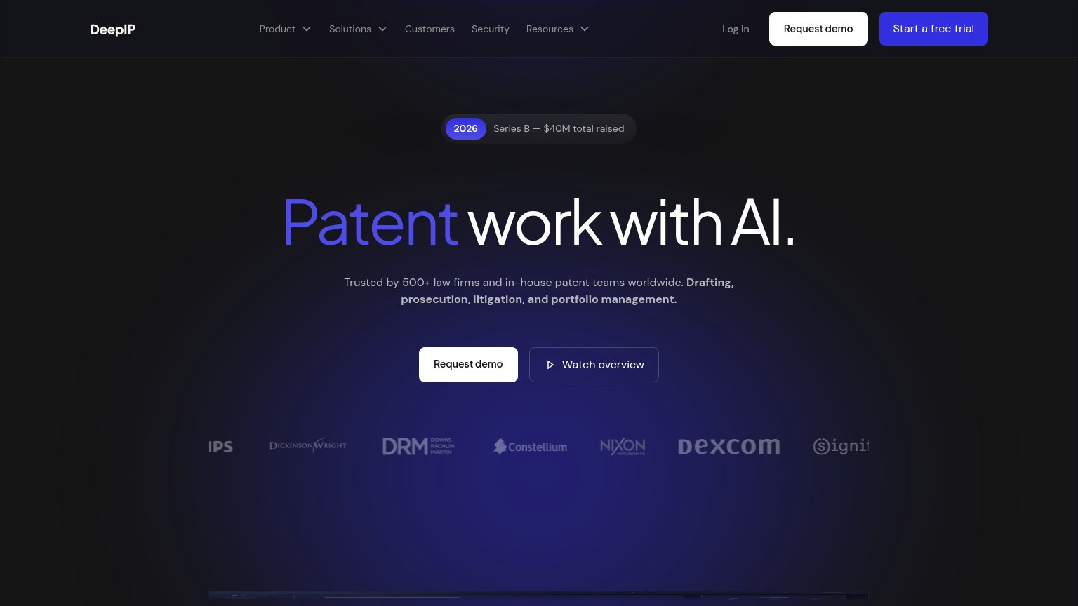
| "Trusted by 500+ law firms and in-house patent teams worldwide" with a customer logo strip (Dexcom, Constellium, Dickins |
CTA
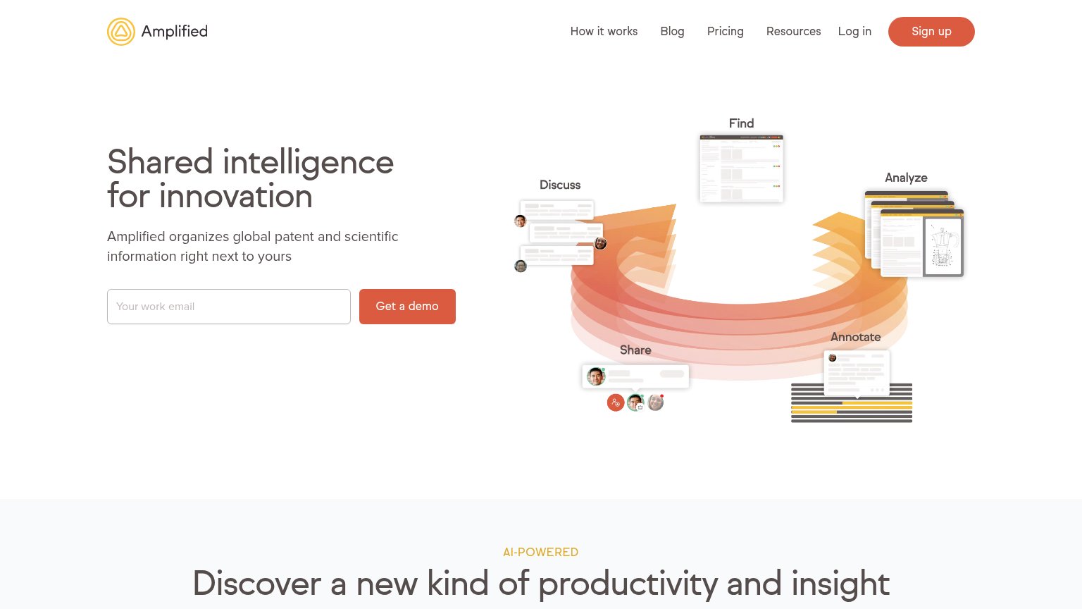
62FairCopy, size, verb, cost-feel — does the primary CTA earn the click?
Problems
- demo booking feels costly
- no CTA in the hero itself
- casing drift: Demo vs demo
- small nav-sized button on desktop
Mobile web
64FairThe phone experience as a first-class citizen.
 123
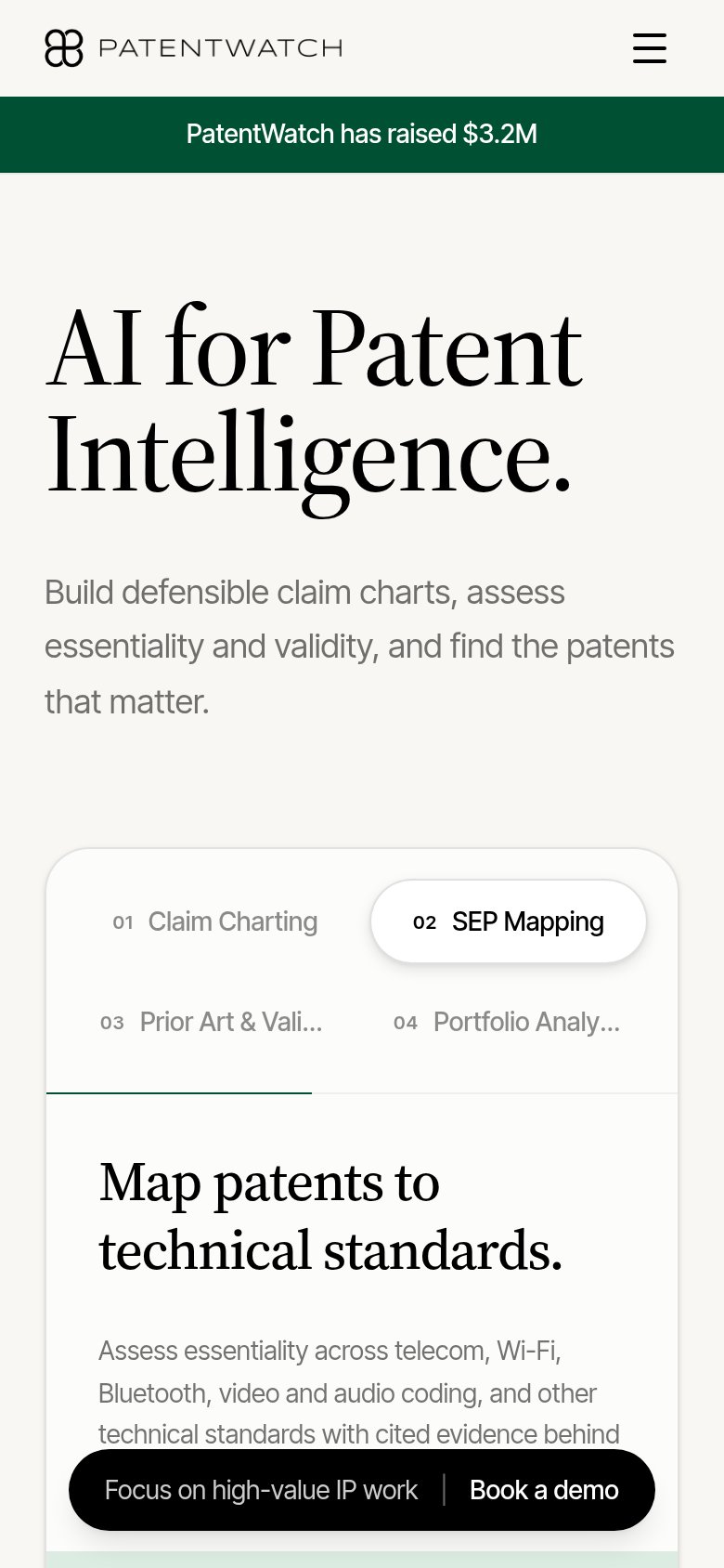
- Sticky pill CTA — "Book a demo" shares the pill with a slogan, halving the tap target and covering the feature copy beneath.
- Fundraise announcement banner — "PatentWatch has raised $3.2M" spends prime fold space on investor news with no visitor benefit or link.
- Truncated feature tabs — "Prior Art & Vali..." and "Portfolio Analy..." clip mid-word, making the tab labels unreadable on the phone column.
Value props
68FairTitle, subtitle, hero — do they sell the product's true value?
Patent Watch’s headline undersells
AI for Patent Intelligence.
Build defensible claim charts, assess essentiality and validity, and find the patents that matter.
Working
- Subhead names real practitioner jobs
- Product demo shows a live claim chart
- "Defensible" signals rigor to IP buyers
Could improve
- H1 is a category label, not a claim
- Zero numbers or proof points in fold
- No emotional payoff (time saved, risk)
Information hierarchy
72FairDoes the design help or inhibit what the page is trying to say?
1234- Funding announcement banner — Full-width green banner outranks the headline in the scan path and communicates nothing about what the product does for the visitor.
- Floating pill CTA — "Book a demo" pill duplicates the header CTA and sits on top of the claim-chart demo table, obscuring the very evidence meant to persuade.
- Header nav links — Six links (Home, Features, Statistics, News, Login) all lead away from the demo booking and outnumber the single conversion path.
- Subheadline placement — Value-prop sentence sits far right and detached from the headline, breaking the left-anchored reading flow of the fold.