
Your landing page’s weakest score is CTA.
How Nori ranks
- 1.
Nori79
- 2.
Bearable... wait38
79Growth scoreupdated
category scores
category scoresShowHide
CTA
72FairCopy, size, verb, cost-feel — does the primary CTA earn the click?
Problems
- waitlist feel vs live-app proof
- nav 'Sign up' competes with hero CTA
- no payoff named in label
Information hierarchy
78FairDoes the design help or inhibit what the page is trying to say?
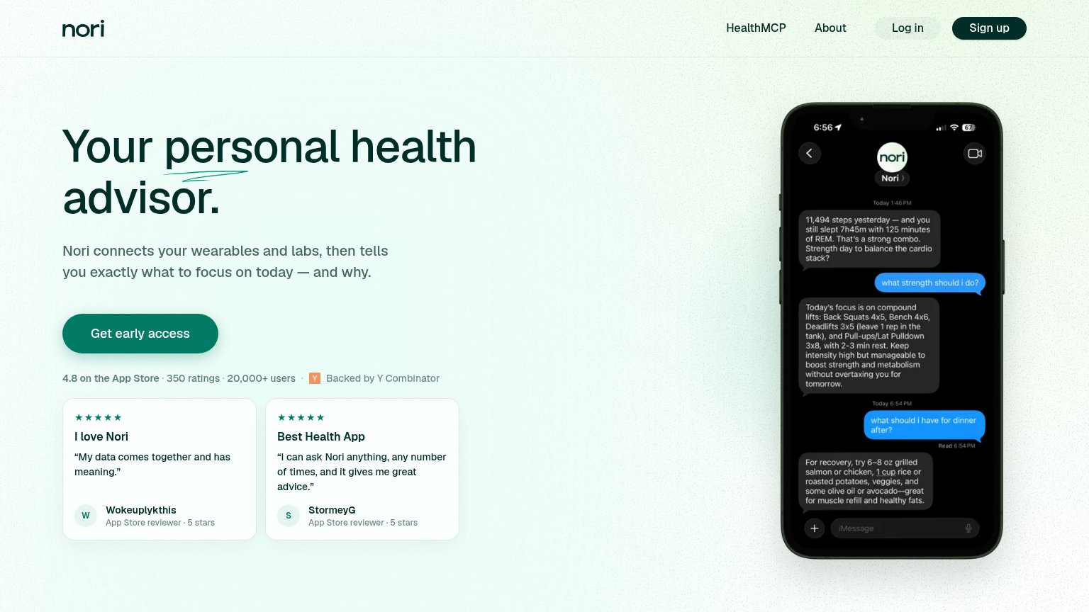
123- Log in / Sign up pair — Two pill buttons at similar weight in the nav compete with 'Get early access' and pull sign-ups toward a different flow.
- Sign up nav button — Dark filled pill matches the primary CTA's visual weight, splitting the fold between two conversion paths with different labels.
- Phone chat mockup — Dense small-type iMessage transcript asks visitors to read four paragraphs of copy; the outcome doesn't land at a glance.
Value props
78FairTitle, subtitle, hero — do they sell the product's true value?
Nori’s headline sells
Your personal health advisor.
Nori connects your wearables and labs, then tells you exactly what to focus on today — and why.
Working
- Subhead names inputs and daily outcome
- Phone demo shows real data-driven advice
- Strong proof: 4.8 stars, 20,000+ users, YC
Could improve
- Headline is a generic category label
- No emotional hook for data overwhelm
- "advisor" undersells the specificity shown
Trust
82StrongProof that the product is real, competent, and safe to try.
| Trust read | |
|---|---|
| Nori | 4.8 on the App Store · 350 ratings · 20,000+ users · Backed by Y Combinator |
| No visible trust signal identified. |
Mobile web
84StrongThe phone experience as a first-class citizen.
 12
- Headline underline flourish — The decorative squiggle collides with the wrapped word 'advisor.', muddying the headline.
- Header Sign up pill — A second CTA in the header competes with 'Get early access' and splits the tap decision.
Competitors
inferred from product, audience, and value prop#1Nori79
#2