
Your landing page’s weakest score is Value props.
How Nessie ranks
- 1.
TypingMind73
- 2.
ChatHub73
- 3.
Nessie70
- 4.
Msty68
70Growth scoreupdated
category scores
category scoresShowHide
Score over time
Value props
62FairTitle, subtitle, hero — do they sell the product's true value?
Nessie’s headline undersells
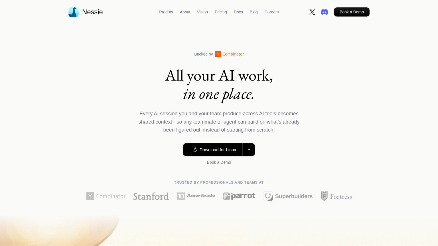
All your AI work, in one place.
Every AI session you and your team produce across AI tools becomes shared context - so any teammate or agent can build on what's already been figured out, instead of starting from scratch.
Working
- Subhead names real outcome: no starting from scratch
- Team + agent framing signals collab value
- YC badge and logo bar add instant proof
Could improve
- Headline is generic aggregator copy
- Zero numbers or named AI tools
- Hero shows no product screenshot
Trust
64FairProof that the product is real, competent, and safe to try.
| Trust read | |
|---|---|
| Nessie | "TRUSTED BY PROFESSIONALS AND TEAMS AT" logo row (Y Combinator, Stanford, Ameritrade, Parrot, Superbuilders, Fortress) |
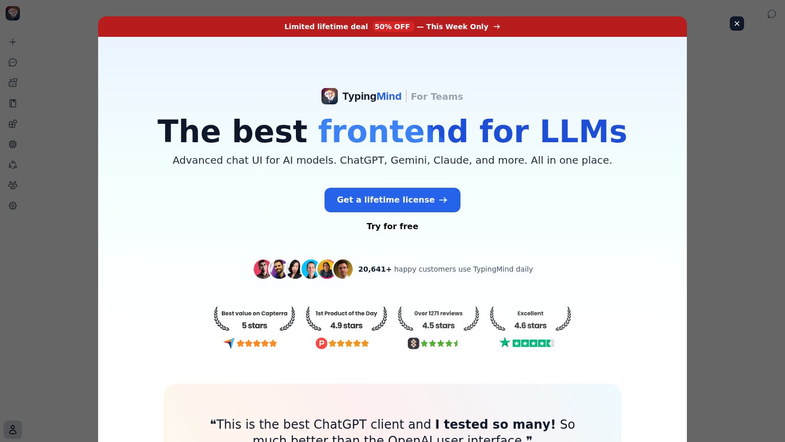
| Testimonial section opening visible on mobile ("Msty has been a…" with quotation mark) | |
| Row of four review badges with scores and counts: "Over 1271 reviews, 4.5 stars", "Excellent 4.6 stars" (Trustpilot), "1 | |
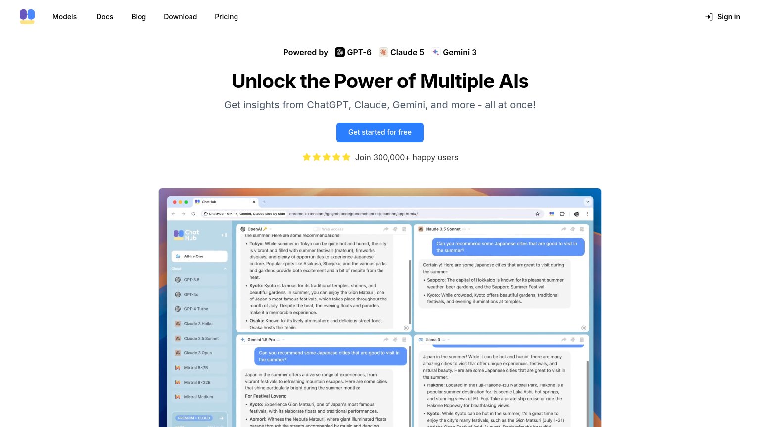
| "Join 300,000+ happy users" with five-star row beneath the primary CTA |
CTA
68FairCopy, size, verb, cost-feel — does the primary CTA earn the click?
Problems
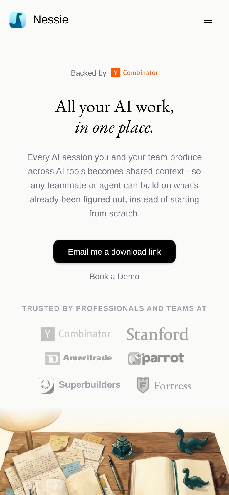
- mobile swaps to email-me flow
- label differs desktop vs mobile
- 'for Linux' narrows the promise
- dropdown adds platform decision
Information hierarchy
72FairDoes the design help or inhibit what the page is trying to say?
123- Header nav links — Seven equal-weight nav links plus X and Discord icons give attention nine exits before the hero CTA.
- Duplicate Book a Demo — Text link 'Book a Demo' below the download button repeats the header's black button, splitting the fold's action into two competing paths.
- Download for Linux CTA — Linux-only default label narrows perceived relevance; the tiny dropdown chevron hides other platforms behind an extra click.
Mobile web
82StrongThe phone experience as a first-class citizen.
 12
- Six-line body paragraph — Runs six lines of large type, pushing the primary CTA deep into the viewport.
- Stacked logo grid — Six logos in a 2×3 grid add density right below the CTA pair.