
Your landing page’s weakest score is Value props.
How MOVEdot ranks
- 1.
Synera64
- 2.
MOVEdot63
- 3.
Monolith AI62
- 4.
PhysicsX49
63Growth scoreupdated
category scores
category scoresShowHide
Score over time
Value props
58FairTitle, subtitle, hero — do they sell the product's true value?
MOVEdot’s headline vague
The Agentic Engineering Platform for Automotive Testing · Simulation · Validation
Working
- Names the vertical: automotive T/S/V
- Hero demo shows real agent workflow
- K&C/Adams details signal domain depth
Could improve
- No subhead — headline stands alone
- Category label, not an outcome
- Zero numbers or proof in the copy
Trust
58FairProof that the product is real, competent, and safe to try.


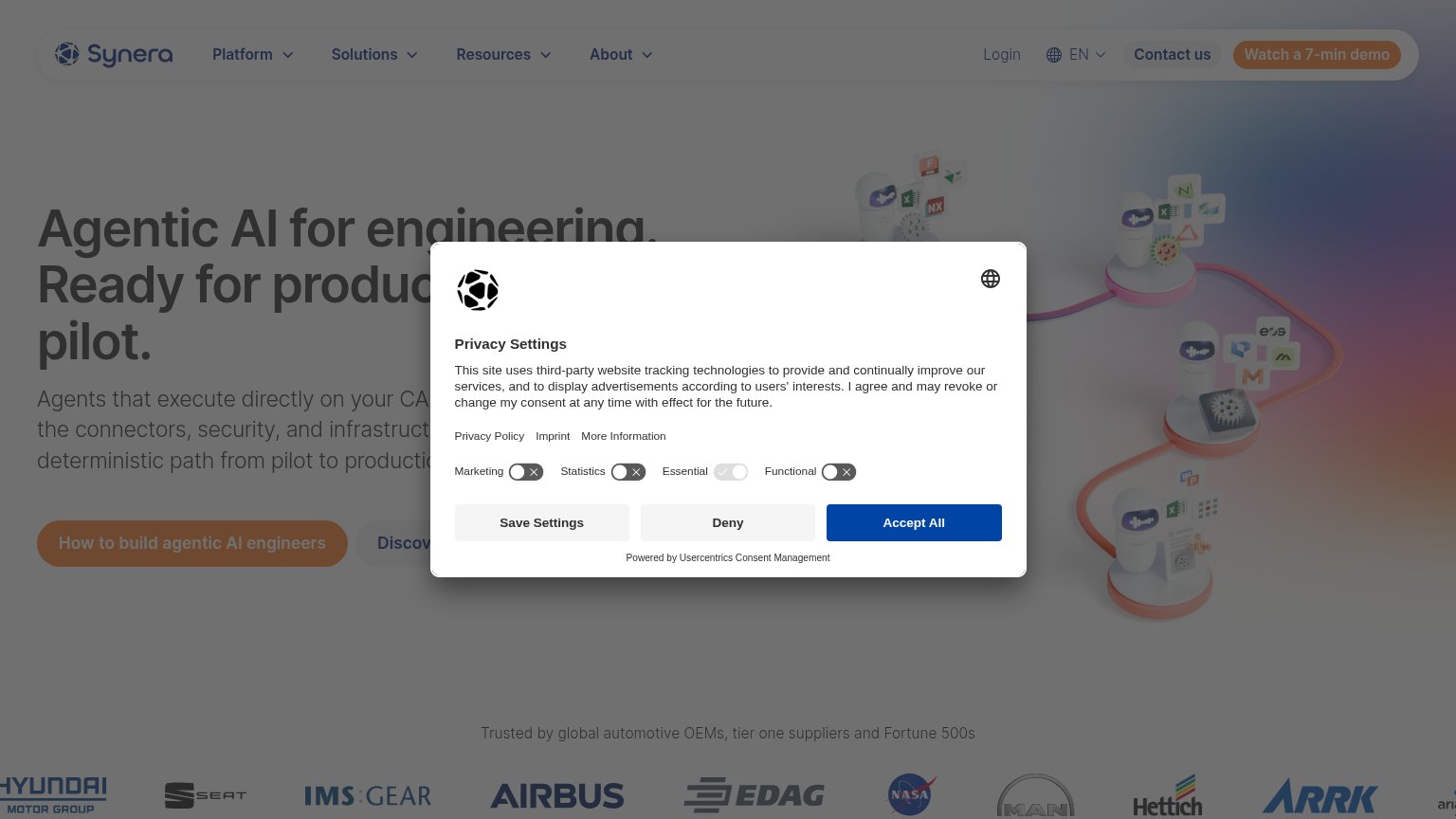
| Trust read | |
|---|---|
| MOVEdot | "Backed by Y Combinator" badge in the header next to the MOVEdot logo |
| Nissan case study modal: "How Nissan Reduced Physical Testing by 17% with AI" with named testimonial from Emma Deutsch, | |
| Logo bar under "Trusted by global automotive OEMs, tier one suppliers and Fortune 500s" with Hyundai, Airbus, NASA, MAN, | |
| No visible trust signal identified. |
Mobile web
62FairThe phone experience as a first-class citizen.
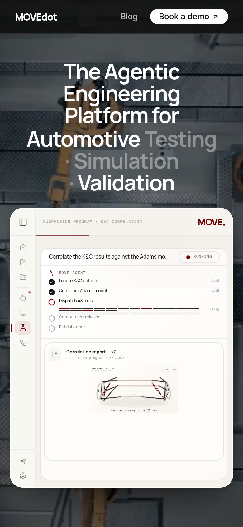 123
- Hero headline block — Desktop-scale headline wraps into seven cramped lines and eats a third of the first viewport.
- Book a demo button — Primary CTA exists only as a small header pill instead of a full-width thumb target in the body.
- Product demo card — Desktop-density UI with tiny microcopy and truncated task text ('Adams mo...') is illegible at phone size.
CTA
68FairCopy, size, verb, cost-feel — does the primary CTA earn the click?
Problems
- 'Book a demo' feels costly/committal
- no CTA in the hero itself
- nav-sized button vs huge headline
- product screenshot isn't interactive
Information hierarchy
71FairDoes the design help or inhibit what the page is trying to say?
123- Faded headline keywords — "Testing · Simulation" render at low-contrast gray, making half the category statement illegible against the busy background.
- Book a demo button — Small white pill in the corner blends with the "Backed by Y Combinator" badge weight; it never anchors the scan path below the headline.
- Product demo panel — Left-rail icon stack and breadcrumb metadata add a dozen unlabeled micro-elements without communicating the outcome at a glance.