
Your landing page’s weakest score is Value props.
How Minro ranks
66Growth scoreupdated
category scores
category scoresShowHide
Score over time
Value props
58FairTitle, subtitle, hero — do they sell the product's true value?
Minro’s headline vague
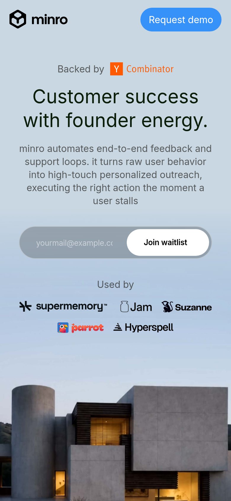
Customer success with founder energy.
minro automates end-to-end feedback and support loops. it turns raw user behavior into high-touch personalized outreach, executing the right action the moment a user stalls
Working
- Subhead names a concrete trigger: user stalls
- YC badge and customer logos add proof
- Distinct voice, not generic SaaS-speak
Could improve
- Headline is a vibe, not an outcome
- Hero villa image shows nothing of product
- No numbers or measurable results
Trust
58FairProof that the product is real, competent, and safe to try.

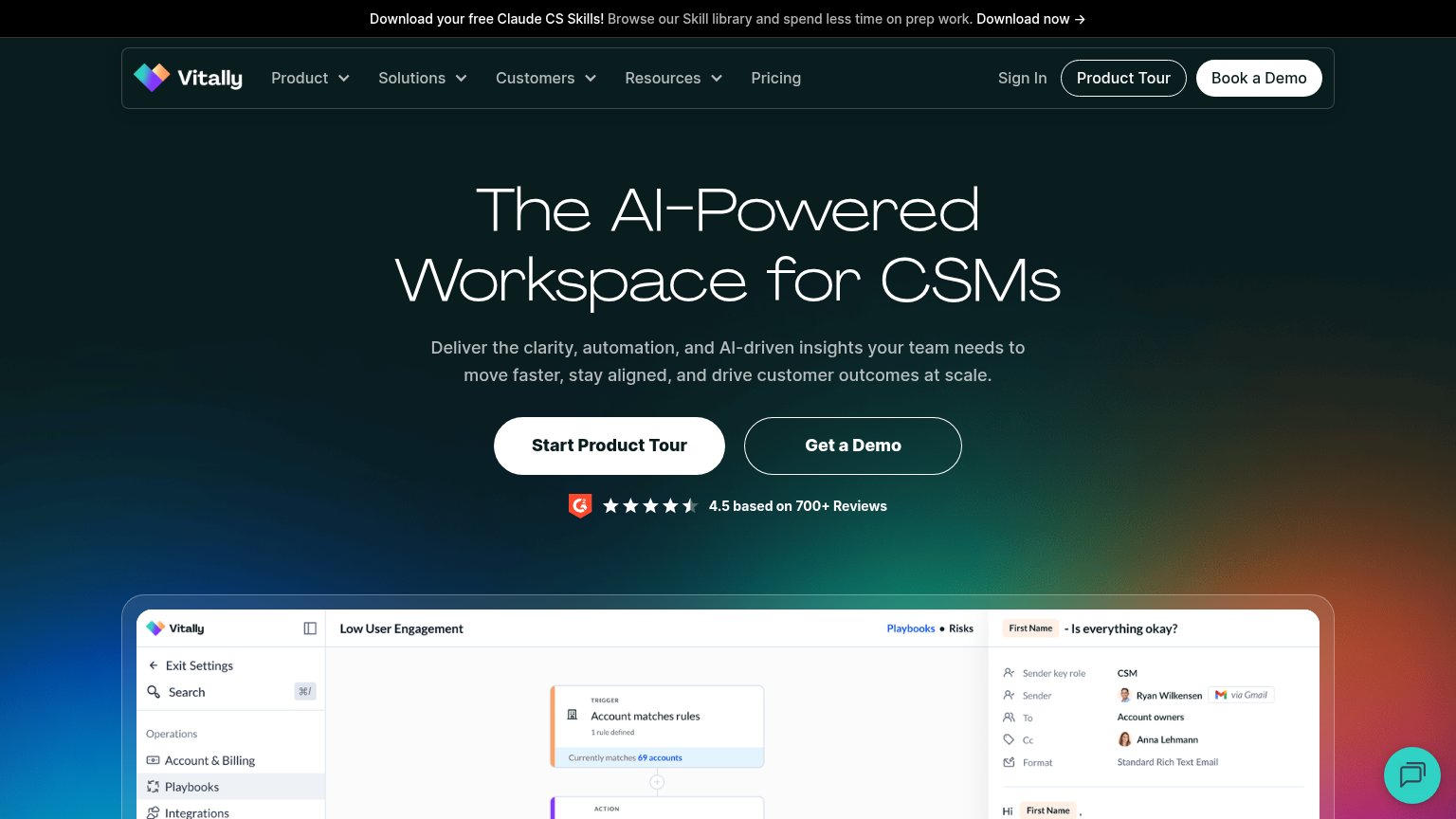

| Trust read | |
|---|---|
| Minro | "Backed by Y Combinator" badge above the hero headline |
| Mobile testimonial section "Customer success leaders, in their words" naming Aruba, HPE with a real person's photo | |
| G2 badge with "4.5 based on 700+ Reviews" directly under the hero CTAs | |
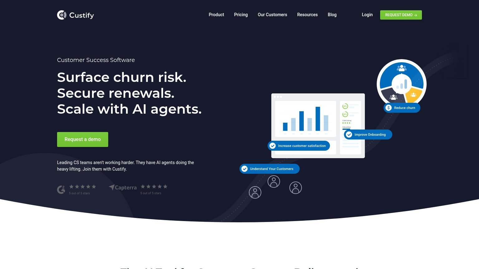
| G2 and Capterra badges showing "5 out of 5 stars" beneath the hero CTA | |
| "4.5 based on +100 reviews" rating strip with G2, Capterra, and Google icons under the CTA |
CTA
66FairCopy, size, verb, cost-feel — does the primary CTA earn the click?

Problems
- waitlist contradicts 'Used by' logos
- competes with 'Request demo' in nav
- placeholder sells nothing
- click buys waiting, not value
Information hierarchy
72FairDoes the design help or inhibit what the page is trying to say?
123- Join waitlist form — Gray-on-gray input and white pill are lower contrast than the header button, so the primary action recedes.
- Request demo button — The loudest blue element on the page competes directly with the waitlist form for the one conversion.
- Six-link nav row — About through Intel gives six equal-weight exits before the visitor reaches either CTA.
Mobile web
76FairThe phone experience as a first-class citizen.
 1
- Four-line subhead — The unshortened desktop paragraph wraps to six lines on mobile, pushing the waitlist form lower in the fold.