
Your landing page’s weakest score is Value props.
How Metorial ranks
67Growth scoreupdated
category scores
category scoresShowHide
Score over time
Value props
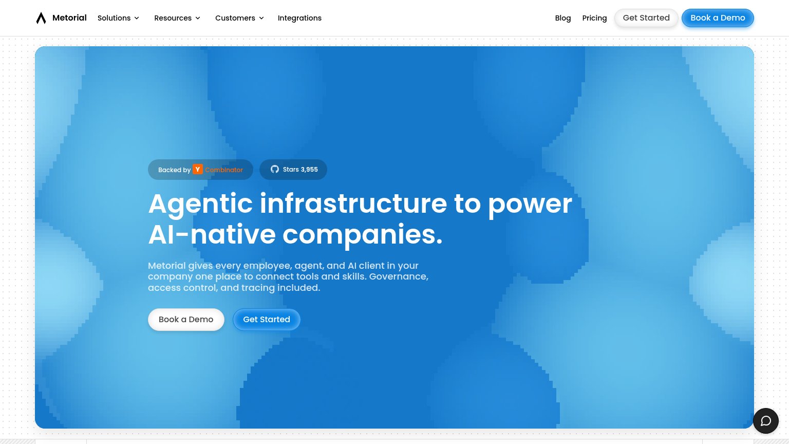
62FairTitle, subtitle, hero — do they sell the product's true value?
Metorial’s headline vague
Agentic infrastructure to power AI-native companies.
Metorial gives every employee, agent, and AI client in your company one place to connect tools and skills. Governance, access control, and tracing included.
Working
- Subhead names concrete capabilities
- YC + GitHub stars build proof
- Clear ICP: AI-native companies
Could improve
- H1 is buzzword-only, no outcome
- Hero image decorates, shows nothing
- No numbers beyond star count
Trust
62FairProof that the product is real, competent, and safe to try.
| Trust read | |
|---|---|
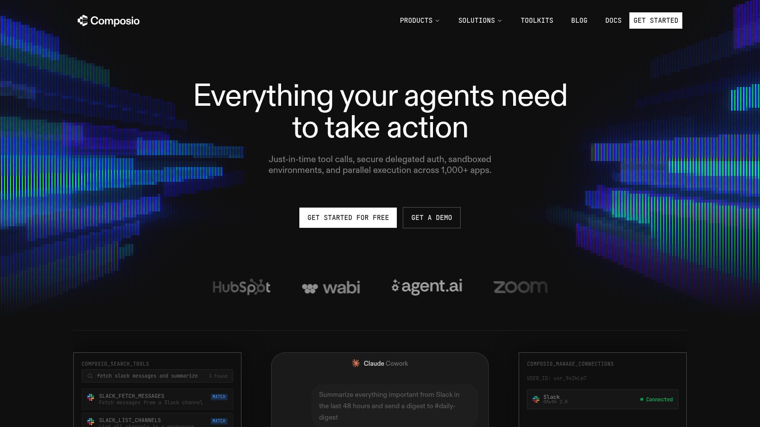
| Metorial | "Backed by Y Combinator" badge with GitHub "Stars 3,955" counter |
| Customer logo strip: HubSpot, wabi, agent.ai, Zoom | |
| "ARCADE IS TRUSTED FOR PRODUCTION AGENTS AT" logo strip with Relevance AI, YUR, Sybill, eddo learning | |
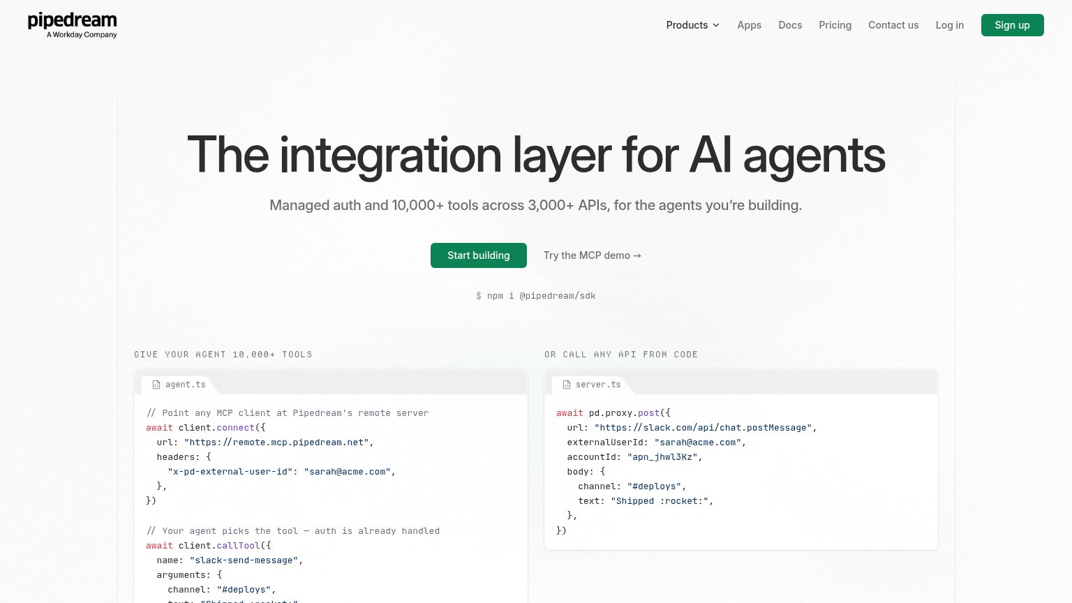
| "A Workday Company" mark under the Pipedream logo | |
| "Backed by Y Combinator" badge with GitHub "5.8k ★" pill above the headline | |
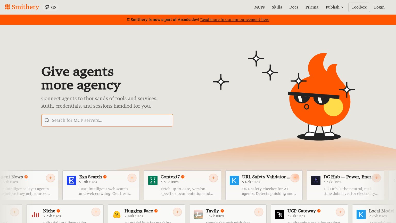
| MCP server cards with usage counts, e.g. "Exa Search — 9.18k uses" and "OneSignal — 22.49k uses" |
CTA
68FairCopy, size, verb, cost-feel — does the primary CTA earn the click?
Problems
- generic label, no payoff named
- Book a Demo placed first in hero
- same size as nav pills, not dominant
Mobile web
70FairThe phone experience as a first-class citizen.
 1234
- Oversized hero headline — Barely scaled from desktop, wraps into five tall lines and pushes CTAs to the fold's edge.
- Get Started button — Primary CTA is a small pill below the demo button — undersized, under-prioritized, not full-width.
- Stacked badge chips — Two social-proof pills eat vertical space before the headline even starts.
- Chat bubble overlap — Floating chat button hovers at the CTA level and can intercept thumb taps.
Information hierarchy
72FairDoes the design help or inhibit what the page is trying to say?
123- Dual hero CTAs — "Book a Demo" and "Get Started" share equal size and weight, so no single action wins the scan.
- Get Started button — Blue pill on a blue gradient loses contrast; the primary action nearly disappears into the background.
- Duplicate nav CTAs — "Get Started" and "Book a Demo" repeat in the nav, doubling the CTA set to four competing buttons in one viewport.