
Your landing page’s weakest score is Trust.
How Lunavo ranks
73Growth scoreupdated
category scores
category scoresShowHide
Score over time
Trust
44PoorProof that the product is real, competent, and safe to try.
| Trust read | |
|---|---|
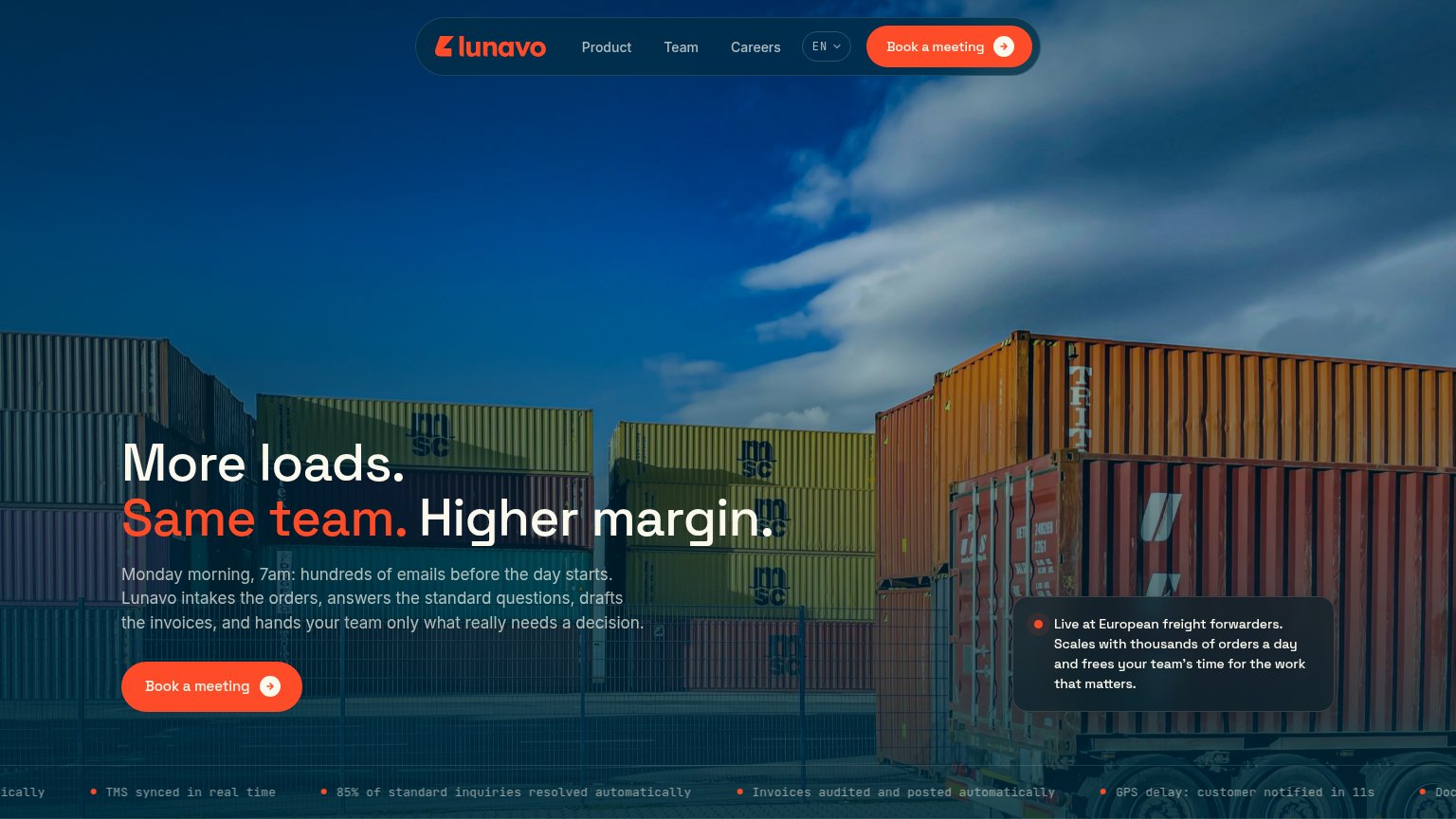
| Lunavo | "Live at European freight forwarders. Scales with thousands of orders a day and frees your team's time for the work that |
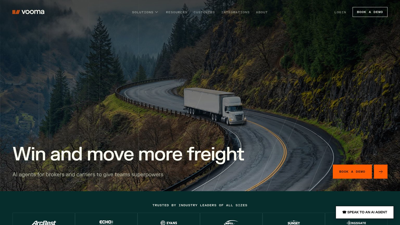
| "HAPPYROBOT RAISES ITS SERIES C TO PUT AI WORKERS TO WORK ACROSS THE REAL ECONOMY" announcement banner | |
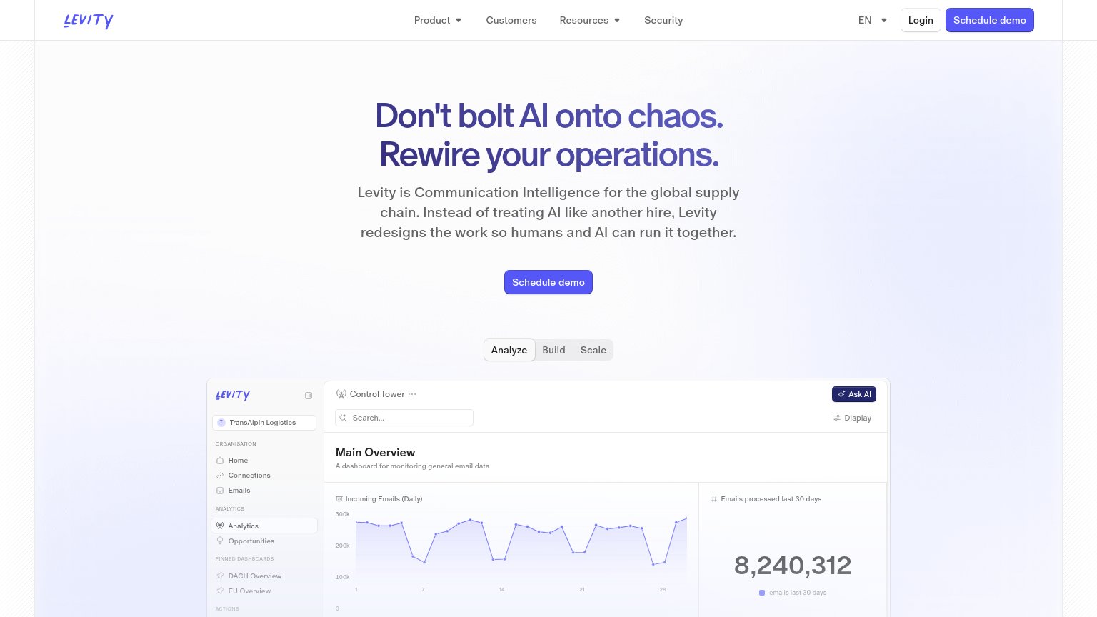
| 'Control Tower' product dashboard showing 'Incoming Emails (Daily)' chart and 'Emails processed last 30 days' panel | |
| "TRUSTED BY INDUSTRY LEADERS OF ALL SIZES" logo band with ArcBest, Echo, Evans, NFI, Sunset, and Kingsgate | |
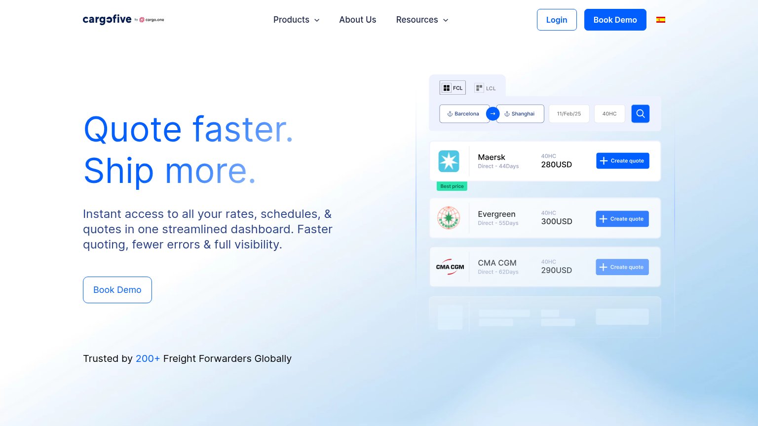
| Trusted by 200+ Freight Forwarders Globally |
CTA
72FairCopy, size, verb, cost-feel — does the primary CTA earn the click?
Problems
- click feels costly — sales meeting
- no payoff named, just a calendar ask
- no echo of headline promise
Mobile web
78FairThe phone experience as a first-class citizen.
 123
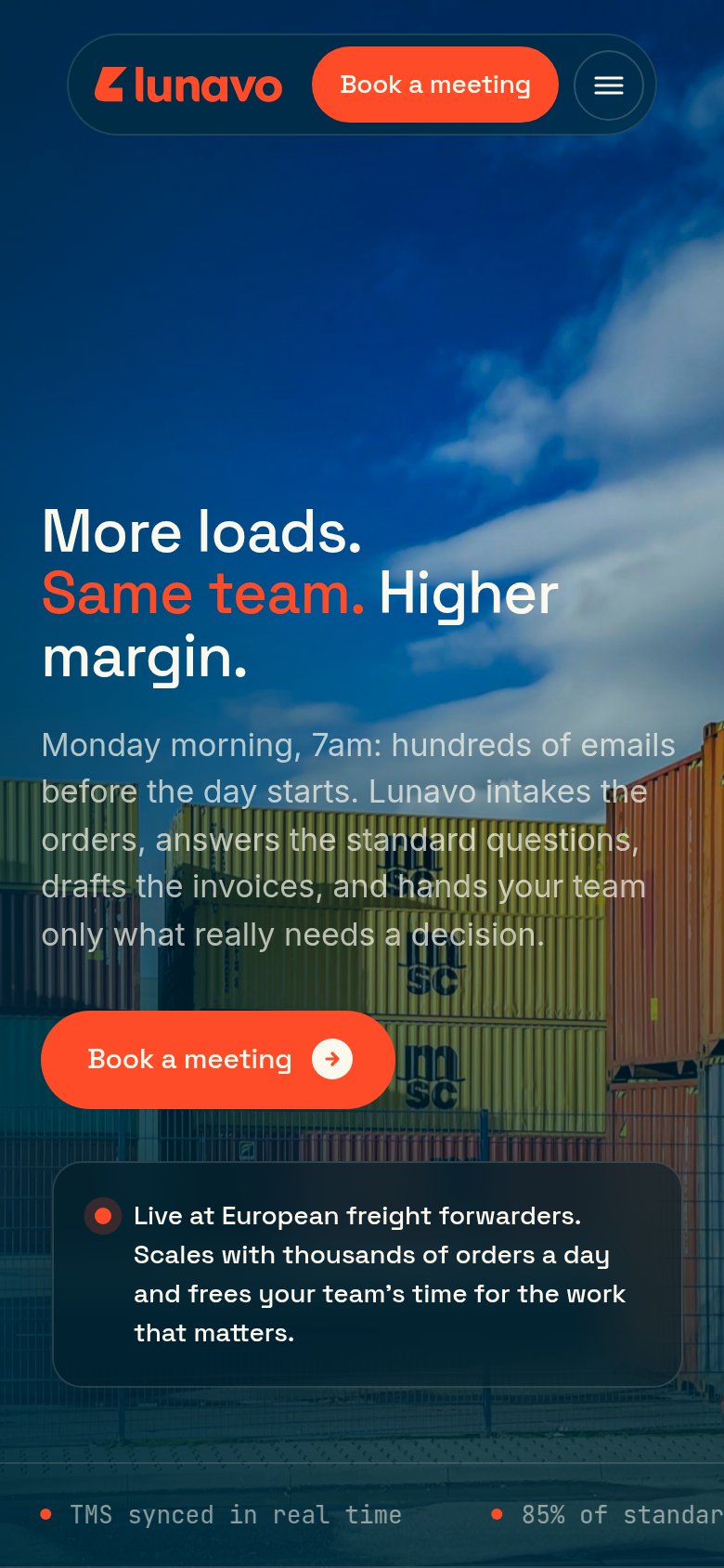
- Six-line body paragraph — Desktop-length copy crowds the fold and pushes the CTA to the viewport's bottom edge.
- Low-contrast grey text — Light-grey copy washes out against the bright yellow containers, hurting arm's-length readability.
- Duplicate header CTA — A second "Book a meeting" in the nav pill competes with the hero button and squeezes the logo.
Information hierarchy
84StrongDoes the design help or inhibit what the page is trying to say?
123- Mobile subhead over containers — On mobile the paragraph overlaps bright yellow containers and legibility drops mid-sentence; visible in desktop's lighter right edge too.
- Proof ticker strip — Small grey monospace text on a busy truck photo is near-illegible, wasting the strongest proof points on the page.
- Live-at-forwarders card — Floats mid-right outside the scan path with no anchor to the CTA or headline, so the social proof reads as an afterthought.
Value props
86StrongTitle, subtitle, hero — do they sell the product's true value?
Lunavo’s headline sells
More loads. Same team. Higher margin.
Monday morning, 7am: hundreds of emails before the day starts. Lunavo intakes the orders, answers the standard questions, drafts the invoices, and hands your team only what really needs a decision.
Working
- Outcome-first headline in nine words
- Vivid 7am inbox scene hits the real pain
- Ticker adds hard numbers (85%, 11s)
Could improve
- Stock container photo shows nothing of the product
- No named customers or logos as proof
- Hard numbers buried in the ticker, not the hero