
Your landing page’s weakest score is Value props.
How Logical ranks
66Growth scoreupdated
category scores
category scoresShowHide
Score over time
Value props
48PoorTitle, subtitle, hero — do they sell the product's true value?
Logical’s headline vague
The AI copilot that was promised
Working
- Taps AI-hype fatigue with a confident wink
- YC + NVIDIA badges add instant credibility
- Clear platform-specific CTA: Download for macOS
Could improve
- No subhead — zero explanation of the product
- Desktop hero shows a dock icon, not the product
- No numbers, outcomes, or use cases in the fold
Trust
62FairProof that the product is real, competent, and safe to try.
| Trust read | |
|---|---|
| Logical | "Backed by Y Combinator" badge with NVIDIA Inception Program logo under the hero headline |
| implicit context Raycast may benefit from pre-existing familiarity among its target audience. | |
| Product demo overlay: "Reading new message in #hiring — Analyzing the thread and drafting next steps" | |
| Product screenshot of Fellou's browser UI with "Deep Action" search bar and task prompts like "Build a pet adoption info | |
| "Featured on There's An AI For That" badge below the download CTAs | |
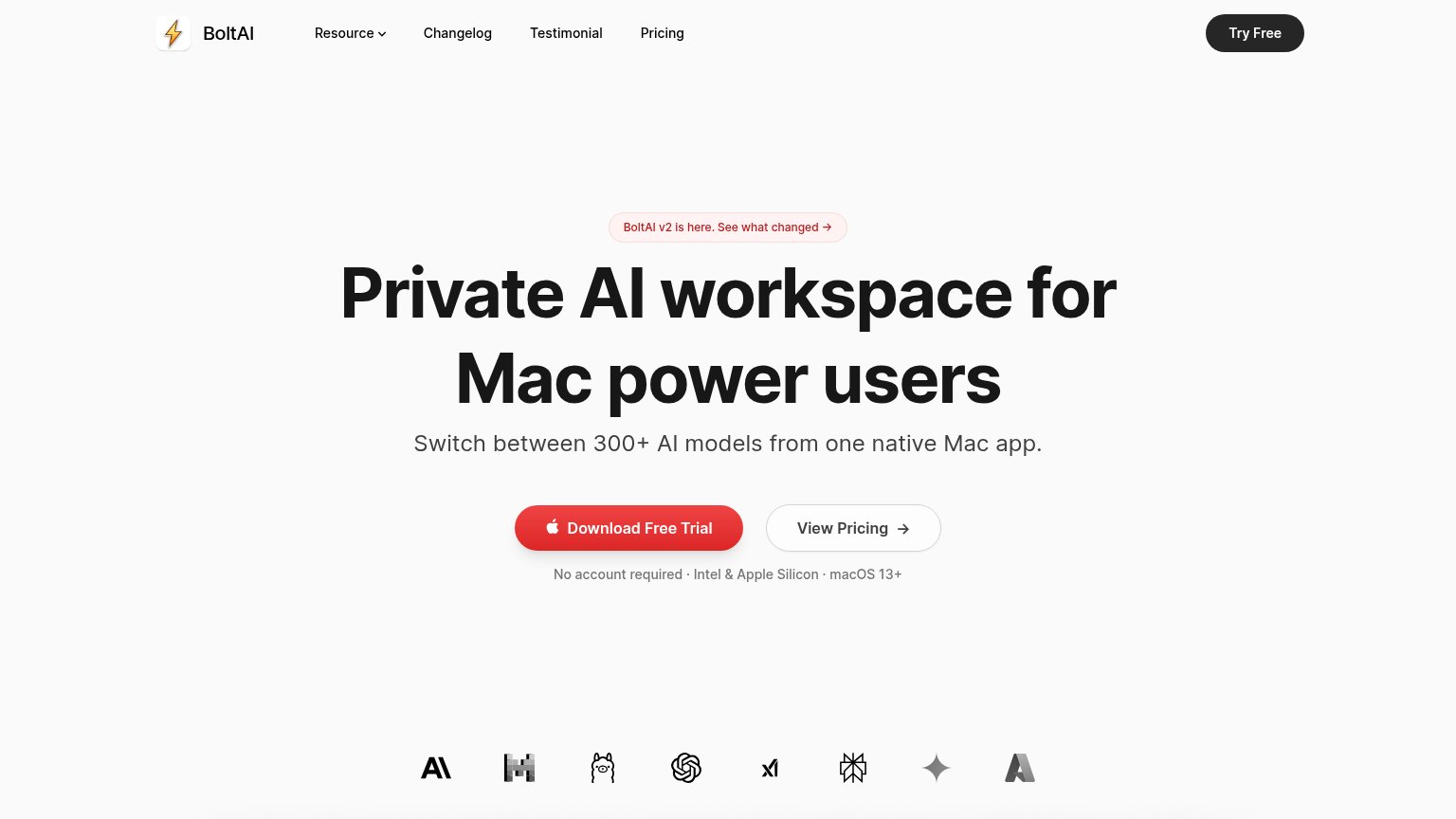
| "No account required · Intel & Apple Silicon · macOS 13+" reassurance line under the Download Free Trial CTA |
CTA
72FairCopy, size, verb, cost-feel — does the primary CTA earn the click?


Problems
- asterisk adds fine-print doubt
- mobile label differs: 'Sign up*'
- Apple logo on mobile 'Sign up*' confuses
- platform limit excludes non-Mac users
Mobile web
72FairThe phone experience as a first-class citizen.
 123
- Sign up* button — Apple logo plus unexplained asterisk muddle the label; the beta footnote is far below the fold.
- Header Sign up pill — Duplicates the hero CTA next to the hamburger, splitting attention in the first viewport.
- Beta footnote text — The asterisk's macOS-only disclaimer sits at the bottom, cut off mid-sentence and detached from the CTA it qualifies.
Information hierarchy
74FairDoes the design help or inhibit what the page is trying to say?
1234- Duplicate macOS download — Header 'Download for macOS' duplicates the hero CTA at near-equal weight, splitting the single action into two targets.
- Nav link row — Four nav items (Features, Resources, Privacy, Community) sit above the value prop and drain attention before the CTA.
- CTA asterisk footnote — 'Download for macOS*' carries an asterisk whose explanation is below the fold, adding doubt at the moment of action.
- Mismatched mobile CTA — On mobile the same button reads 'Sign up*' with an Apple icon — inconsistent action label muddies the conversion path (mobile issue, pinned on desktop equivalent).