
Your landing page’s weakest score is CTA.
How Crunched ranks
- 1.
Crunched76
- 2.
DataSnipper74
- 3.
Rogo72
- 4.
Hebbia71
76Growth scoreupdated
category scores
category scoresShowHide
Score over time
CTA
72FairCopy, size, verb, cost-feel — does the primary CTA earn the click?

Problems
- 'access' implies gated waitlist
- no payoff named in the label
- no header-echo with hero promise
Value props
76FairTitle, subtitle, hero — do they sell the product's true value?
Crunched’s headline sells
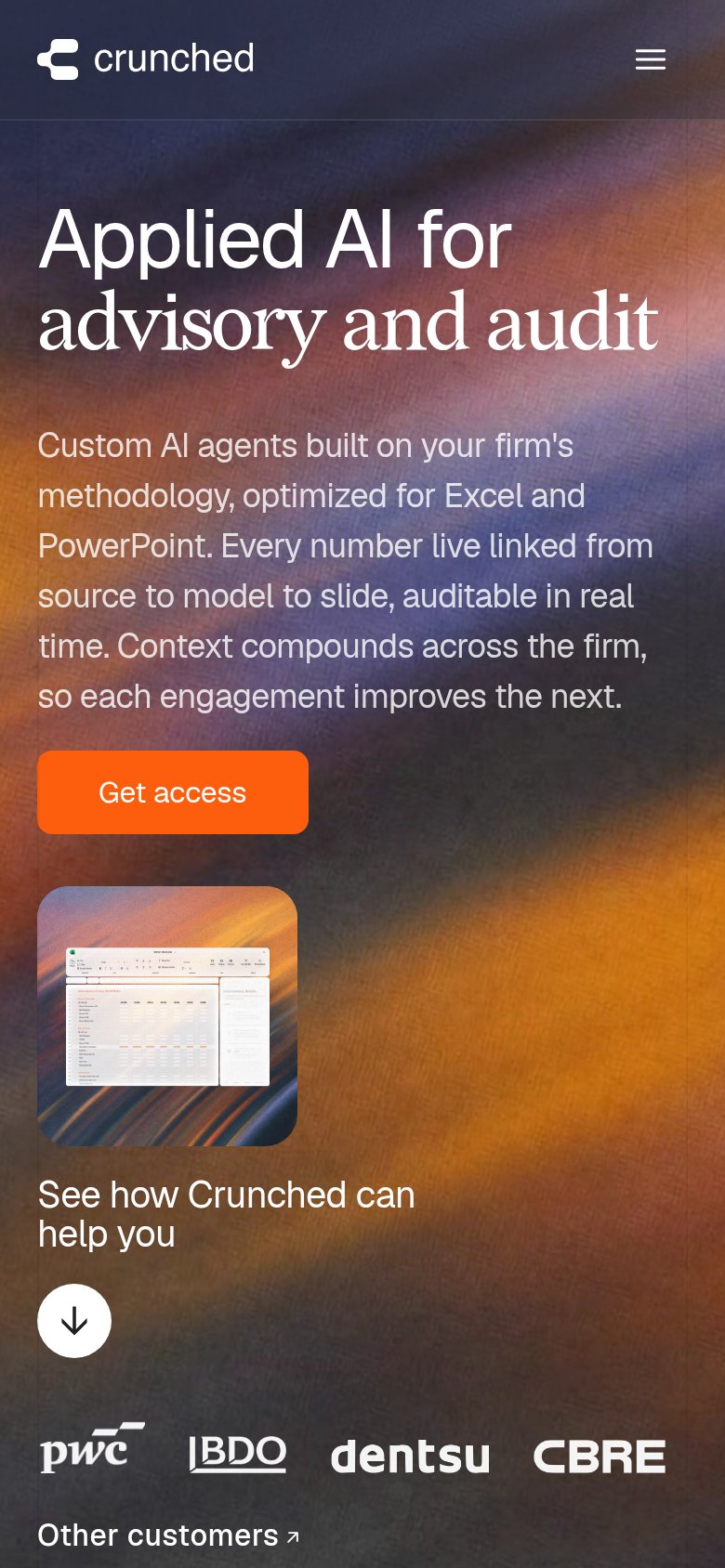
Applied AI for advisory and audit
Custom AI agents built on your firm's methodology, optimized for Excel and PowerPoint. Every number live linked from source to model to slide, auditable in real time. Context compounds across the firm, so each engagement improves the next.
Working
- Names exact buyer: advisory and audit
- Subhead nails traceability anxiety
- PwC/BDO/CBRE logos back the claim
Could improve
- Headline states category, not outcome
- No numbers anywhere in the fold
- Tiny hero shot decorates, not demos
Trust
76FairProof that the product is real, competent, and safe to try.
| Trust read | |
|---|---|
| Crunched | Customer logo row: PwC, BDO, dentsu, CBRE |
| Customer/partner logo strip: Tiger Global, Moelis, Nomura, Société Générale, Rothschild & Co, BNP Paribas, Raymond James | |
| Customer logo row: Morgan Stanley, MetLife, Centerview, OHA (mobile capture) | |
| Review-score strip in the hero demo: G2 4.8, Capterra 4.7, Gartner 4.6 |
Information hierarchy
78FairDoes the design help or inhibit what the page is trying to say?
1234- Video thumbnail teaser — The 'See how Crunched can help Crunched' card plus scroll arrow forms a second call-to-action cluster competing with 'Get access'.
- Five-link nav row — Platform, Case Studies, Security, Careers and Login give five exits before the visitor reaches the primary CTA.
- Other customers link — An outbound arrow link sitting beside the logo row leaks attention right at the credibility moment.
- Long subhead paragraph — Five lines of dense body copy delay the eye's path from headline to the 'Get access' button.
Mobile web
78FairThe phone experience as a first-class citizen.
 123
- Get access button — Desktop-proportioned button floats at a third of the column width; mobile wants a near-full-bleed tap target.
- Seven-line body paragraph — Desktop-length copy stacks seven lines before the CTA, burying the single value statement.
- Spreadsheet thumbnail image — Small screenshot below the CTA is illegible at this size and adds scroll depth without communicating anything.