
Your landing page’s weakest score is CTA.
How Axial ranks
41Growth scoreupdated
category scores
category scoresShowHide
Score over time
CTA
30PoorCopy, size, verb, cost-feel — does the primary CTA earn the click?
Problems
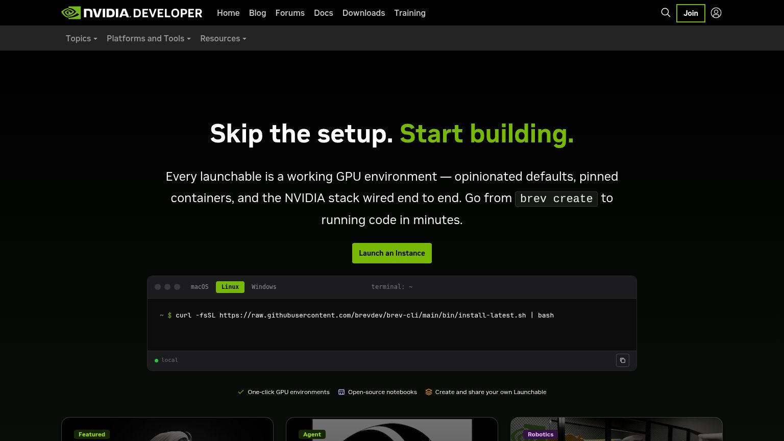
- no CTA anywhere above the fold
- headline promise has no next step
- decorative equation is only sub-element
Trust
32PoorProof that the product is real, competent, and safe to try.
| Trust read | |
|---|---|
| Axial | No visible trust signal identified. |
| Terminal widget with real install command "curl -fsSL https://raw.githubusercontent.com/brevdev/brev-cli/main/bin/instal | |
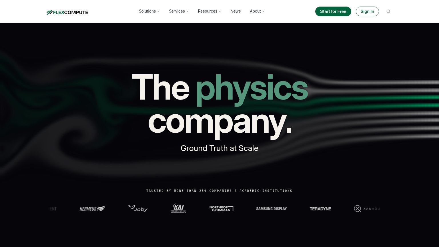
| "TRUSTED BY MORE THAN 250 COMPANIES & ACADEMIC INSTITUTIONS" with logo strip (Northrop Grumman, Samsung Display, Joby, T | |
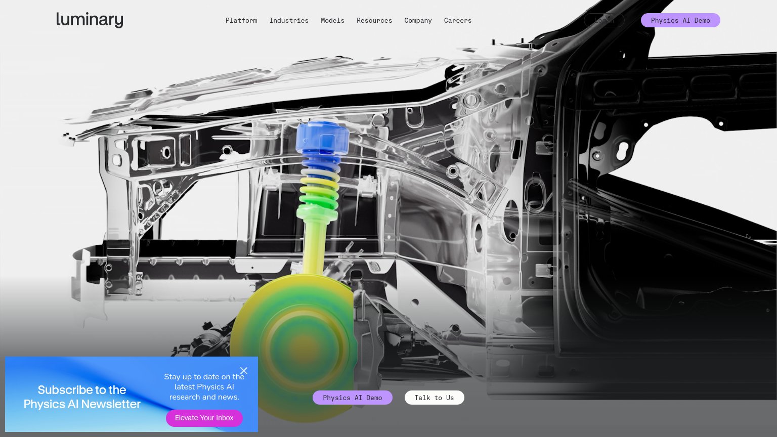
| No visible trust signal identified. | |
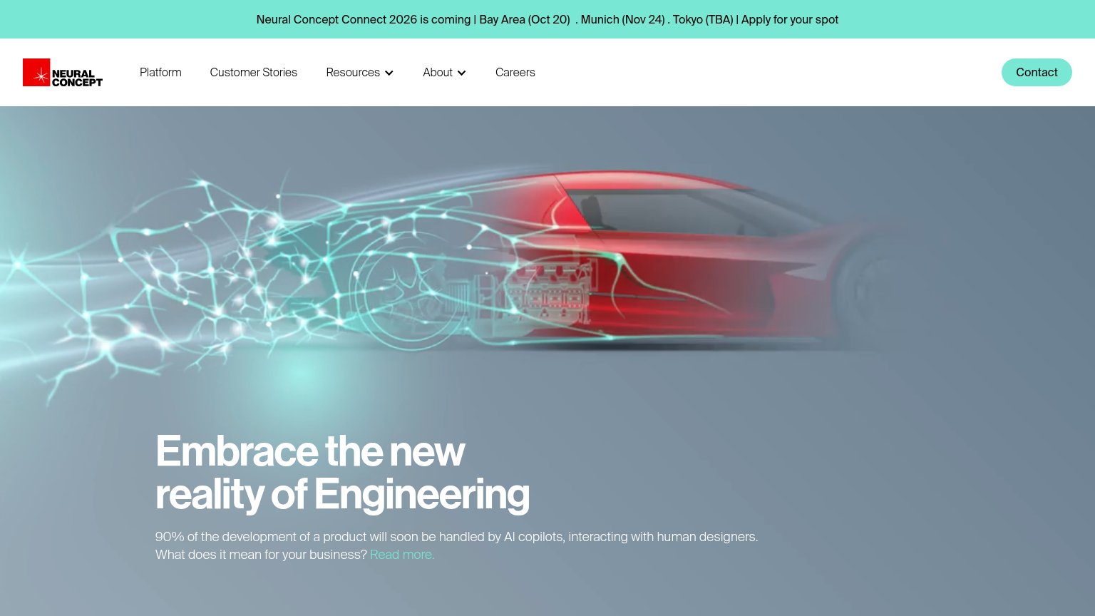
| "Neural Concept Connect 2026 is coming | Bay Area (Oct 20) . Munich (Nov 24) . Tokyo (TBA)" event banner |
Mobile web
44PoorThe phone experience as a first-class citizen.
 123
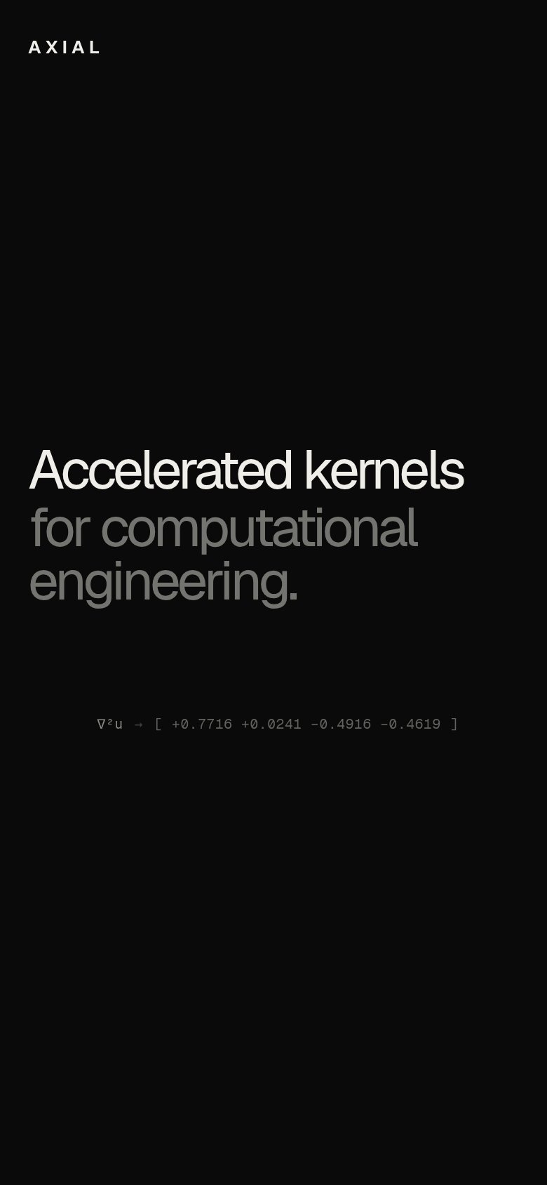
- Hero headline block — No CTA or link anywhere near the value statement — the fold offers nothing to tap.
- Equation ticker line — Squint-small monospace string carries no meaning for visitors and is the only element besides the headline.
- AXIAL wordmark header — Header has no menu, link, or action — mobile visitors have zero navigation affordance.
Value props
48PoorTitle, subtitle, hero — do they sell the product's true value?
Axial’s headline undersells
Accelerated kernels for computational engineering.
Working
- Names a clear technical category
- Speaks directly to engineering buyers
- Confident, uncluttered single message
Could improve
- No outcome or speedup number
- No subhead adding specifics
- Equation snippet decorates, not proves
Information hierarchy
52FairDoes the design help or inhibit what the page is trying to say?
 12
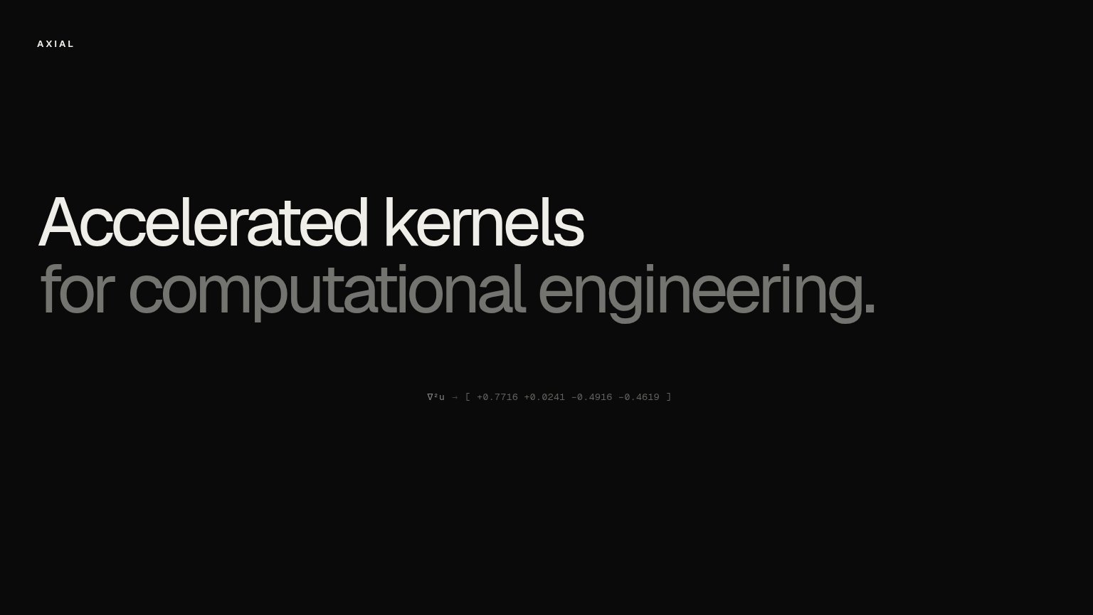
- Second headline line — "for computational engineering." is dimmed to low-contrast grey, weakening half of the only value statement on the page.
- Kernel output ticker — The tiny ∇²u monospace readout is near-invisible at this size and communicates nothing a visitor can parse or act on.