
Your landing page’s weakest score is Trust.
How Aspect ranks
- 1.
Frame.io76
- 2.
Aspect71
- 3.
Iconik71
71Growth scoreupdated
category scores
category scoresShowHide
Trust
52FairProof that the product is real, competent, and safe to try.

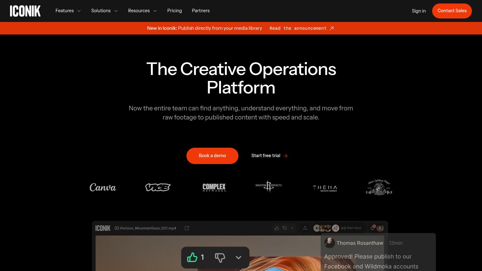
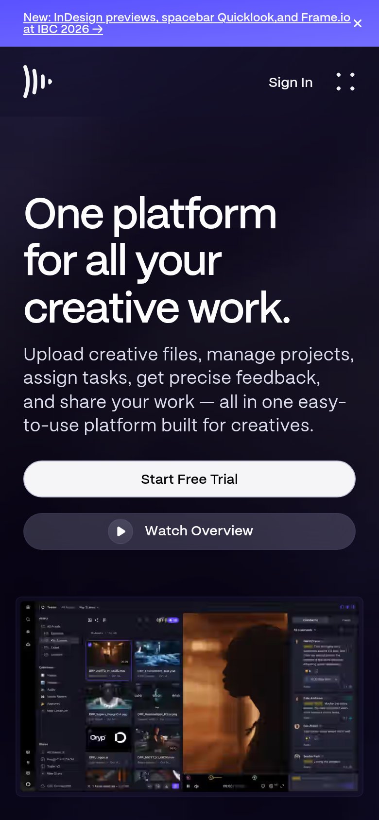
| Trust read | |
|---|---|
| Aspect | Detailed product UI screenshot showing versioned assets, an "Approved" status badge, and a named comment/review thread |
| Detailed real product UI screenshot showing asset library with named files ("DRP_A00TQ_V1_0085.mov"), folders, and appea | |
| Customer logo row: Canva, VICE, Complex Networks, Houston Rockets, Thema (Canal+), MGM |
Value props
72FairTitle, subtitle, hero — do they sell the product's true value?
Aspect’s headline undersells
Intelligent media storage for the whole team.
Upload multi-media files, collaborate and review, stream video locally like a NAS, and automate media gruntwork with AI, all in one unified platform.
Working
- "like a NAS" anchors a concrete comparison
- "media gruntwork" names the real pain
- Hero screenshot shows review workflow live
Could improve
- "Intelligent" is a generic modifier
- No numbers or proof points in fold
- Headline reads feature, not outcome
Mobile web
72FairThe phone experience as a first-class citizen.
123- Side-by-side CTA buttons — Desktop-proportioned pair floats in the column instead of stacking as full-width thumb targets.
- Oversized hero headline — Scaled down too little — wraps into four cramped lines with awkward breaks and dominates the fold.
- Chat bubble overlay — Large launcher covers the product screenshot's corner and competes with the CTAs for attention.
Information hierarchy
76FairDoes the design help or inhibit what the page is trying to say?
 1234
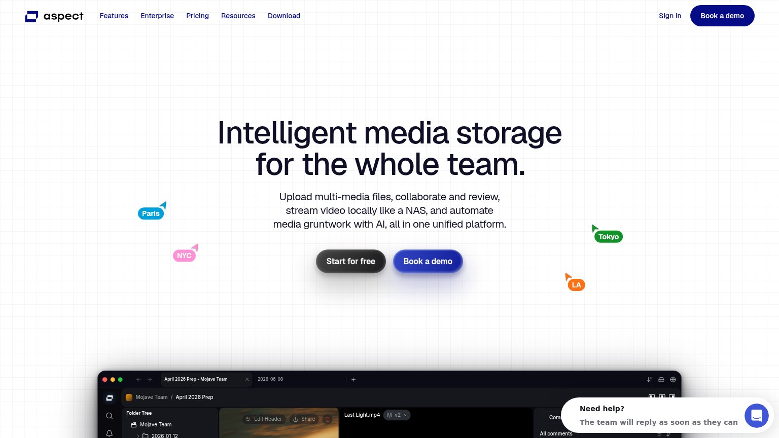
- Dual hero CTAs — "Start for free" and "Book a demo" sit side by side at equal size and weight, splitting the primary action.
- Header Book a demo — Duplicates the hero's demo button in the same dark pill style, adding a third equally weighted action to the fold.
- Intercom chat widget — "Need help?" bubble overlaps the product screenshot and pulls attention from the scan path toward a side conversation.
- Cropped product screenshot — The app UI enters the fold as a thin illegible sliver, teasing detail without communicating anything at this crop.
CTA
82StrongCopy, size, verb, cost-feel — does the primary CTA earn the click?
Problems
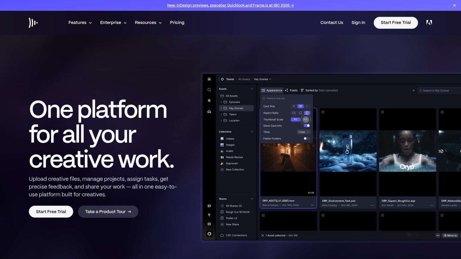
- Secondary 'Book a demo' outshines it
- Nav promotes demo, not free start
- Dark button blends vs blue accent