
Your landing page’s weakest score is Mobile web.
How Antigen ranks
66Growth scoreupdated
category scores
category scoresShowHide
Score over time
Mobile web
54FairThe phone experience as a first-class citizen.
 123
- Header missing CTA — "Get a demo" vanishes on mobile, leaving only a hamburger and no tappable action anywhere in the capture.
- Truncated board columns — The "In Progress" column and its cards are cut off mid-word at the right edge — desktop kanban never re-flowed for phone.
- Oversized hero headline — Headline scales down too little, wrapping into six lines and pushing all product content past the fold.
CTA
62FairCopy, size, verb, cost-feel — does the primary CTA earn the click?


Problems
- no CTA in hero, nav-only
- mobile fold has no visible CTA
- demo click feels sales-heavy
- small footprint vs. headline
Information hierarchy
68FairDoes the design help or inhibit what the page is trying to say?
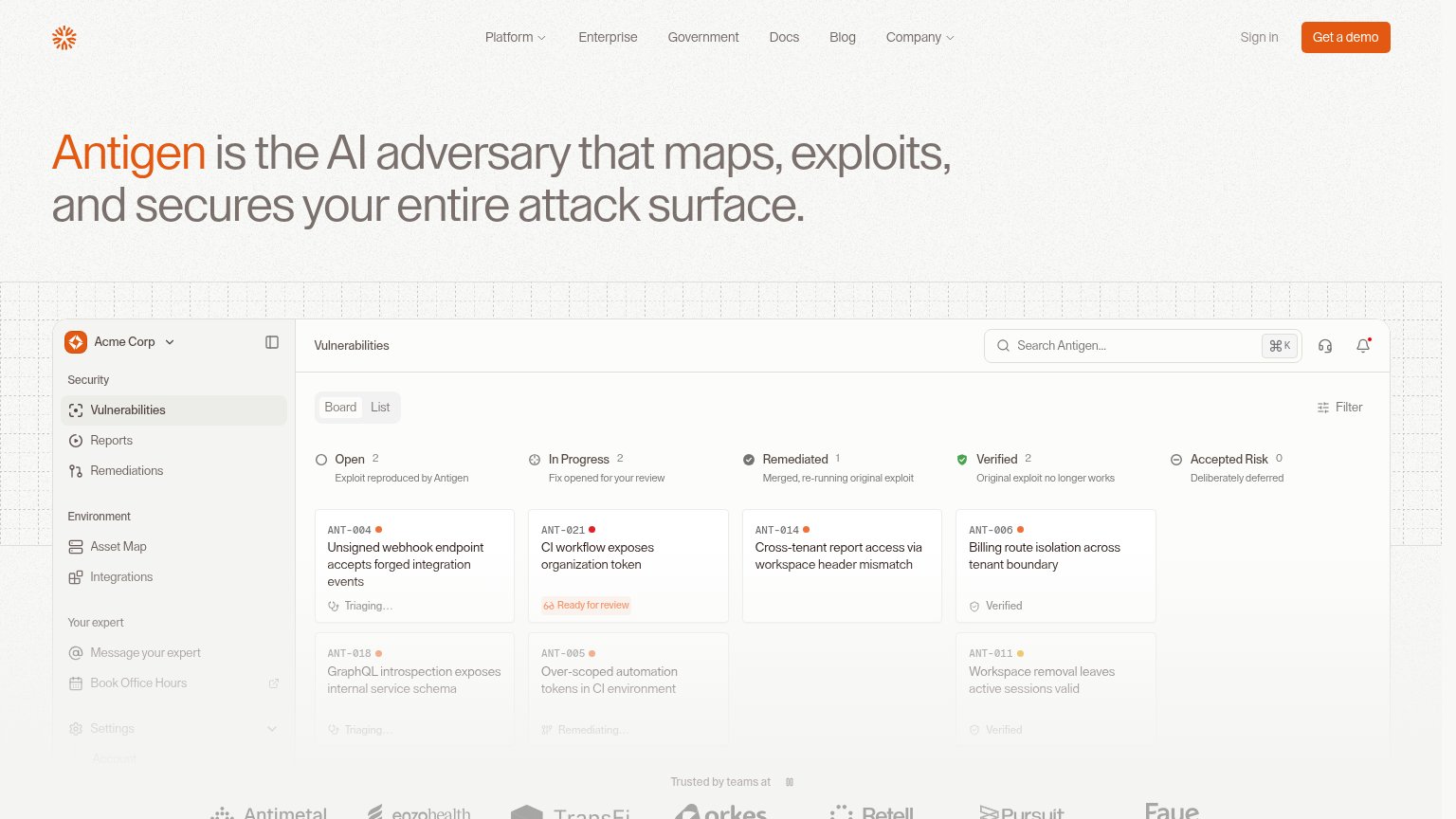
123- Product UI overload — The full kanban board with sidebar, search, filters, and six vulnerability cards asks the visitor to parse a dense app screen before any CTA repeats.
- Nav link row — Seven nav items plus Sign in create eight exit paths before the single 'Get a demo' button.
- Board search bar — A functional-looking search field with ⌘K shortcut inside a static screenshot invites interaction with a non-conversion element.
Trust
68FairProof that the product is real, competent, and safe to try.
| Trust read | |
|---|---|
| Antigen | Embedded vulnerabilities-board product UI with realistic exploit tickets (e.g. "ANT-004 Unsigned webhook endpoint accept |
| "150+ security teams trust XBOW to find and prove the flaws attackers would actually exploit" | |
| Video player branded "HORIZON3 — AI-NATIVE PROACTIVE SECURITY" below the hero (visible in the mobile capture) | |
| Gartner Peer Insights Customers' Choice 2026 badge (mobile capture) | |
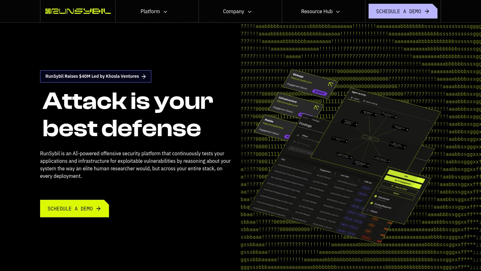
| RunSybil Raises $40M Led by Khosla Ventures | |
| Product dashboard UI showing "Signals Received 148" and "5 Critical Findings" |
Value props
76FairTitle, subtitle, hero — do they sell the product's true value?
Antigen’s headline sells
Antigen is the AI adversary that maps, exploits, and secures your entire attack surface.
Working
- "AI adversary" is a sharp, memorable category frame
- Verb chain maps/exploits/secures is concrete
- Hero UI proves exploits are reproduced and verified
Could improve
- No subhead to add proof or specifics
- Zero numbers anywhere in the fold
- Buyer outcome (relief, speed) left implicit